
The Pixelated Dot
design Letterbox | collaborator Peter Sorenson | client RMIT University
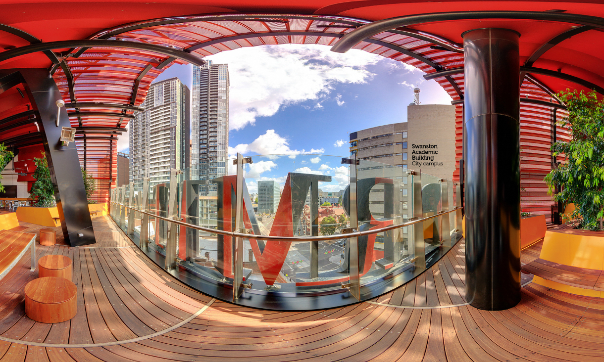
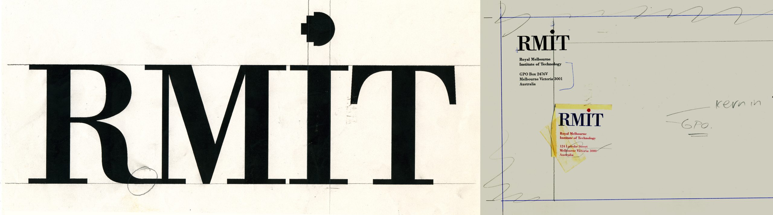
More than three decades after its design, the RMIT University identity continues to be a prominent landmark on the Melbourne skyline. The identity system reflects two key aspects of the institution: firstly, its origin as the ‘Working Man’s College’ dating back to 1887; and secondly, its more recent evolution of an international centre for technological research and innovation.
The applications of this identity continue to be extensive. The ‘pixelated dot’ device has become synonymous with the kind of applied research and teaching for which RMIT University is renown. The identity was designed in collaboration with fellow academic Peter Sorenson.
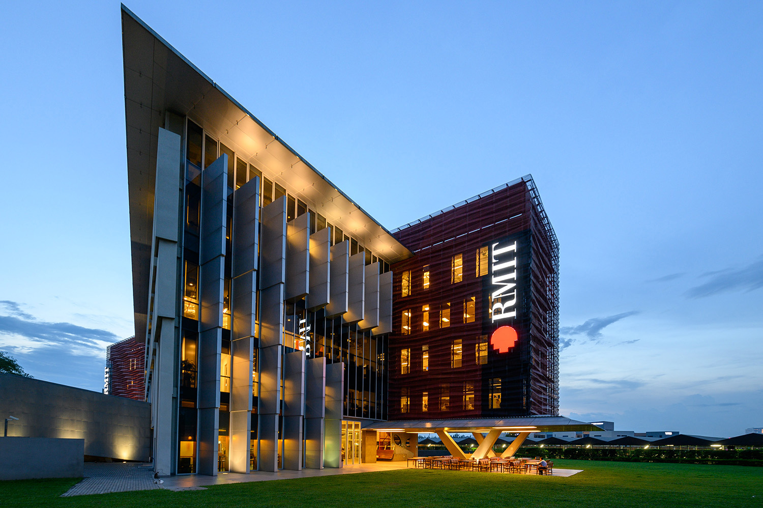
RMIT University Vietnam Campus

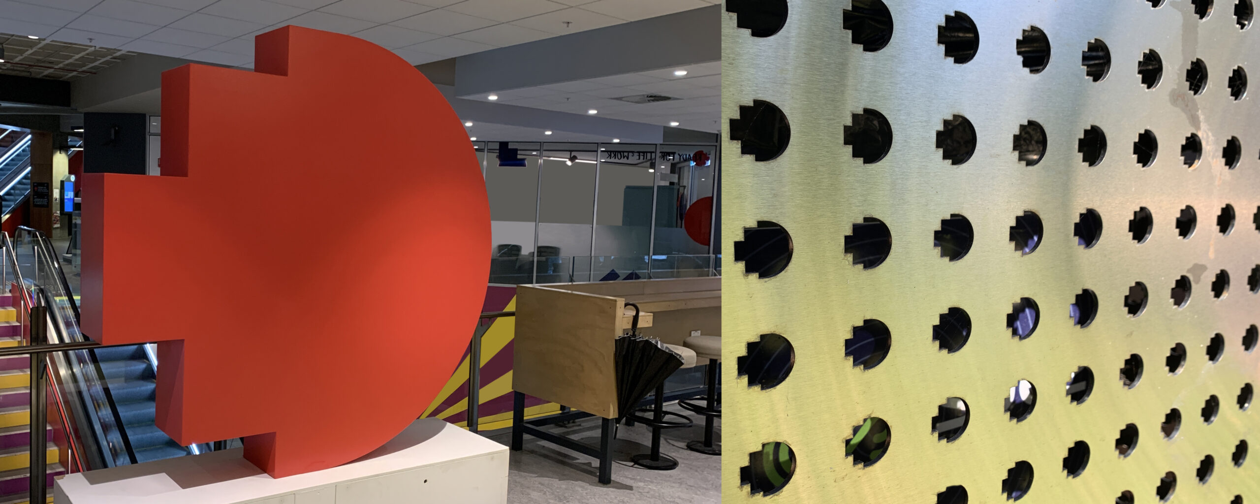
The ‘exploded pixel’ has been used across its many communication channels. Design: RMIT Branding
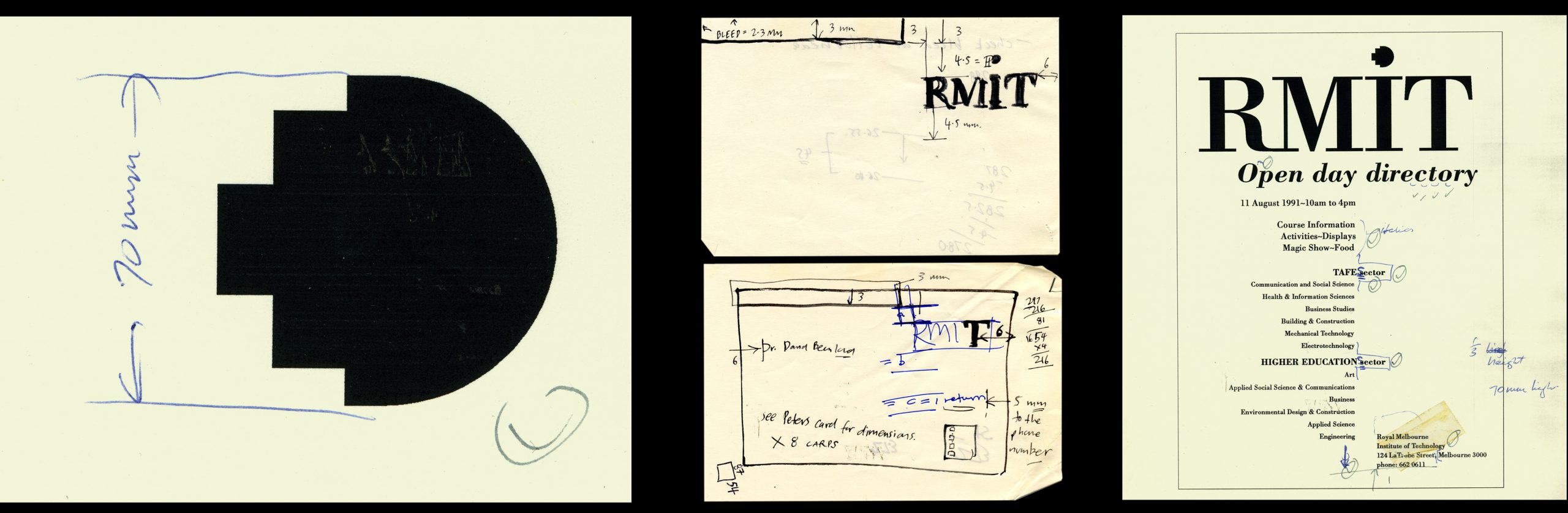
Original drawings of the RMIT University pixel device (1991)


The RMIT identity lighting up the façade of building 100 of the city campus.
Original RMIT pixel dot film (2011)
For nerds | The rmit identity was produced on an Apple Macintosh SE30 with 4 megs of RAM, 40 meg hard disc and a nine inch mono screen — like ‘sculpting a bus through a porthole‘.