Emerging from DTP:
Australian Typography 1995–2005
writer Stephen Banham published Australian Creative (2005)
On the tenth anniversary of Australian Creative, it seems an opportune moment to recall a statement about the state of Australian typography written a decade ago — ‘Whenever I read text set in Gill Sans, I can’t help but hear the voice of an English narrator reading along with me. Australian designers have a lot to say — we just don’t have a font to say it in’. I am the first to admit that these words (my own, from Ampersand 1) — now sounds like naivity tinged with a misplaced idealism. But the statement does however highlight the progress Australian typography has made in the past decade — the increased confidence and faith in that what we have to offer is not just ‘on-par with international practice’ but offers something unique.
There has of course been a great deal of typographic activity indeed over the past decade. We’ve shrugged off the dreaded menace of desktop publishing that once the struck fear of redundancy into the hearts of typographers. We’ve moved beyond the age of superficial deconstruction of form and language when the likes of David Carson and Carlos Segura (T26) were catapulted into dazzling stardom. The armies of hybridized ‘franken-fonts’ have faded away as people began to rediscover that typography is in fact more about reading than just looking.
Within current type design this maturity has brought with it a greater emphasis on text faces — so why is this the case? Like any product, type design responds to the changing environment of the marketplace. For type designers, that marketplace is generally graphic designers. As more and more design studios position themselves as branding agencies whose responsibilities are spreading to entire strategies over many medias and environments, their typographic choices are increasingly those able to cover a vast array of application. Hence the growth of hugely extended families that are able to respond to these needs — thus the extraordinary success of faces such as Erik Spiekermann’s Meta and Lucas De Groot’s Thesis. But of these these ‘typographic workhorses’ will always be balanced (and complemented) by ‘showpony’ display faces.
Typography’s ever-present companion, technology, has also had its fair share of influence along the way. Developments such as Opentype formats have introduced the opportunities for vastly expanded glyph sets and the all important cross-platform opportunities while improvements in font design software such as Fontlab have enabled leaps in both ease of use and complexity of output.
Perhaps one of the greatest virtues of typography is the seemingly infinite diversity of approaches on a single theme (the alphabet). The fact that typographic practice flourishes within these parameters is testimony to its energy and the Australian contribution to this is also showing very healthy signs indeed.
Apart from the ever-present font piracy that robs type designers of their livelihood, another (albeit longer-term) issue affecting the health of typographic skill may be found within design education. As the practice of typography, particularly type design, requires a significant investment of development and research, it finds itself somewhat at odds with the increasingly ‘express line’ mindset of much contemporary design education. This has tended to push type design into the post-graduate sphere — an undertaking unfortunately restricted to the few prepared to pay for this opportunity.
Despite this, there are always individuals who are prepared to take the ‘path of most resistance’ and explore new forms of typographic language. Any article on the current state of Australian typography can of course only be viewed as a snapshot of that time and place. This list of type samples is indicative rather than not exhaustive for two reasons; firstly, it was decided that the typefaces featured in this article should be available for purchase and secondly, due to the solitary and quiet nature of type designers, one can never be aware of every typeface being produced at any given time.
Of course there are many current typographic ‘works in progress’ — some being produced in academia and some in industry — but this may be best covered in another article altogether.
Throughout the following type samples, I have given the type designer the opportunity to describe their typeface/s in their own words — this both highlights the range of approaches and philosophies as well as simply paying due respect to those who have put in so many hours of work.
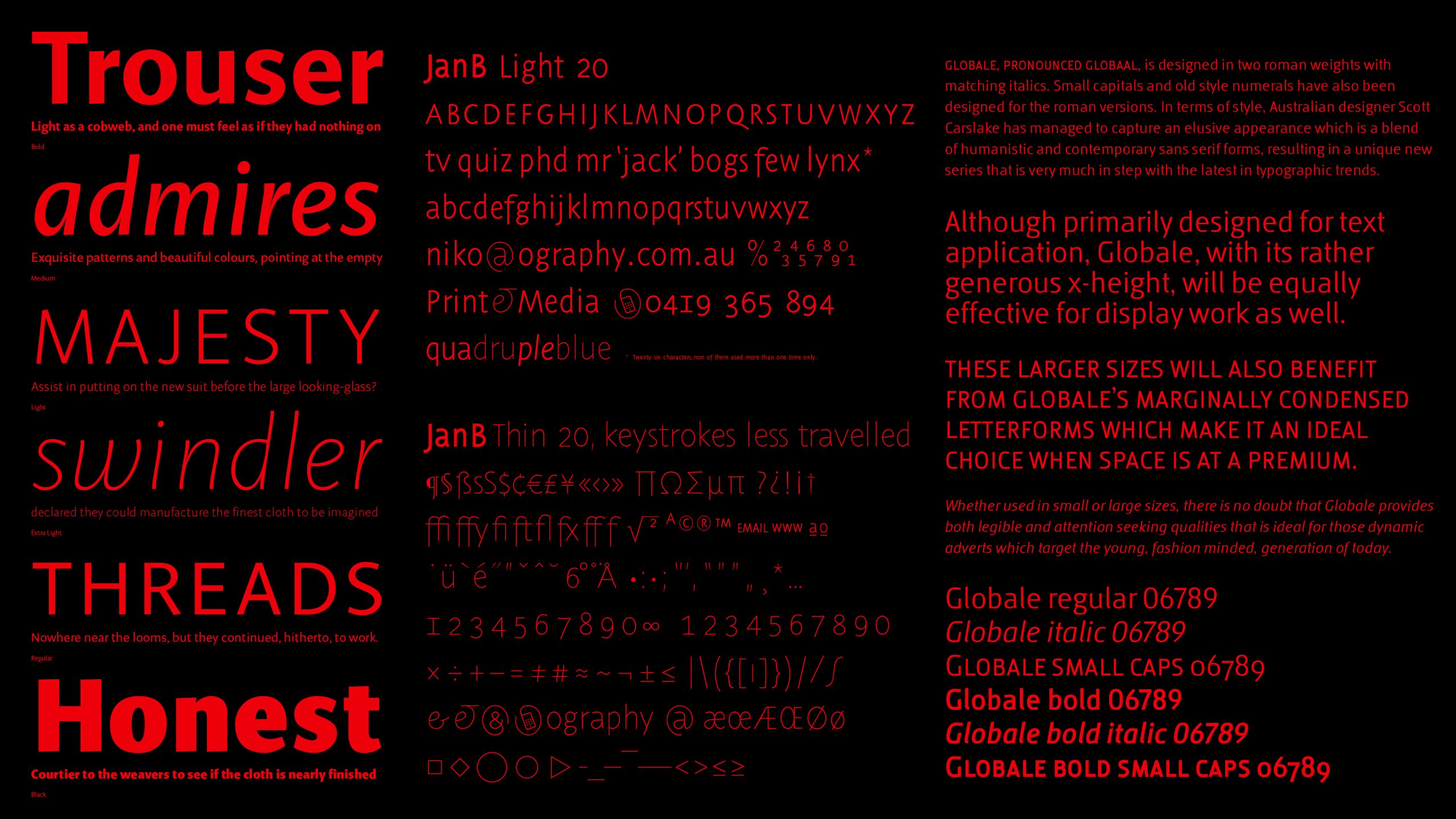
JanB (2005) Niko Spelbrink, Ography
Why another typeface? Just as trees adapt to life under changing circumstances so should type! And times are changing, especially where written language is concerned. The fountain pen has been discarded in favour of the keyboard. Writing now more and more means applying prefabricated type. The default typefaces we all use are testimony to us using shortcuts to shape language. Australian trees, and Mountain Ash forests in particular, provided me with inspiration for the lines and curves needed to make a font that can compete head-on with these few default fonts. Trees are significant features of our natural environment. Fonts similarly are features of our cultural landscape.
JanB, the font I developed, is suitable for both print and screen. Special attention is given to representation of text on a low resolution screen. JanB can be used to create beautiful and very readable small print, tables, text, headlines and on posters. It is an economical font, very legible and performing well in small point sizes. It is also a well-proportioned display font. JanB will be available in Thin, Light, Regular, Medium and Bold. A true Italic version, small capitals and a full set of expert glyphs accommodating a wide range of scientific usage are standard in this font.
Voca (2004) Monib Mahdavi, Mahdavi Design
A Modern sans serif with a slight grotesk touch to it, Voca was developed for corporate branding and as an alternative to things like Akzidenz, Helvetica, Univers etc.
Globale (2004) Scott Carslake, Voice
Globale was designed purely out of an interest and curiosity in letterforms. Its design began from looking at fonts that I liked, and specific letterforms that just felt right. In my own mind, I could see a beautiful lowercase a, but it did not exist in any font that I knew. I soon reached a point where I began creating my own letters; they were very crude, and out of proportion — I soon learnt that this was no easy skill. Therefore, it became a personal challenge to create a complete san-serif alphabet that functioned at small sizes, was aesthetically pleasing and read very well. I guess I also never saw myself designing a typeface in the future — who does? So it was a very rewarding exercise that had a deliberate purpose in the end. I was certainly inspired by many typefaces and typeface designers, but ultimately I was inspired by actual letterforms. When you deconstruct them and see how different letterforms have been constructed so they look right visually, well, it’s amazing! I once read a quote in a paper promotion that went something like this ‘Typography is like an aloof kind of lover, the closer you get, the more beautiful it becomes.’
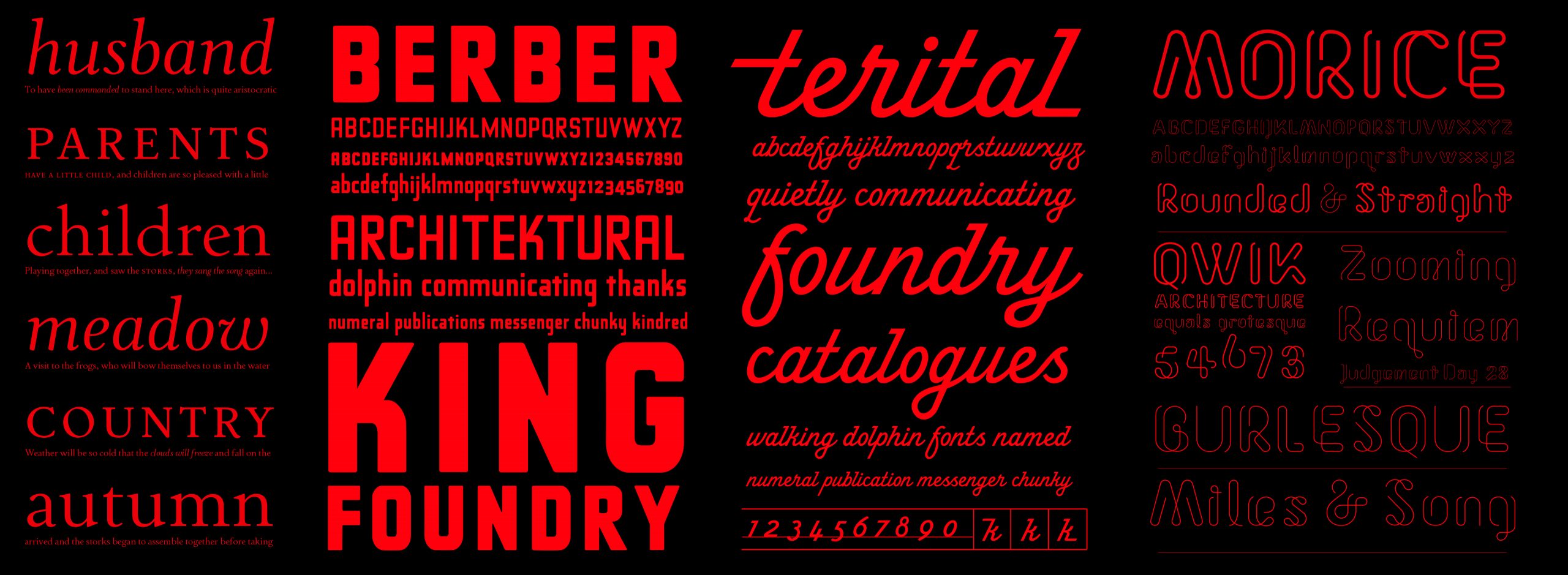
Terital (2003) Stephen Banham & Wendy Ellerton
Our long and frustrating search for a dynamic, monoline script typeface drew to our attention the lack of such a typeface. Hence, this prompted us to create our own Terital (so named after a 1960s Italian overcoat advertisement which was the starting point of the typeface). The formulation of incoming and outgoings (crediting the influence of Rian Hughe’s Cottingley) allowed for the intelligent solution of the linkage variants in the font — the most challenging aspect of designing scripts and possibly why there are so few. I have always considered one of the ugliest typographic acts is the setting of script in all caps in Terital we alleviate this problem by making the typeface lowercase only (with the exception of the upper case ‘i’ letterform).
Morice (2005) Morice Kastoun
Deceptively simple in its lineal structure, Morice expresses the essence of each letterform with a quiet elegance. There are several variations within the Morice family — rounded terminals or straight terminals and two weights of each of these — Regular and Thin. Originally designed by Morice Kastoun and digitised and developed by Letterbox, this typeface has been a collaborative project over the past year.
Ferrara (2003) Wendy Ellerton
A comprehensive typeface family which synthesizes past and present traditions in order to reveal the elegance of the Latin letterform. Ferrara is a reaction to my observations of the world, both aesthetically and conceptually. The type family visually responds and reacts to typography from the 15th Century to the present day.
Imogen (2005) Wendy Ellerton
The first and most important design concern for me is that the letterforms should be balanced, so that when set in text a natural flow and rhythm is accomplished. The second challenge is that the typeface should perform for me as a multi-purpose typeface family. Hence, the design needs to be concerned with a number of aspects, which are discussed further – “Generally, people use serif typefaces for the setting of lengthy texts, as the serifs encourage the reader’s eye to enter a state of energetic repose. Although Imogen is a sans serif typeface, it should be suitable for setting lengthy texts. Hence, the tone portrayed through the character shapes should not feel monotonous when read and the letter shapes should encourage the reader to do exactly that, read. As this is a requirement, I believe the design should emphasize the horizontal flow of words on a line, rather than accentuating the vertical nature of sans serif typefaces. The family should offer designers a wide range of styles and weights, so the largest and smallest projects can be handled. Through optimizing the typeface for display versions in the future, the typeface will also work in large point sizes, for example the setting headlines and signs. And lastly, on an aesthetic level, my typeface should look human and not as though it were constructed systematically by a machine. My main aim is to design something which looks completely natural”.