Ingredient and Method:
A Survey of Geoffrey Fawcett 1926–2003
writer Stephen Banham published The RMIT Design Archives Journal Vol 6 Nº 2 (2017)
It is no secret that ‘mark-making’ crafts such as letterpress printing, risograph printing, ticket writing and sign-writing have all experienced a ‘twilight renaissance’ in recent years. Perhaps the most popular of these is hand lettering. Both the online and offline graphic design worlds are awash with hand-drawn scripts, ranging from the masterfully flourished to the plain unconvincing.
The interest in, and revival of, hand-lettering skills is part of a wider want for a reconnection of the graphic designer to many of the manual skill sets thought lost to an earlier era. This want for reconnection has facilitated an important generational handover and a redefinition of skills from previous generations to current ones. Locally this has seen many hand lettering short courses such as those offered by Old School, New School and Maria Montes emerge to meet a demand for skills no longer broadly taught in conventional university design school curriculums.
This revival is perhaps most explicitly borne out by observing current industry demand. In a global survey of the most popular typefaces of 2015 by MyFonts, one of the two largest international font vendors, more than half (60%) of the most popular typefaces were based on hand-lettered forms, indicating that the commercial demand by designers and advertising agencies for typefaces emulating hand-drawn scripts (albeit in digital form) is strong.1
This rise in interest in the hand-lettered form is not isolated to the world of typography but rather is indicative of a wider cultural fascination with the notion of ‘authenticity’. The contemporary reading of ‘authenticity’ is less concerned with the end product than with the process of production itself, working as a counterpoint, supplementing the universal with the unique. As David Boyle forecast in 2003, ‘It is beginning to be clear that the dominant cultural force of the century ahead won’t just be global and virtual, but a powerful interweaving of opposites – globalisation and localisation, virtual and real’.2
In typographic terms, this demands a more engaged, physical experience, re-igniting the inherent connection between mind and hand, and by inference offers an alternative to the exclusive use of the computer as the method of production. It is argued that digital technology ‘edits out all the imperfections, the unfiltered emotions, the unpredictabilities and the vagaries of the human touch’.3 The ‘truth’ offered through homogenous consumer aesthetics is rapidly becoming less believable. The stranglehold of the computer program in flattening out the texture of imagery and its physical, material presence creates something quite different in experience from the image created by materials manipulated by hand. From childhood onwards, everyone has the ability to connect to the inventiveness, danger and downright fun of directly applied experimentation: what happens when you mix this with that? How will this paint react with that material? With computers, much of the magic has all been worked out by programmers a long time ago.4
The typographic form most identified with the culture of hand lettering, script, has been particularly noted as experiencing a dramatic revival. Type scholar Paul Shaw recently noted that ‘Scripts, once the orphans of the type world, relegated to the back pages of type specimen books and ignored in typography manuals, now rival sans serifs as the fastest growing group of fonts, selling strongly to both amateurs and professional designers’.5
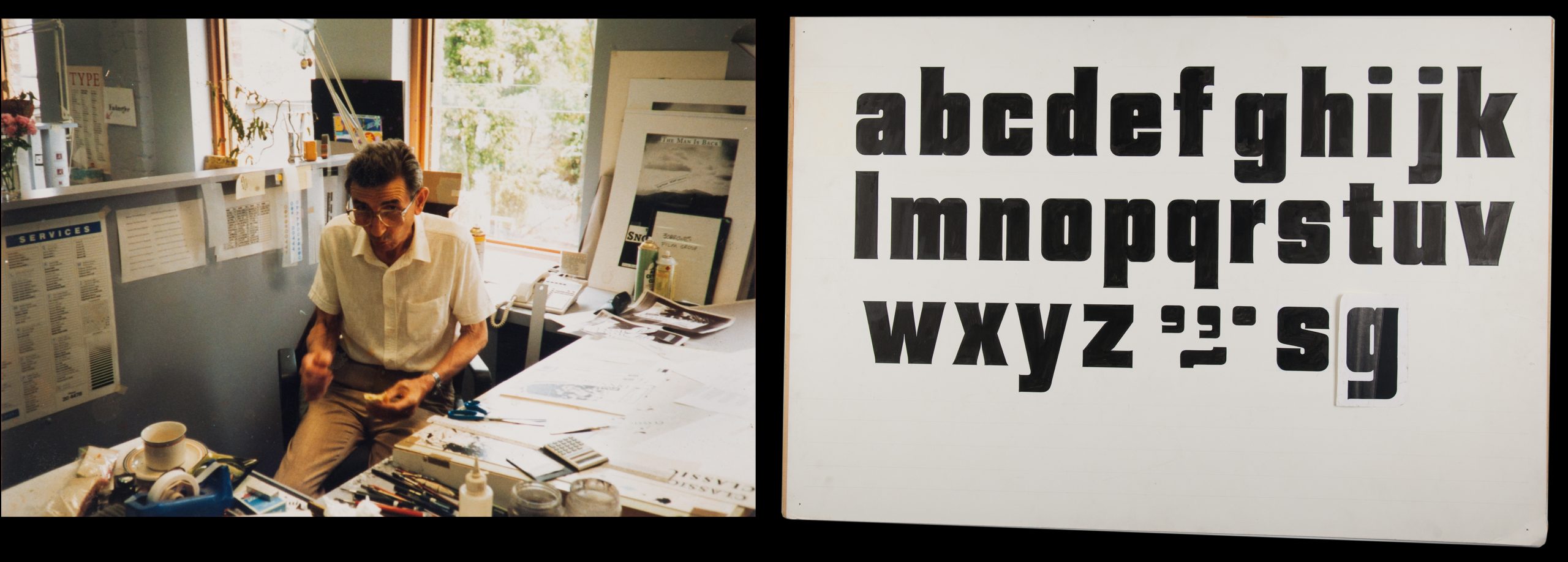
left: Godfrey (Geoffrey) Fawcett at the offices of David Lancashire Design, c. 1980s. right and top: Untitled Bold Sans Lettering, Godfrey (Geoffrey) Fawcett c. 1990s
Furthermore, a concurrent interest in ornament within graphic design culture has aided the acceptance and proliferation of the most popular of scripts – the embellished or ornamented script. The current fascination with ornament and decoration can be seen not only as a reaction against, but also as an addition to, the work and thinking of the turn-of-the-century, systems-obsessed designers. The modernist philosophy that has dominated twentieth-century design empties ornament of meaning and separates it from function, thus rendering it superfluous in the eyes of the canon. Knowing this, the feting of ornament and the production of exuberantly excessive, dense and sometimes exaggeratedly useless work, can be seen as a provocative thumbing of the nose to the approach to design advocated by many schools and professional organisations in which ‘problems’ are ‘solved’ by following a sequence of codified steps.6 Within the typographic world, the most noted and influential of these ‘embellished typographers’ is the Canadian designer, Marian Bantjes. Her work embraces the notion of ‘long hours of intense labour, where all sense of time and reality disappear’.7 She refers to this in her 2010 monograph I Wonder: ‘It seems that over the last two centuries, the time invested in the creation of documents has slowly decreased, from the decline of highly elaborate penmanship, to the rise of templated engraving dies, to haphazardly laser printouts’.8 This sense of a physical commitment to something that feels very ‘authentic’ offers a great deal of appeal to a younger generation of designers for whom design has been a primarily digital experience.
So it was timely that the RMIT Design Archives should acquire some of the work of hand lettering artist Godfrey (Geoffrey) Fawcett, as part of its larger collection of the work of prominent graphic designer David Lancashire. David’s artful approach to design, often incorporating illustration, called for a comparably human touch to the typographic voice of the corporate identity and packaging projects that David Lancashire Design (DLD) undertook. It was Fawcett who fulfilled this role, working alongside Lancashire for many decades as a freelance lettering artist.
DLD had been established in 1976, after Lancashire left his position as art director at advertising agency Ogilvy and Mather. The practice soon acquired a reputation for well-crafted and artful design work, a counterpoint to the emergence of a more stark modernist influence that was then gaining momentum in the Australian graphic design industry. As the renowned designer Les Mason commented in 1983, ‘Things began to change around with the influences of the Swiss school of typography in the early sixties’.9 Whilst many studios were pursuing the European notion of ‘total design’,10 whereby identity systems were conceptualised and applied using rationalist frameworks of uniformity and reductive simplicity, Lancashire took a softer approach, using custom lettering and a great deal of illustration.
Lancashire recalls the humble conditions of DLD during the early years: ‘ We would work in the back shed at my home in Ashburton. It had an artiscope (a bromide camera) and we would simply hose down the equipment in the garden’.11
Fawcett worked as a freelancer, being paid per job, gradually working more regularly on jobs for Lancashire until he was working on DLD projects on a full-time basis. For Lancashire, having an in-house letterer opened up rich possibilities of customised typography in design projects, particularly packaging. ‘Lettering artists are available to produce their interpretations of type forms, tailored to suit individual advertisements, as well as produce other lettering styles not available…’12
The son of a lithographer, Fawcett was born in England in 1928. Although it is uncertain whether his father’s profession influenced his orientation towards the graphic arts, it was common for sons to follow their fathers in their professions. After working in several agencies in the United Kingdom, Fawcett made the move to Melbourne. He settled in the south-eastern suburb of Langwarrin, making the long journey to the DLD studio in Newry Street, Richmond, every day.
Working alongside Lancashire at DLD, the working process was simple: Lancashire would sketch the idea and Fawcett would meticulously draw it up. Prior to the introduction of Letraset and the widespread use of photo-typesetting, this close relationship between art director and an in-house lettering artist was a common one – most famously personified by the studio relationship between New York art director Herb Lubalin and his lettering artist Tom Carnese. Lubalin was renowned for his ‘napkin sketches’ of designs, which were then handed onto Carnese for masterly typographic execution. The unequal power dynamic led to an unbalanced legacy – history records the work of Lubalin far more prominently than that of his letterer.13
Despite commercial art being a poorly paid profession, Fawcett’s pride in the trade was expressed in no uncertain terms. Lancashire recalls introducing Fawcett to a colleague as a ‘finished artist’, to which Fawcett forcefully replied: ‘I am not a finished artist, I am a lettering artist!’.14
Fawcett’s contribution to the practice was substantial. In a dld promotional book, produced in 1988, the presence of Fawcett’s lettering is evident across the three booklets housed within its firm cardboard casing, each profiling the three parts of the design work: Print Promotion, Corporate Identity and Packaging.
Various Brand Lettering, Godfrey (Geoffrey) Fawcett c. 1980s
The ‘pragmatics of production’ permeate Fawcett’s work. To the modern eye, expecting a complete and persuasive design rendered speedily and slickly, the ‘incomplete’ nature of many artefacts within the Fawcett collection are oddly compelling because they reveal ‘fragments’ of artwork, ingredients that make up an unseen, eventually completed artwork. Fawcett would photocopy or bromide parts of the letters and make an assemblage replicating typographic curves and features to save time. Lancashire notes: ‘You don’t see anything behind a lot of current artwork. It’s all there. Now everything looks finished straight away – and it’s not. There’s no gap between the thought process and the ‘touchy-feely’. Process is the journey. Otherwise it’s just a superficial picture’.15
There is a practical economy of labour in seeing a word that has not been drawn in order but in its ‘typographic parts’. Its primary role as ‘production artwork’ is not to immediately seduce the viewer through a completed beauty but to be the foundation of its print reproduction. And with it came a strong sense of actual size, scale and planning, since resizing and endless revisions are less easily accommodated when done by reproduction camera or by hand. As Lancashire plainly states, ‘It was called commercial art, and that’s exactly what it was’.16
A knowledge of the production processes following the design stage was central to any letterer and Fawcett was no different. Lancashire would discuss the design and typography with Fawcett, who would then ‘make it fit’, even if it meant bending it around all matter of shapes, as was the case with a great number of logos and packaging designs during this period. This print knowledge meant that he could cleverly minimise the work involved – such as drawing lines across Letratone (adhesive halftone screens) to achieve the desired tonal qualities.
Lancashire describes the process that Fawcett used: ‘All his work was carried out by hand and with bromides, then stuck down onto smooth finished artboard with cow gum. Brush ruling was used for his hand lettering. He also mesmerised students and new designers in the studio with his method of sharpening a stick, dipping it in ink and ruling with it on tracing paper – he said it gave him a better line than with ruling pens’.17
As the impact of the Apple Mac began to spread across the field of graphic design, Fawcett could see that the age of the in-house lettering artist was passing. He was an ‘Indian Ink and China White man’, so, as Lancashire recalls ‘He was glad to get out of the game’.18 Fawcett died in 2003, only a few years after he ‘retired’ from working at DLD.
So, what does the Fawcett archive offer the contemporary viewer, seeing it many decades after its execution? For one, the collection highlights the difference in definition of what it is to be a hand-letterer – and, more specifically, the considerable difference between the role of the ‘jobbing’ or ‘trade’ letterer and that of the contemporary ‘hand letterer’. The former presented itself as a being more ‘matter-of-fact’ about the business of generating artwork for print production, indeed aligning itself to the print industry. The latter, being a revival of the former, is afforded a more professional complexion – with the visual language of hand lettering now being considered in the marketplace as more ‘boutique’ in personality. Hand lettering is now seen as an artfully expressive alternative to the norm (computer-generated typography) – a counterpoint to an earlier era when hand-lettered solutions were the norm, before there was a widespread alternative. As a result of this more priviledged position, the contemporary letterer is more prone to self-conscious embellishments of a message, invoking a sense of spectacle and novelty.
Fawcett’s work also highlights a more pertinent divide between twentieth and twenty-first century notions of hand-lettering – that of content. Whereas the ‘commercial artist’ made no claim to be the author or have any influence over the content to be drawn, the contemporary letterer is more likely to view their work in an artistic, authored and ‘bespoke’ sense – reinforcing the cultural and economic transformation of hand lettering from trade to boutique.
Many hand letterers now expect an element of authorship (and stylistic ownership) over their work. The parallel revival of tattoo culture, with its similar bespoke culture, has helped hand lettering enter a wider, popular (pop) cultural sphere, rather than being the sole concern of commerce and marketing.
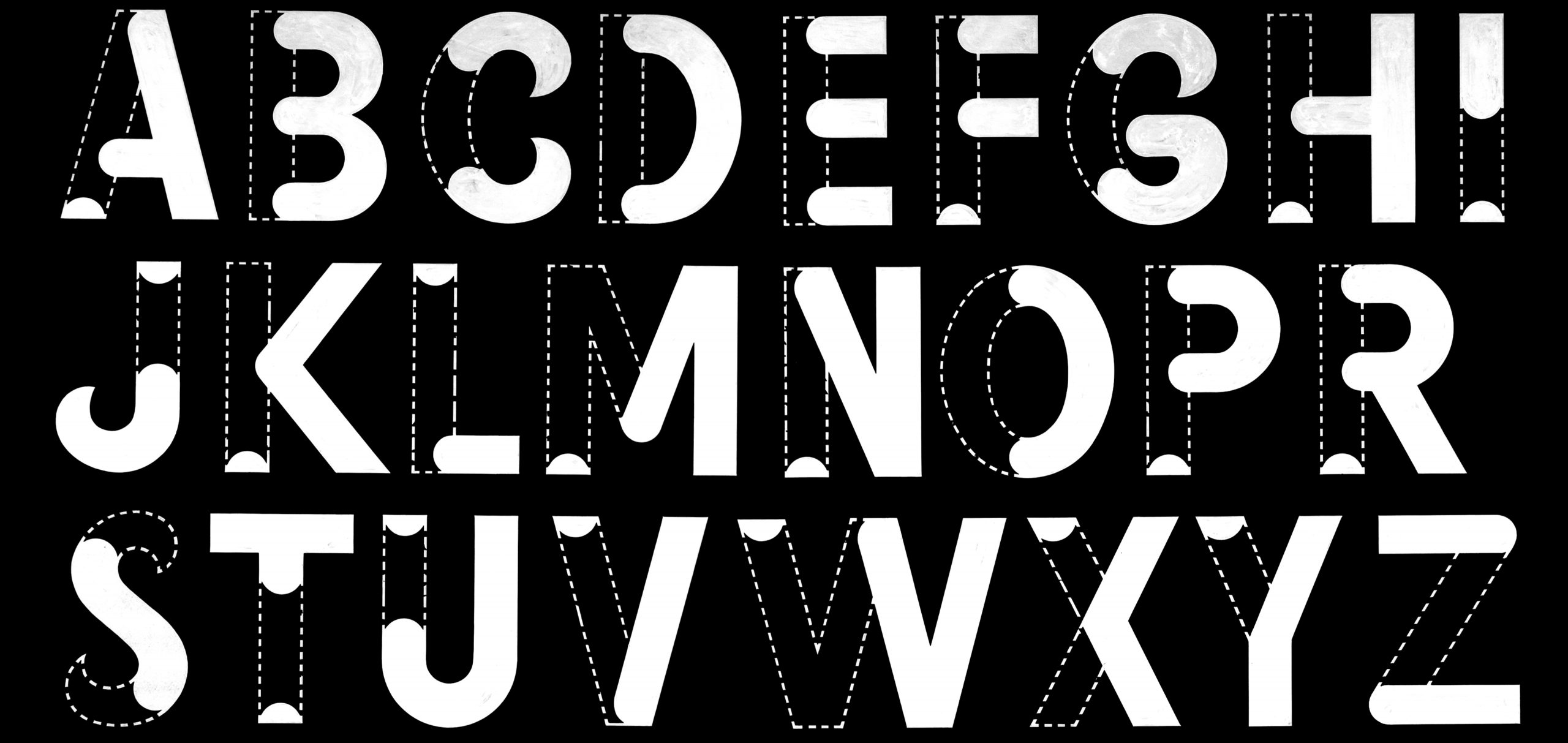
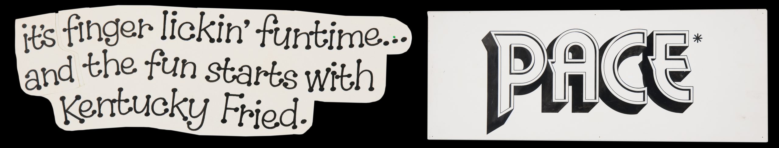
There are specific works within the collection that not only display the breadth of Fawcett’s deftness but also the very wide ‘jobbing’ scope letterers had to respond to during the era of commercial art. On a single board , itself a bromided composite of lettering artwork, is displayed a crowded array of advertising and promotional statements in just about every superlative lettering treatment available: formal scripting, informal scripting, outlining, inlining, line-filling, swash-capping, drop-shadowing, reversing and contouring, amongst others. Words are given an almost onomatopoeic treatment –‘Wow!’ is rendered as blaring globes while ‘Gas the good flame for spring’ is emblazened with a half-line fill, an inline and drop-shadowing around a semicircle. The equivalent of an entire digital letterer’s portfolio presented en masse, the piece serves as an impressive testimony to Fawcett’s scope as a hand letterer. In this display, the words themselves seem to recede into the background, present only to express the commercial or ‘real life’ application of his technical prowess.
Fawcett’s typeface designs — or ‘interpretations’, in many cases, such as the Helvetica titling character set — typify the role of the letterer from this era, namely as a provider of ingredients to enable others to complete their design projects. Fawcett’s typefaces exhibit simple character sets, almost always without glyphs such as punctuation and diacritics now considered standard in digital fonts. Some feature what appear to be additional alternate letterforms, ‘s’ or ‘g’ for example. It is however difficult to tell whether these were intended as alternates (in the contemporary digital sense) or if they were in fact redrawn corrections of the original glyphs.
A piece that highlights this notion of ‘ingredient’ is a numeral set, presumably drawn for retail display. This features the price ‘70 cents’ on the top line and on the second line the rest of the numerals in that style to be used when the price changes. Charmingly, these are not presented in numerical order but rather in the order of their structural similarity (the ‘3’ being similar in structure to the ‘5’, the ‘9’ with the ‘8’ etc.), making the process of its creation and development evident as a ‘typographic toolkit’ for the designer, in this case, David Lancashire.
Like many of the earlier lettering artists of the commercial art era, much of the graphic power of Fawcett’s work lies in the jarring juxtaposition between the complete banality of the words themselves – ‘Sale!’, ‘Discount’, etc. –and the exquisite typographic beauty and technical craftsmanship of its execution. This is the language of an earlier period of advertising – more blunt, more direct, no hint of irony or post-modern self-awareness. But it is this very blandness of message that amplifies its transformation from inane message to masterful typographic elegance. The creation of each piece, a pastiche of parts to be compiled at a later stage of production, is unique in its ‘matter-of-factness’ and humility. The spirit of the work speaks loudly – ‘There’s a job to do and it just does it’.
From an archival perspective, work such as that of Fawcett’s, made up of its various parts and ingredients, offers the viewer a ‘direct line’ to the maker – it is all about process, the sketched development, the various iterations and production components. In 2011, Lancashire assembled a modest exhibition of Fawcett’s original hand lettering artwork, entitled Black and White, at Lamington Drive in Collingwood, Melbourne. Although humble in scale and presentation (a small gallery space featuring original works pinned directly to the wall), the exhibition offered the viewer a very unique design experience – an insight into the ingredients of the design process of the hand letterer, not their final, finished outcomes.
Most telling of Lancashire’s ‘love of process’ was the central image cleverly used to promote the show – the inking boards that Fawcett used on his work desk to test his brushes. These featured a landscape of thousands of test brush swipes and pen scribbles. The result transforms what is essentially a utilitarian object (an element of production, the board) into something that is considered far more precious by contemporary eyes – an artefact that could only come from a pre-digital era.
The Black and White exhibition not only made people aware of Fawcett’s work but also introduced many graphic designers to their profession’s proud yet often forgotten predecessor – commercial art. At a time when the profession of graphic design is often described as being in transition, the collection of Fawcett’s hand lettering offers a resource for future generations of designers to research and explore the possibilities of the hand-drawn typographic form even more deeply.
1. www.myfonts.com/newsletters/sp/201601.html
2. Grant Curruthers, Handmade graphics refuse to go quietly, Eye. Journal of Graphic Design 58 (2005): 77.
3. David Boyle, Authenticity: Brands, Fakes, Spin and the Lust for Real Life (London: Flamingo, 2003), 4.
4. Boyle, Authenticity, 4
5. Paul Shaw and Abby Goldstein, ‘The Line of Beauty ’, Eye. Journal of Graphic Design 83 (2012):54.
6. Alice Tremlow, ‘The Decrimimalisation of Ornament’, Eye. Journal of Graphic Design 58 (2005): 19.
7. Tremlow, ‘The Decrimimalisation of Ornament’, 19.
8. Marian Bantjes, I Wonder (London: Thames and Hudson, 2010), 80.
9. Geoffrey Caban, A Fine Line. A history of Australian commercial art (Sydney: Hale & Ironmonger 1983).
10. The introduction of ‘total design’ is widely credited to the Dutch emigré designer Pieter Huvaneers.
11. Interview with David Lancashire, 13 August 2015 at the RMIT Design Archives.
12. Mortimer Leach, Letter Design in the Graphic Arts (New York: Reinhold Publishing 1960).
13. Adrian Shaughnessy, Lubalin (London: Unit Editions 2013), 31.
14. Interview with David Lancashire, 13 August 2015 at the RMIT Design Archives.
15. Interview with David Lancashire, 13 August 2015 at the RMIT Design Archives.
16. Interview with David Lancashire, 13 August 2015 at the RMIT Design Archives.
17. lamingtondrive.com/shows/black-and-white
18. Interview with David Lancashire, 13 August 2015 at the RMIT Design Archives.