
Local and/or General:
Australian Typography 1986–2016
writer Stephen Banham published 30th Anniversary Issue of Desktop Magazine in 2016.
Hmm, 30 years in Australian Typography in just 1000 words. A quick estimate makes that to be around 33 words per year. Although I wanted this to be more than just a timeline, I can also appreciate that those who weren’t around for the ride will want to know about what happened, who did it and what this added to the exciting typographic culture we now have in Australia.
So if we journey back to 1986, we will have just seen the first utterances of the personal computer (aka apple macintosh) being discussed at design events (these were a rarer occurance given that it was still two years before the birth of AGDA in 1988). It was however a very active time for the Australian Type Directors Club which was to run for a few more years before disbanding.
The selection of phototypesetting typefaces available at the time was ridiculously limited by contemporary standards. Typesetting trade houses such as Markbys, Typo and the Composing Room all supplied the commercial demands for Souvenir, Helvetica and Palatino very well. This limited typeface range fed generations of lettering artists, notably the work of Geoffrey Fawcett and Keith Morris. Others are well due for the recognition they deserve, such as the highly expressive titling of Philip Brophy for the post-punk music scene.
Skating over the three decades one is struck by the highlights of the period – amongst them is the design of the bespoke Parliament typeface (Emery Vincent Design) for the opening of the new Canberra Parliament Building in 1988. This was not only significant for the elegant design but also for the fact that it marked one of the first high profile commissions of new type design.
With the wider use of software packages such as Fontographer (Altsys, 1986), digital type design entered an early (and sometimes awkward) period of experimentation and discovery. The early 1990s saw the first attempts of creating an Australian digital type design culture.
These included Russell Bean’s foundry Type Associates (1993) (whose font names referred to Australian themes) and my own Letterbox (1991) which not only designed digital typefaces but began publishing Qwerty, a print series examining Australian themes in typographic expression.
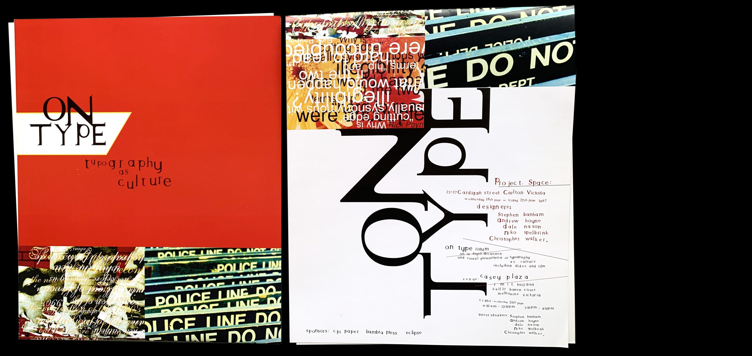
1996 saw Prototype Type Design release a printed type sampler Don’t believe the hype. A standout of this sampler was the typeface EK, designed from and referencing the EK Holden. During this same year, Andrew Hoyne was cutting his teeth with some custom typography, even organising the exhibition and forum On Type a year later in 1997.
If one was looking to signpost this 1990s era as an ‘ism’ (and why not), this period could be described as vernacularism (an interest in our own local visual language).
An important part of looking back is also to look forward. And it is in typographic education that we have seen many significant leaps. Playfully calling himself ‘Dr. Type’, Anthony Cahalan was the first Australian with a PhD on a typographic subject in the late 1990s and since then the opportunities for Australians to learn typography has developed significantly. Many, including Dave Foster, Wendy Ellerton, Dan Milne and Troy Leinster, have sought to learn their craft overseas (mainly in Holland) whilst others such as Vincent Chan are contributing to the teaching of typography within Australia. The very committed Australian chapter of the ISTD (International Society of Typographic Designers) has been promoting and encouraging the craft of typography for nearly a decade through their rigorous assessment programs.
The past decade has seen a local reflection of the larger international fascination with hand-lettering. Often described as the Hipster Script Movement (or is this another ism?), this period represents a predictable and ironic cultural search for authenticity, blurring the previously clear demarcation between lettering and typography. This era has not only spawned the notable profiles of Gemma O’Brien and Luke Lucas but also the well-timed and well-intentioned Old School, New School (OSNS).
Judging by how popular it is now, it’s a good time to be involved in Australian typography. The technological advancements such as the development of Open Type formats has allowed local type designers to explore expansive glyphs sets for non-latin languages such Chinese and Arabic. But the smaller, incremental changes appear trivial when seen in the shadow of the most fundamental shift during these 30 years. So significant is this change that it ‘cleaves’ the three decades apart, making any comparison between the pre-and-post internet lives of the typographer unfair – or to put it another way, it would be like comparing Souvenir with Gotham, two different expressions from two different times.
For Australian type designers the web presents a two-edged sword. Sure, it allows opportunities for foundries to easily sell and distribute their wares internationally, but it also enables the user to subscribe to fonts (rather than outright sale) offers the wisest and most effective way for us to avoid the ever-present issue of font piracy. For local type designers it has meant that their fonts are being increasingly funnelled through the larger global font vendors such as Fontshop and MyFonts. The not-so-good side of the web is that opens up a tightly competitive international marketplace as well as spreading advancing software that is getting closer (and better) at automating bespoke type design altogether.
Looking at the experience of the graphic designer through a typographic prism, another major thing that has shifted over 30 years (apart from the internet) is the expectations around the design process. In 1986 a designer working on a press ad may have been able to allocate at least a few hours to carefully craft the typography, finely adjusting spacing and letterforms by hand until it was just right. Three decades later, the time spent crafting typography or even customising typefaces is virtually non-present, the design and production ‘stages’ so intermixed as to be invisible.
But just how specifically ‘Australian’ has the last 30 years of type been? There is no easy answer to this. Like the necessary ‘coming of age’ question every Australian design student asks – is there a quintessential Australian design style – this question is more important in the journey it demands than from any neat, conclusive resolution. Nevertheless, looking across the 30 years we do seem to have lost some of the ‘niavity’ that came from a sense of knowing that ‘nobody was watching’. If there has been a any cost to the rising professionalism and sophistication of Australian typography (and graphic design), it has been the loss of this innocence. And like virginity, it will never return. So we had better run with it for another 30 years.