Stereotype
Writer Mia Timpano Published T Magazine in October 2007.
Helvetica. The font that says,“You’re safe, the plane will land and we have your money.” The font that swept away the gathering shit in the global landscape in 1957 and continues to scrub out local character and humanity. Mia Timpano faces anti-Helvetica cult leader Stephen Banham.
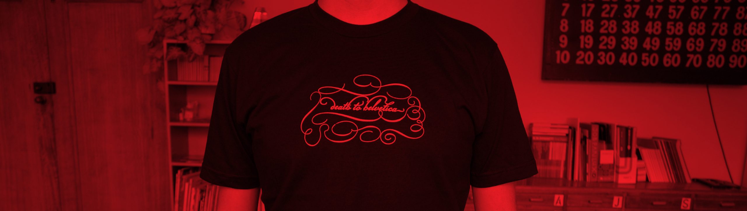
I had my dreams. And in my dreams Stephen Banham was a deranged, whirling, toothless and frothing mental. He isn’t, sadly; he’s the perfectly manicured typographer. But I’d heard stories, or more specifically one story, in which Stephen, locked in some kind of demented fury, had run through Parliament station, wildly destroying all signage set in Helvetica. In the story Stephen is dragged away and finally arrested. When I meet him, he assures me the story is just that – a story – but it is a fitting urban legend to surround the man who for so long has led the Melbourne chapter of the anti-Helvetica movement. As a key part of Stephen’s ongoing campaign, he released the now-cult Death to Helvetica T-shirts. And I ask:
Is the campaign still a significant part of your world?
It’s been a while. Well, I started it in 1999, for a particular reason.
Which was?
Because there was a huge spate of Helvetica. It began to flatten the visual environment of graphic design. Then it began to fade away, which was good. But then of course this year, with the celebrations of Helvetica’s 50th birthday and the film Helvetica coming out, it’s created a huge resurgence.
The ‘Death to Helvetica’ shirt logo is a gentle baroqueexplosion. Why?
I wanted to create an absolute opposition between the content and the form. In Paris I’d found this typeface which hadn’t ever been released, called Champion. It was just this insane script typeface with extraordinary ligatures and embellishments, and I thought, “That is the quintessential opposite to the clinical Swiss-ness of Helvetica.”
And you captured the attention of the world. Why?
I think because it is more than just an argument about the typeface; it’s actually a political stance against the generic.
So why not also object to typefaces like Times New Roman, which is equally widespread? Or Comic Sans, which is truly objectionable?
Because Helvetica, as opposed to those other typefaces, came with an entire ideology. It came with an actual philosophy, which is that this typeface can be used for everything. But with Comic Sans… I think most people hate that typeface just because it’s so damn ugly for a start, and then because it’s used in very inappropriate ways. I’ve seen an invitation to somebody’s funeral in Comic Sans, which I find really, really unusual, because that is just so offensive to the person who has died. It is clearly inappropriate. So there’s a slight difference there, in that the argument about Helvetica isn’t actually about the typeface as a form. I don’t actually have a problem with the typeface. It’s the values that go with it. I don’t think Times New Roman has had the same flattening effect that Helvetica has, because Helvetica has had secondary and tertiary flattening effects, because not only is there Helvetica, but then of course Microsoft created Arial, which is a knock-off of Helvetica, so you have this other thing which is doing exactly the same harm.
Who did you agitate?
We’ve only had one group who really took offence, which was the Dutch design group Experimental Jetset. They of course use Helvetica for everything. For them it’s a spiritual thing. It was interesting to see them in the Helvetica film, because they really do talk about Helvetica as being part of their culture, part of who they are. I can respect that. Then, of course, there are pro-Helvetica factions. consume helvetica, for instance, who produce the ‘Consume Helvetica Always’ and ‘Helvetica is the Neue Black’ tees.
Do you respect them?
Yes, I think they’re funny. I’m not saying that we are more right than they are, but it’s important that there are different views. There is a whole heap of stuff out there about Helvetica, because it is more than a typeface – it is a symbol of how you view the world. It really is. I love that there is an entire political spectrum based around a single font, through which you can define your relationship with typography. It’s beautiful. Yes.