Ampersand
writing and design Stephen Banham | publisher Letterbox
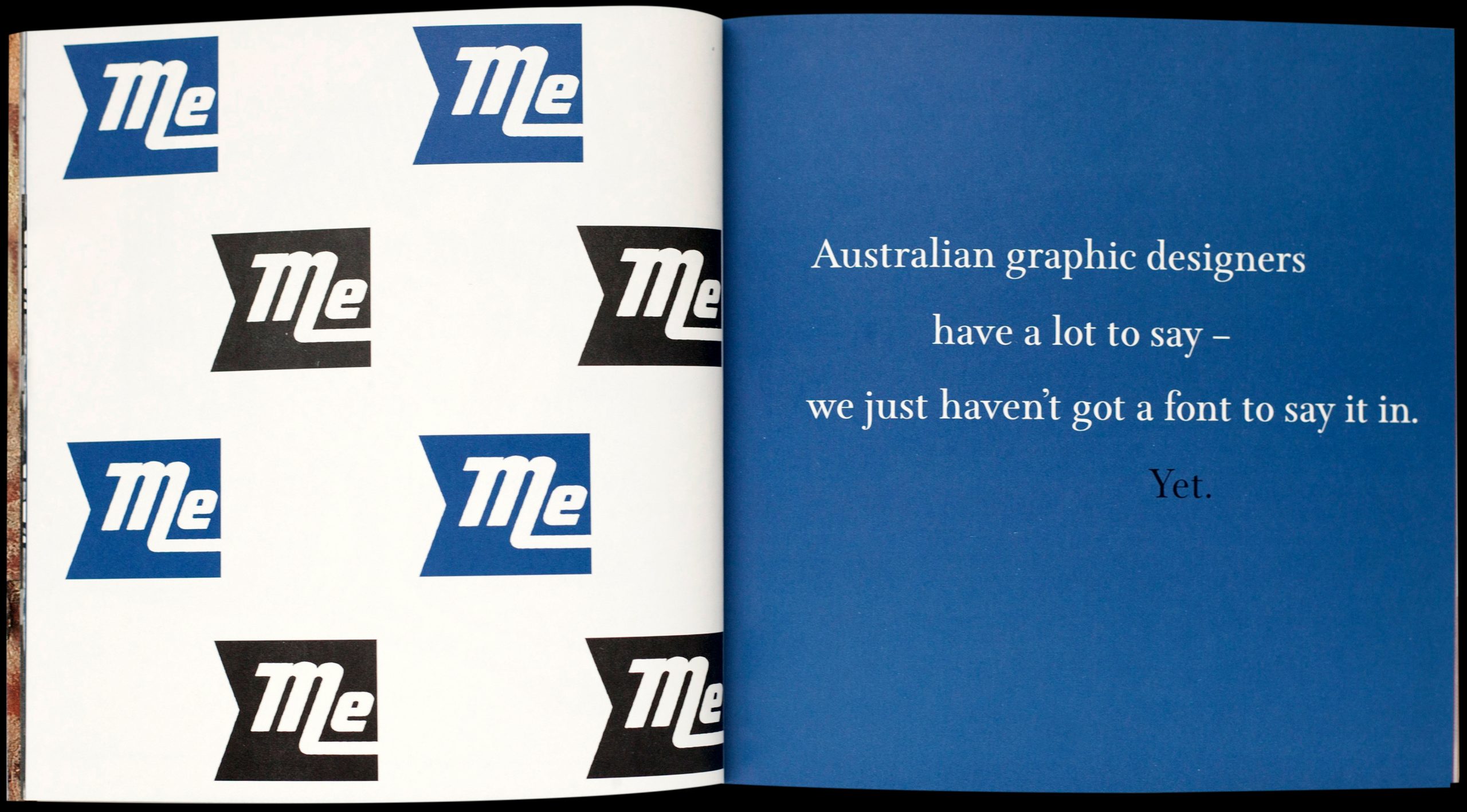
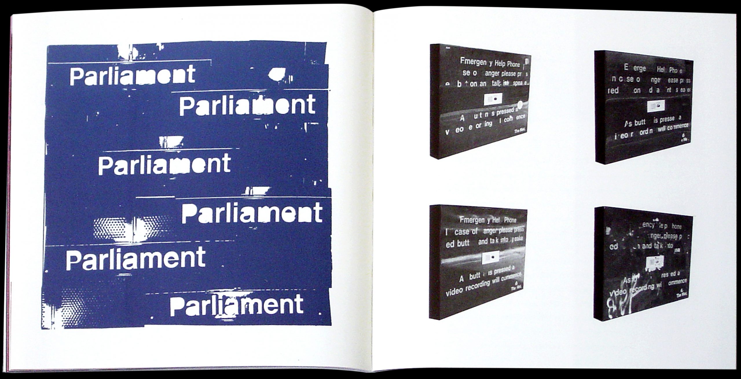
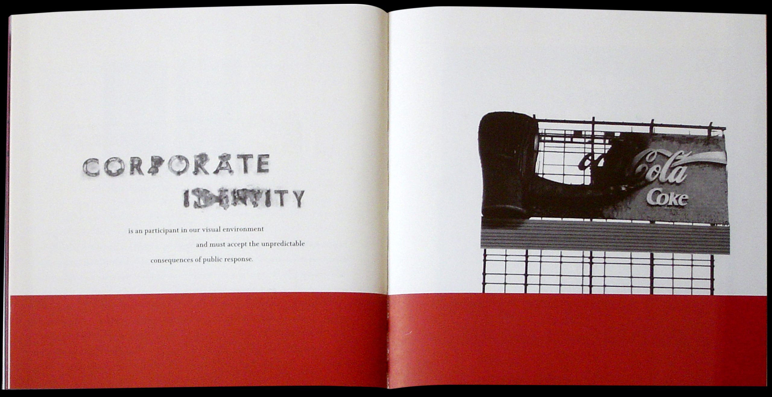
Published in 1997 as a way of expanding some of the themes first explored in the previous series Qwerty (1991–1996). This first issue of Ampersand includes writings and research such as ‘The lifespan of a corporate identity’ (what happens to identity systems after the bill is paid) and ‘This type is bigger than the both of us’ (a study of large scale typography) amongst many other texts. The issue, housed in a customised polypropylene casing ships with a very early and now unavailable typeface Gingham (1996).


