Letterbox
Menu
Projects
Books
Fonts
About
Writings
Profile
Contact
Search
Search
instagram account
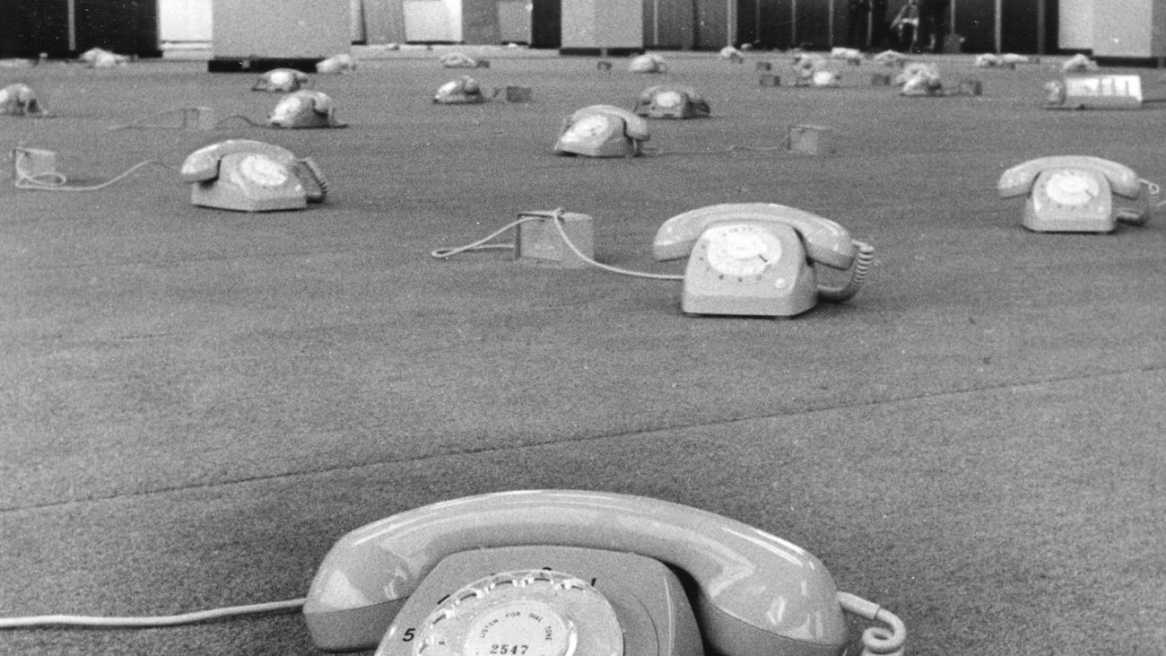
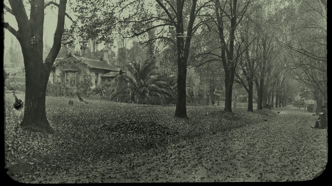
One Day In Our Park
Sans Forgetica
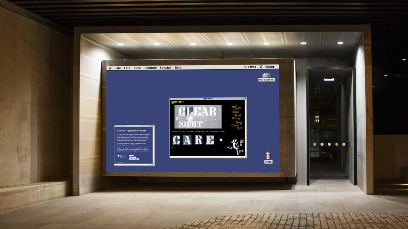
Typotronic
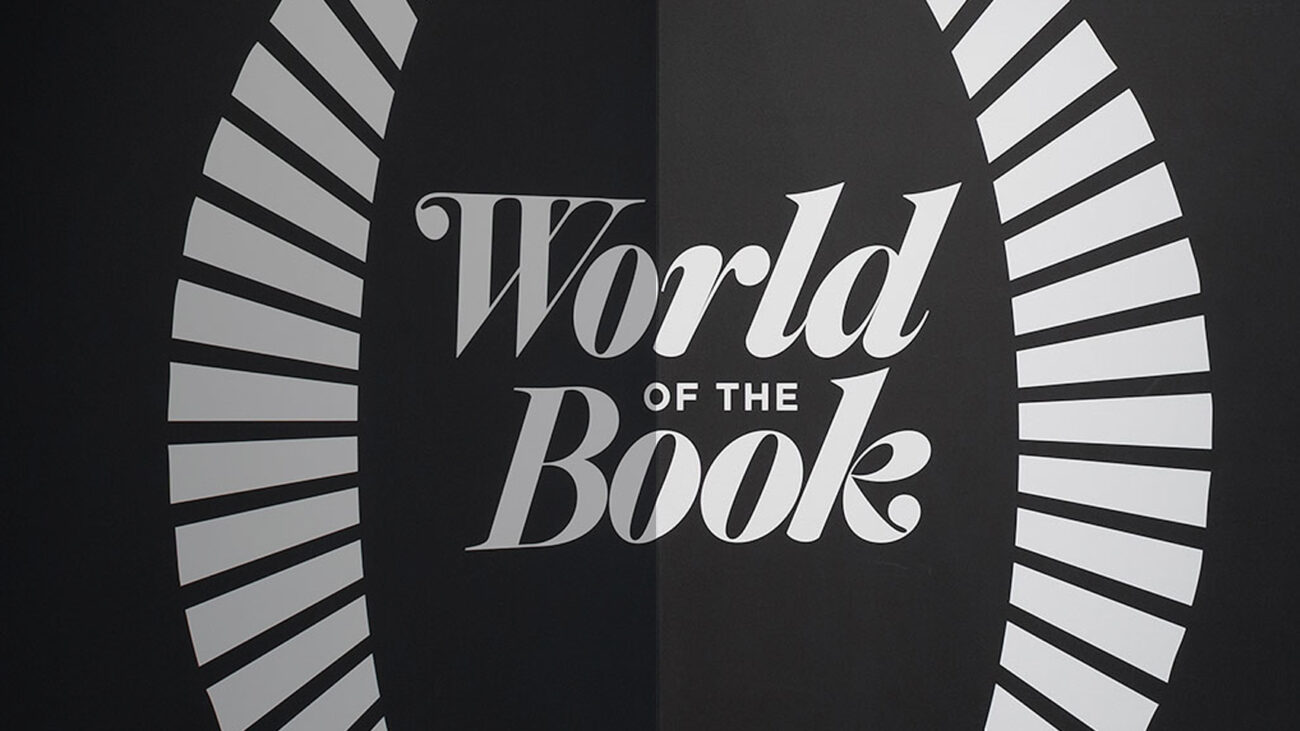
World of the Book
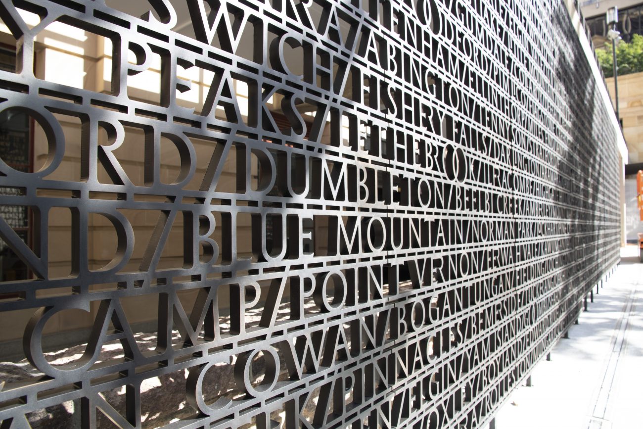
Brisbane Anzac Square
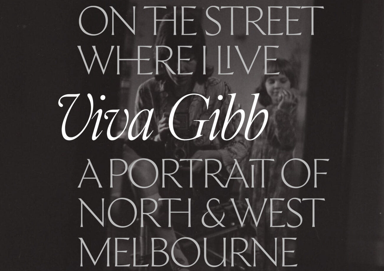
Viva Gibb: On the street where I live
You Are Here
Wizards!
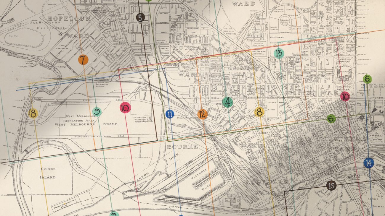
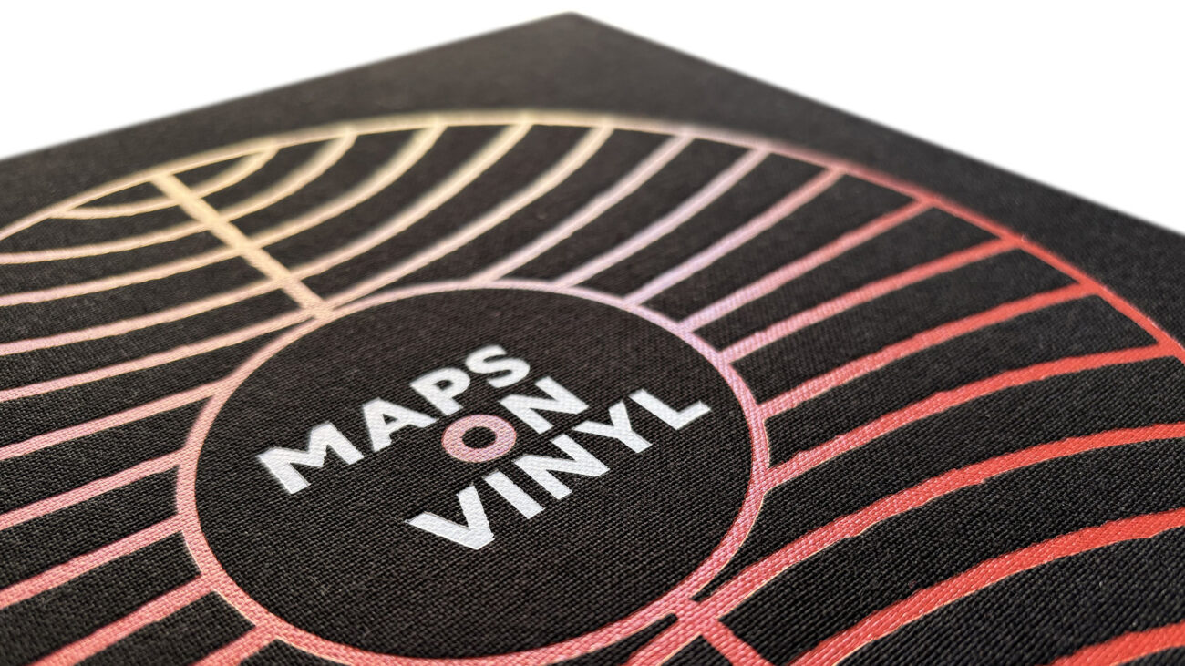
Maps On Vinyl
Monument to the Overheard
The Dirty Dozen
Typographic Nº 74
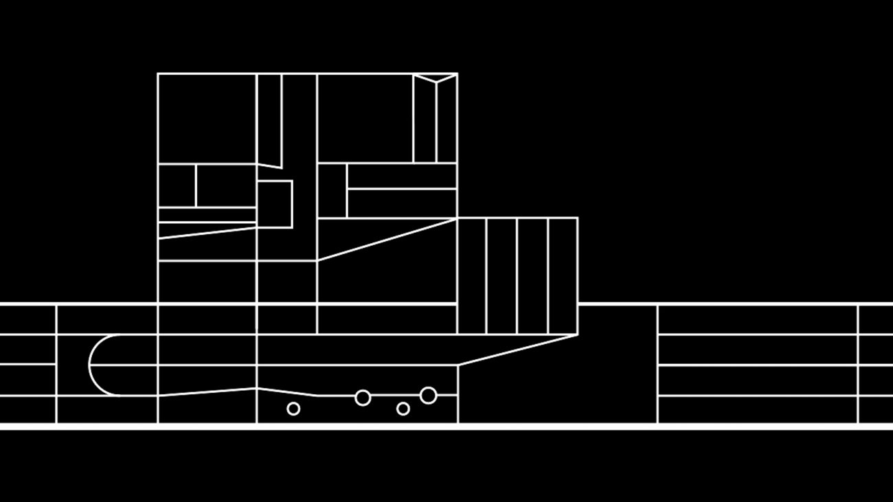
RMIT School of Architecture
The Museum of Falling
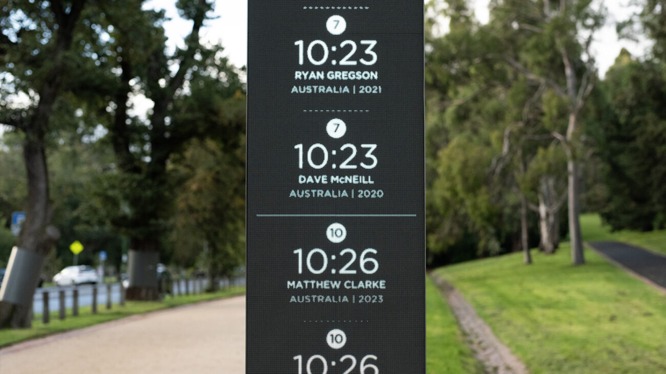
Tan Track Clock
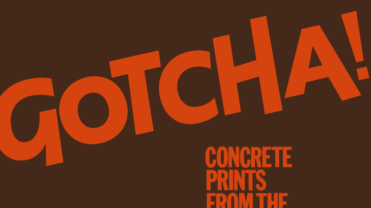
Gotcha!
Meanjin
Typographic Nº73 (ISTD)
Emblazon
Mundane to Friday
Off The Grid
News & Weather
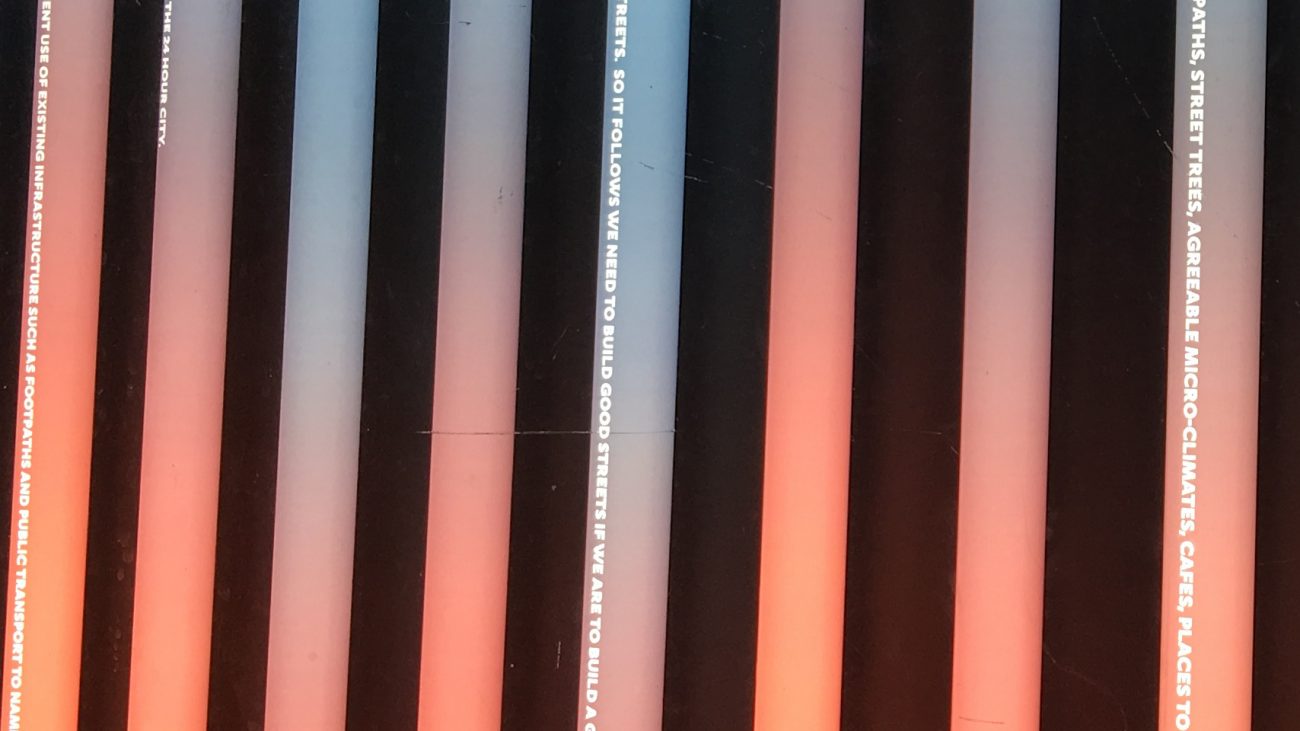
What we do next really matters.
The Capitol
Typographic Nº72 (ISTD)
Mall of Fame
Victorian Law Reform Commission
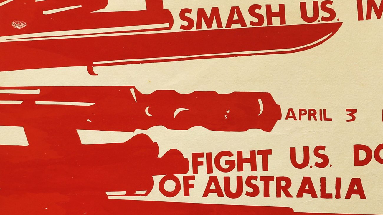
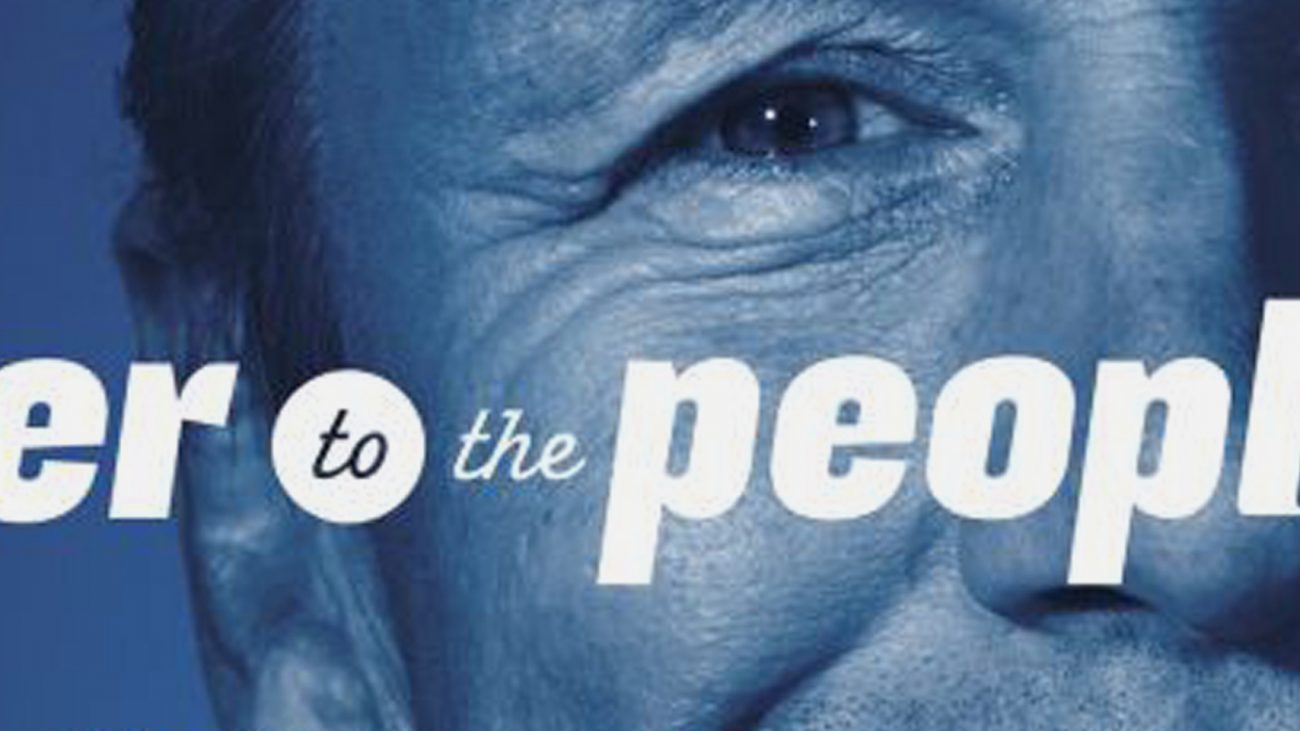
We Protest
Postcode 3000
Between the Street and Sky
Ink In The Blood
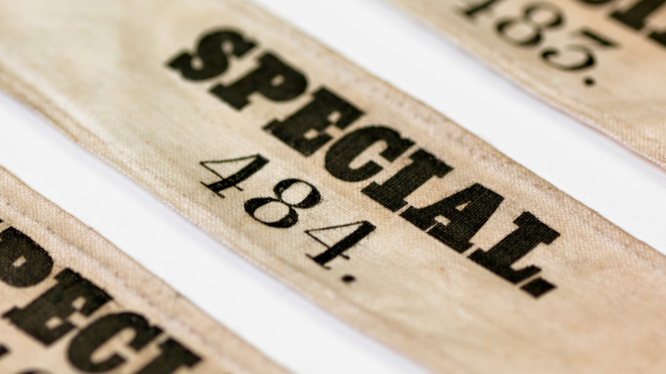
Special
Ian Potter SouthBank Centre
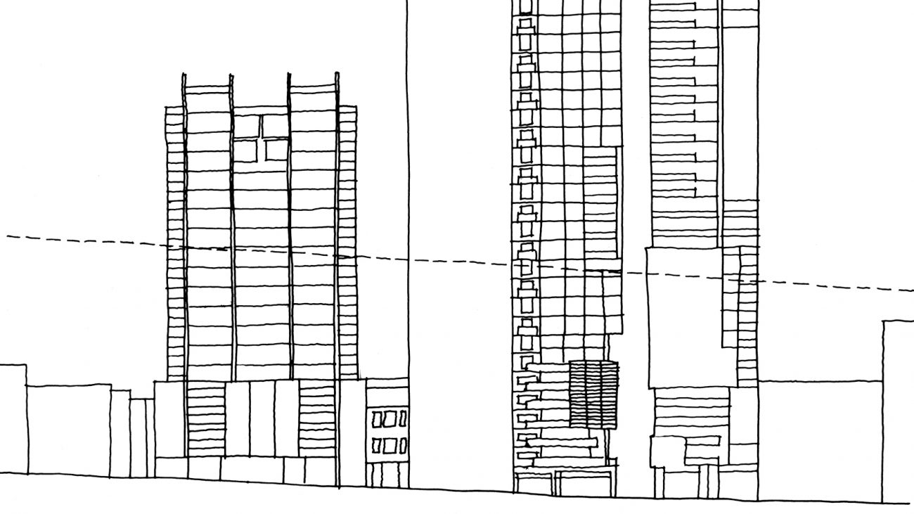
Tall Storeys
Meanjin 73.2
Circular
Holland
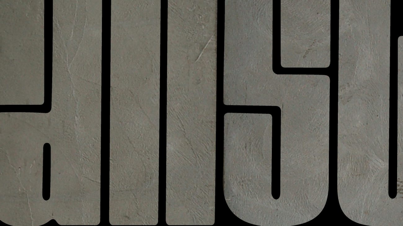
UWA Slab
Virgin Script
Stettler
Argyle Pink
Albion
Frankston Script
Frankston Script Stencil
Recital Sans
Carona
Brunswick Black
Gordon
Bisque
Berber
Terital United
Kevlar
Morice
League
A History of the Future
Going Viral
Executed
At Dusk, Under The Clocks
Hello Yellow
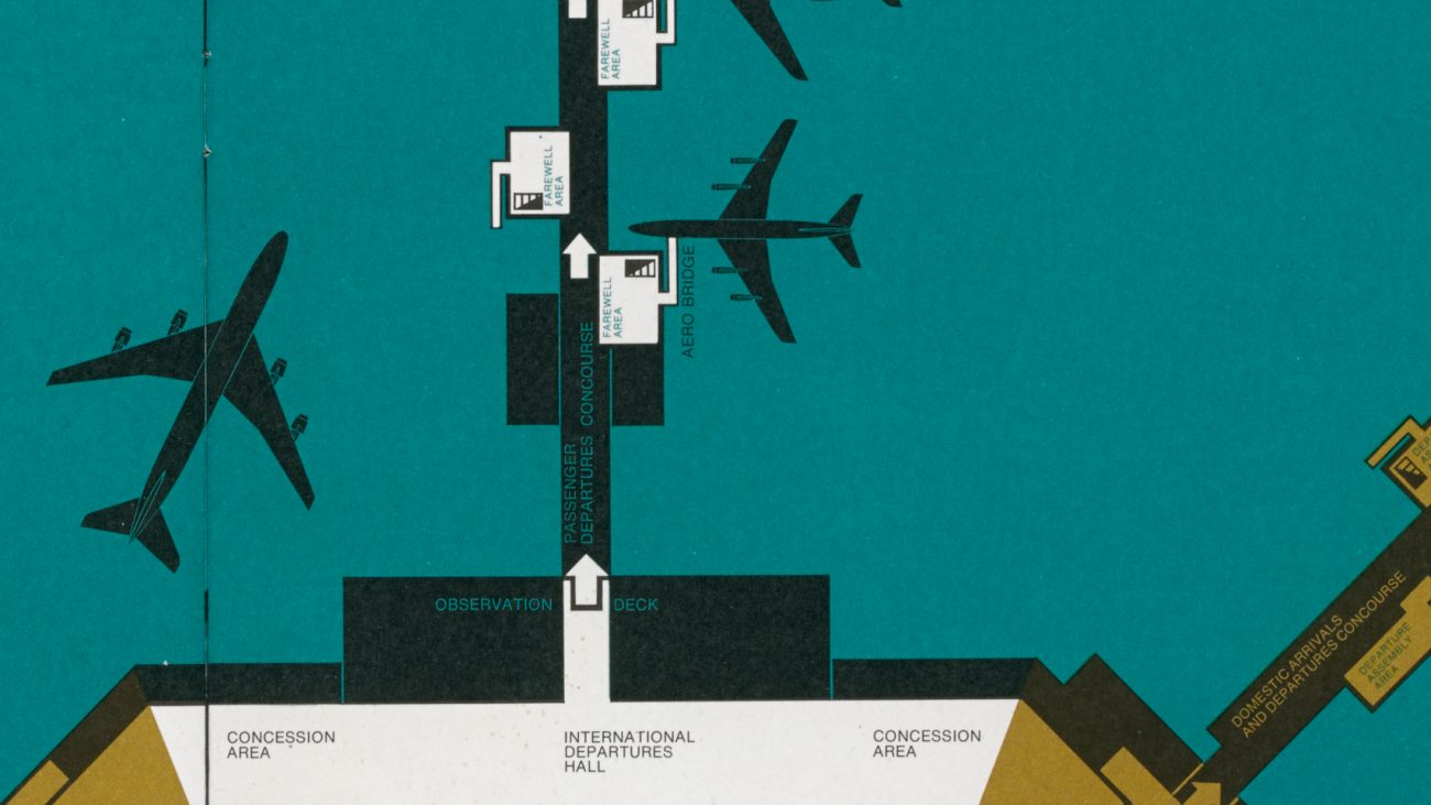
JetSet Melbourne
Cluster
Good Looking
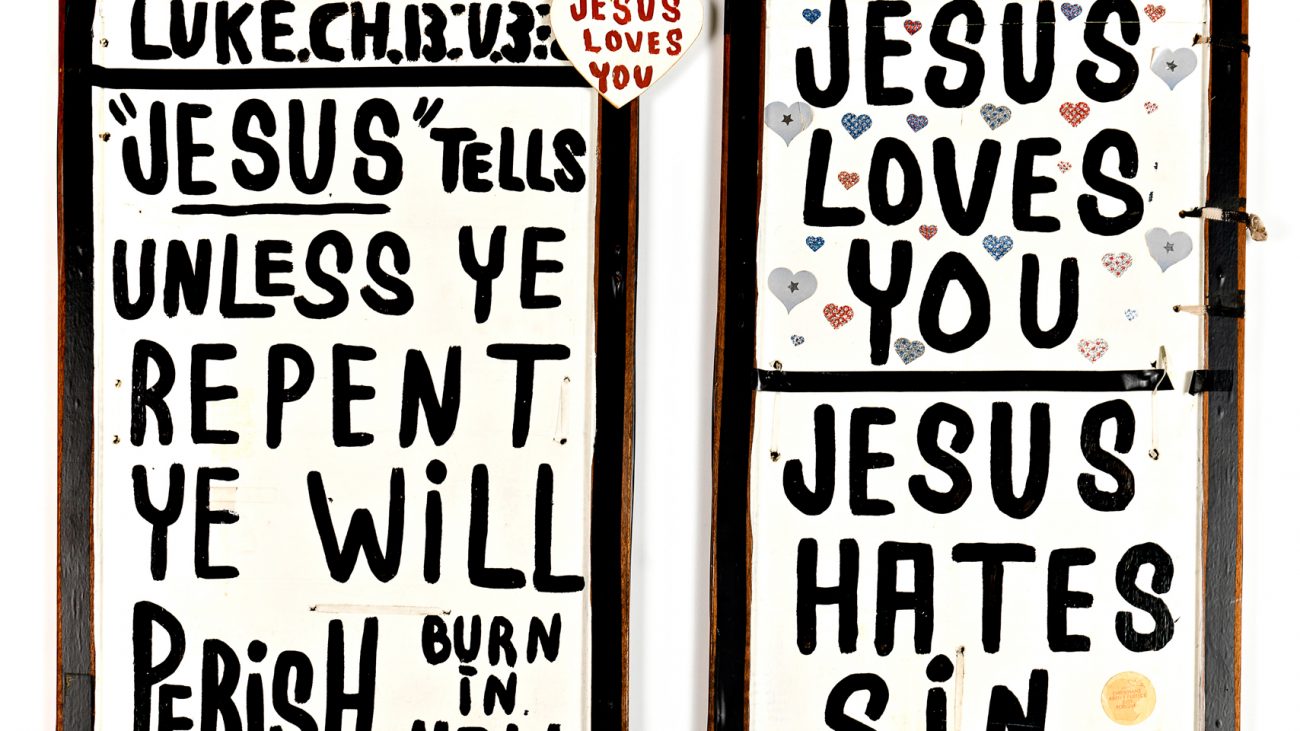
Jesus Trolley
Royal Melbourne
Magic Lantern
National Piano Awards 2012
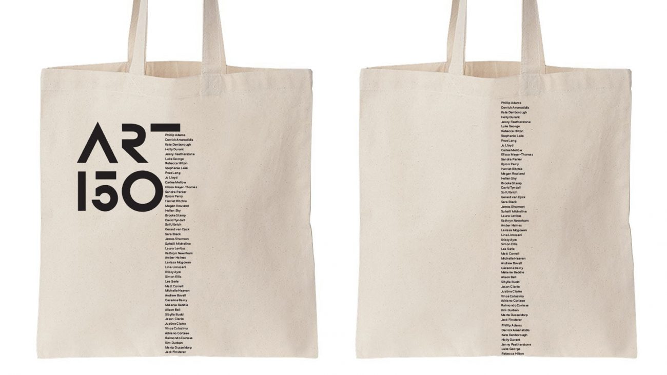
VCA 150th Anniversary Design
National Piano Awards 2016
Kuzman Architecture
Rhiannon Slatter Photography
24hr Experience
Helen Smith MacPherson Trust
Sainsbury Books
Dr. Dwyer
Chirnside Flowers
Stereotyped
RMIT Design Archives
HTAV
Hugo Michell Gallery
Melbourne Recital Centre
Venice Biennale of Architecture 2006
Cantilever
Venice Biennale of Contemporary Art 2003
Two Fish
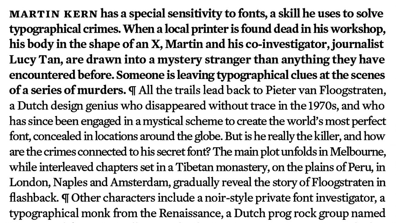
Death of a Typographer
Melbourne Sirius
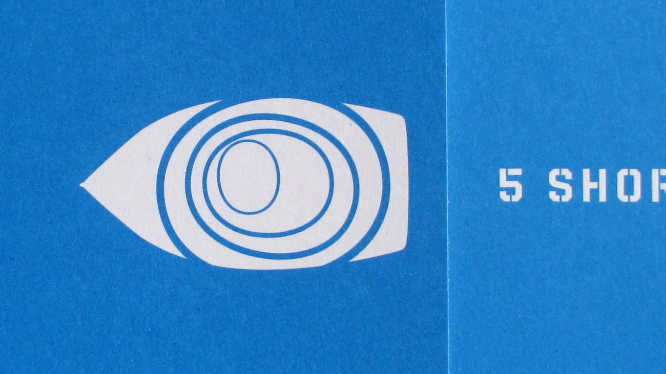
Five Short Blasts
Artium Centre for Contemporary Art, Spain
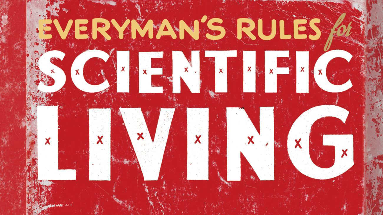
Everyman’s Rules for Scientific Living
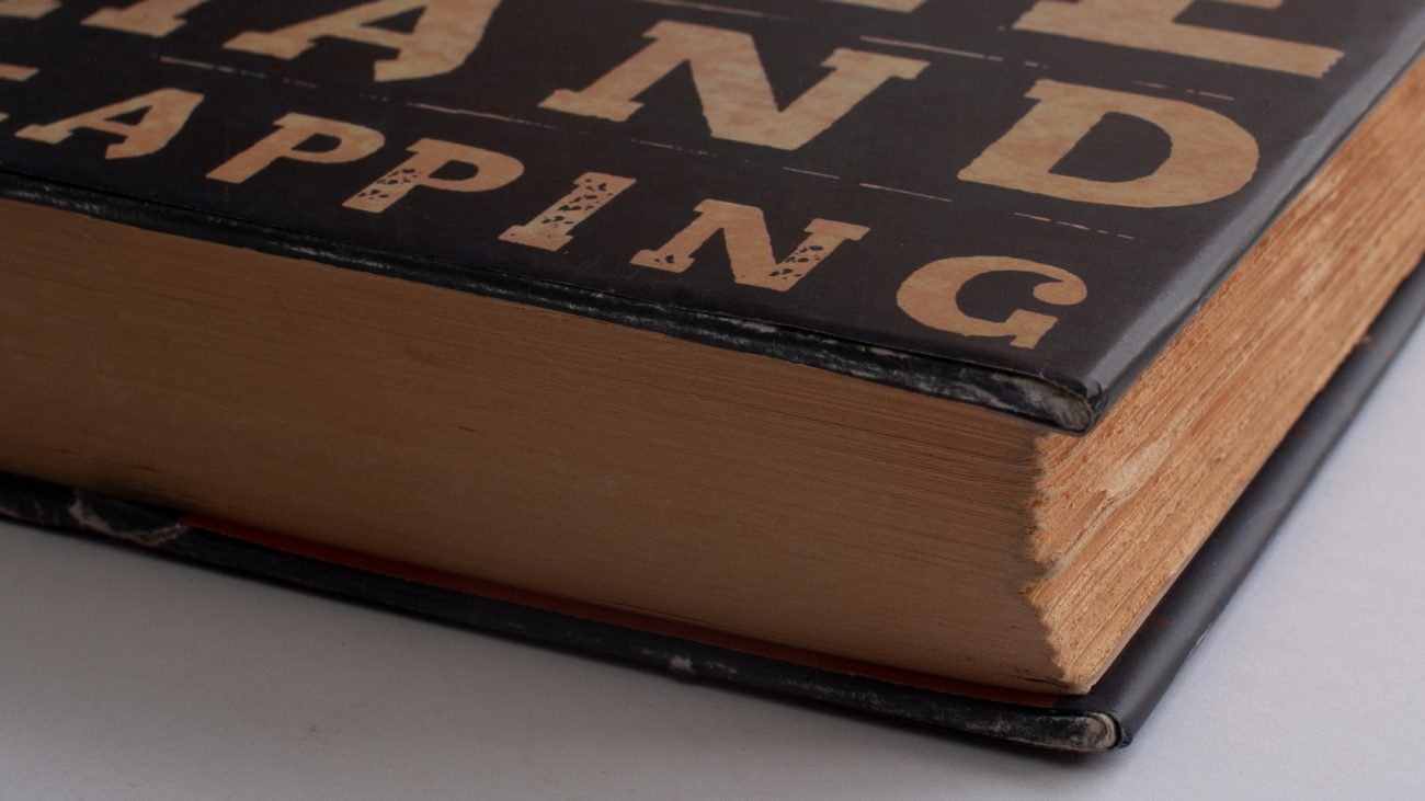
The Sound of One Hand Clapping
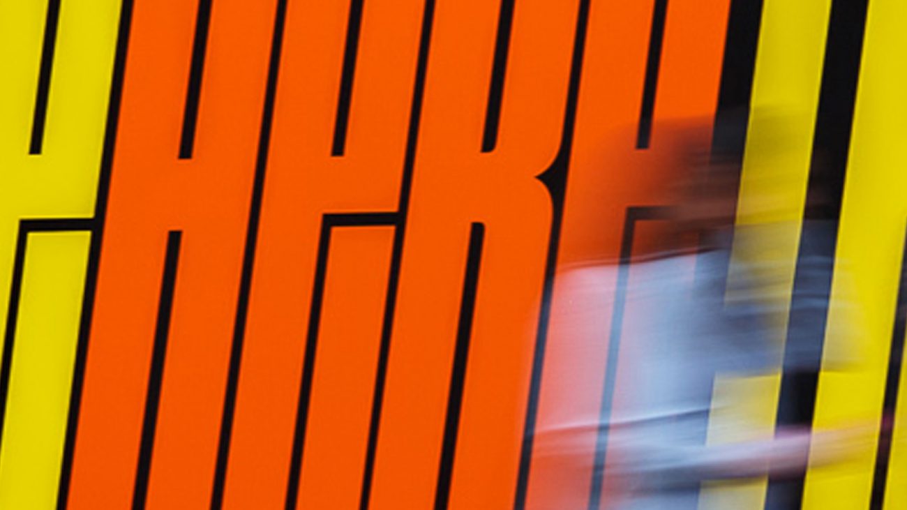
Here There
Mortuary Train
Moreland Arts Precinct
Orbit Oblique Exhibition
Queen Victoria Market Alphabet
To The Beach
You Are Cordially Invited…
Dream Factory
Weekly Ticket
RMIT University
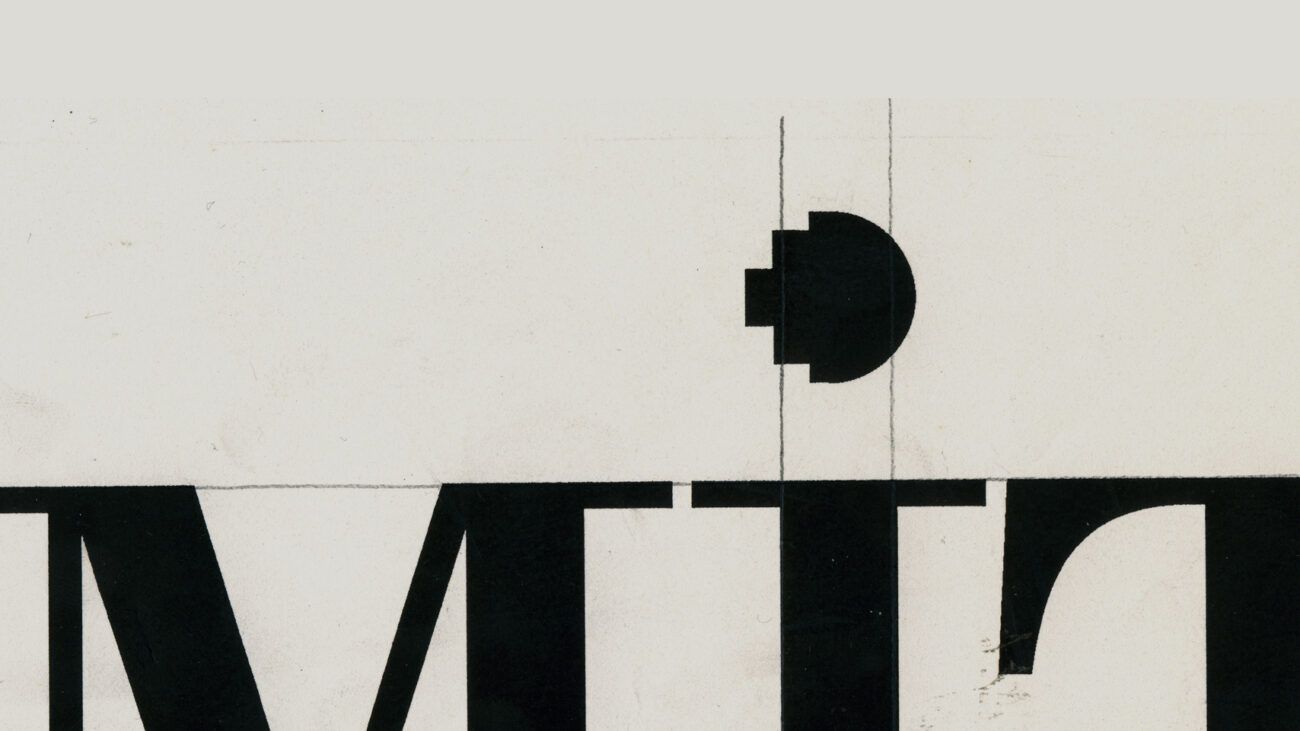
Blood and Tinsel
Multistory
Cluster Tram
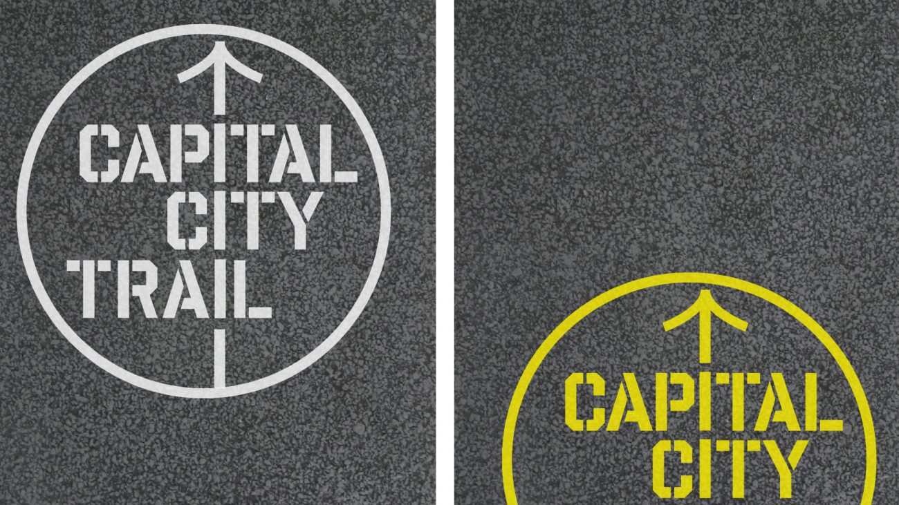
Capital City Trail
Accidents Not So Grotesk
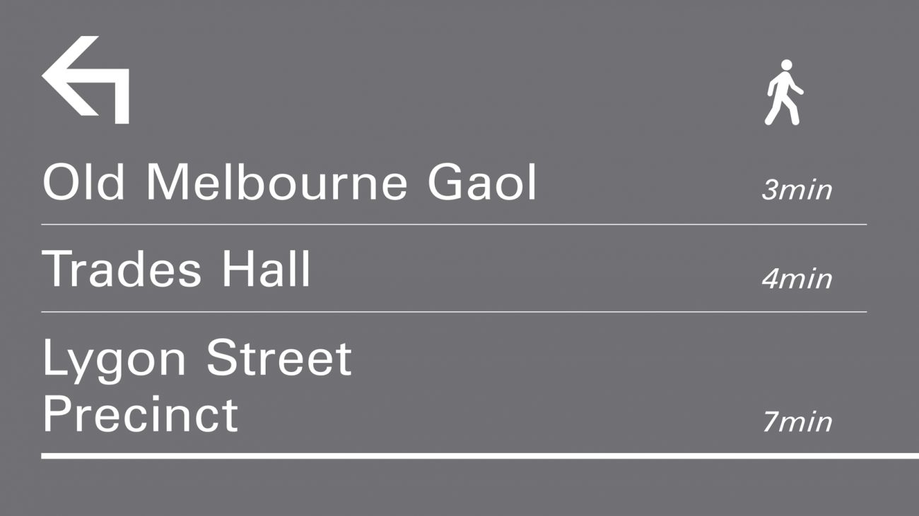
Pedestrian Signage
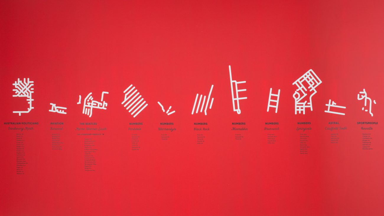
City Numbering System
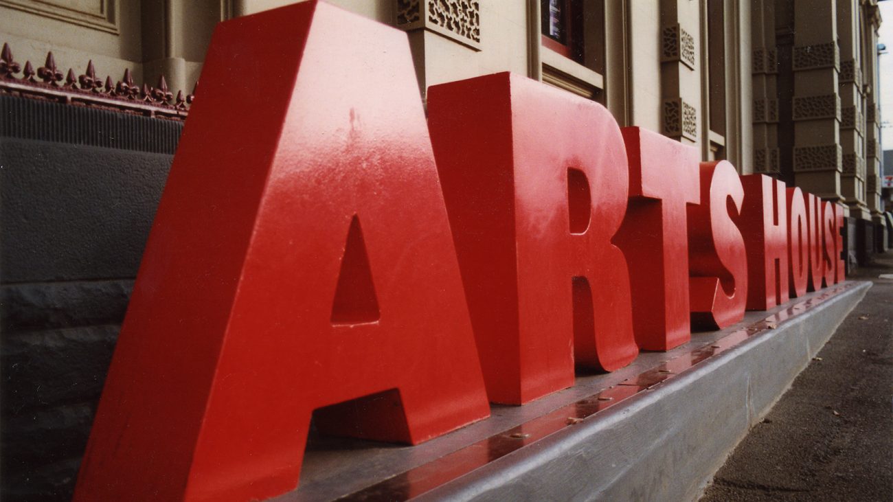
Artshouse
Breath
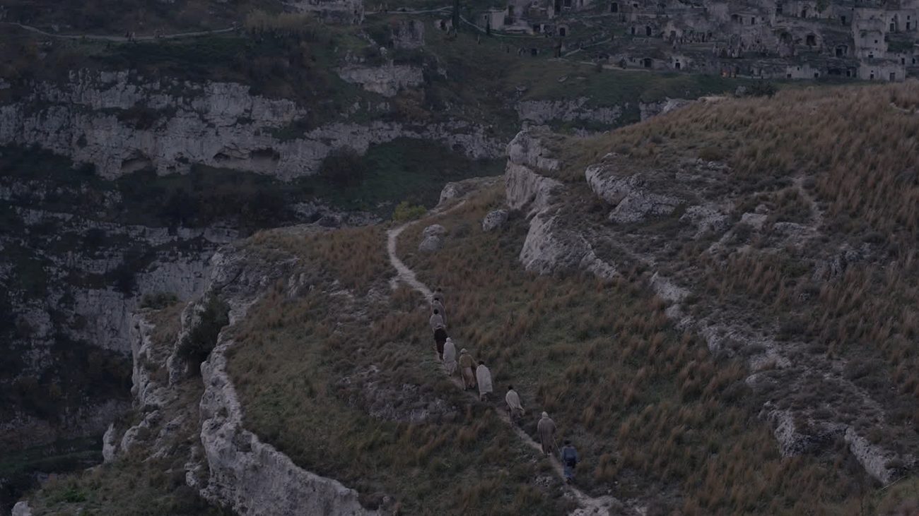
Mary Magdalene
Wealth Generation
Lose Yourself In Melbourne
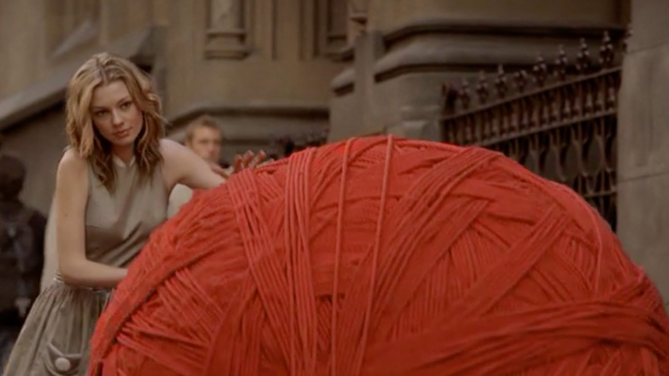
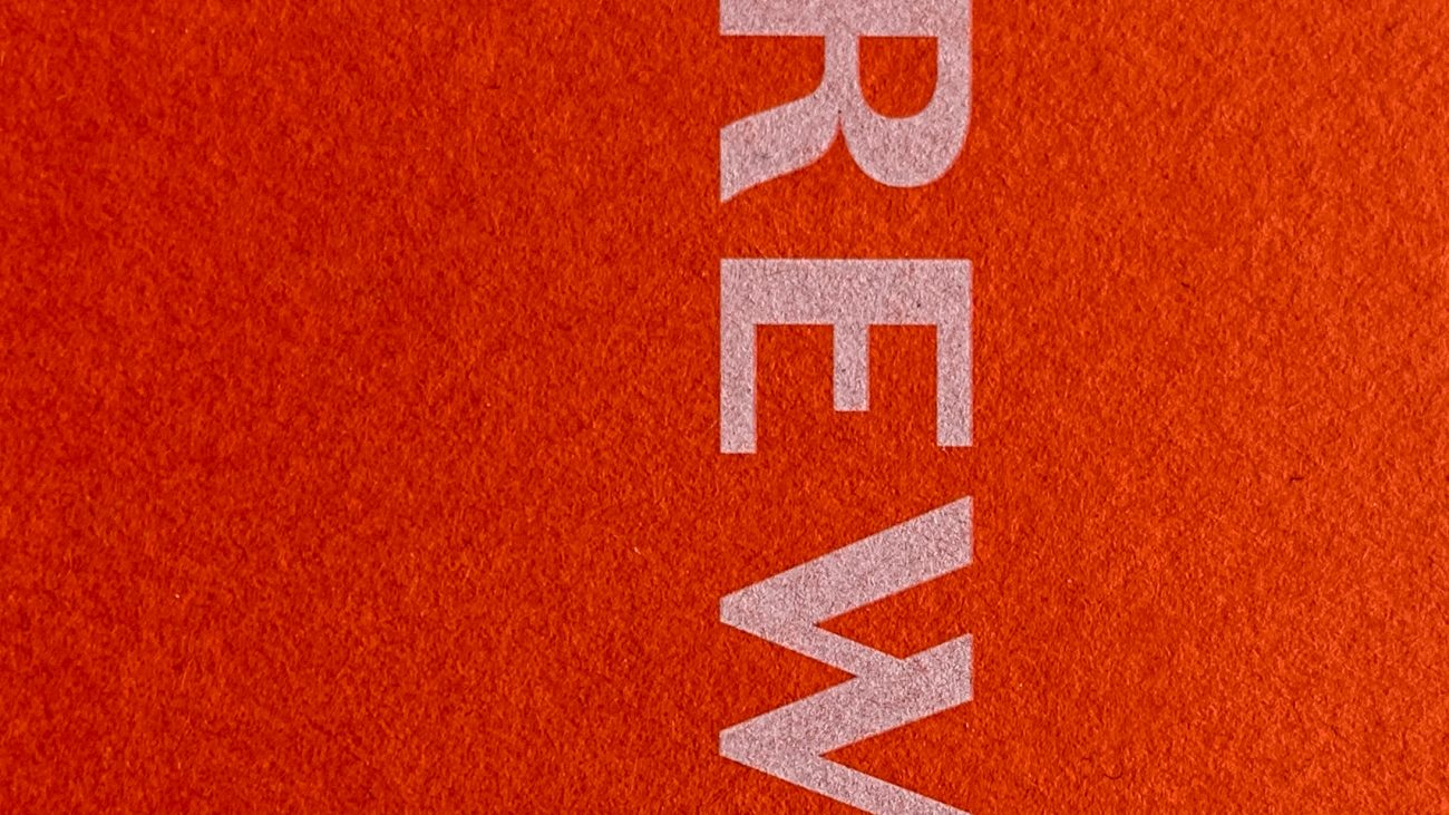
Erewhon
Page Not Found
Yirramboi Festival 2017
New Music Network
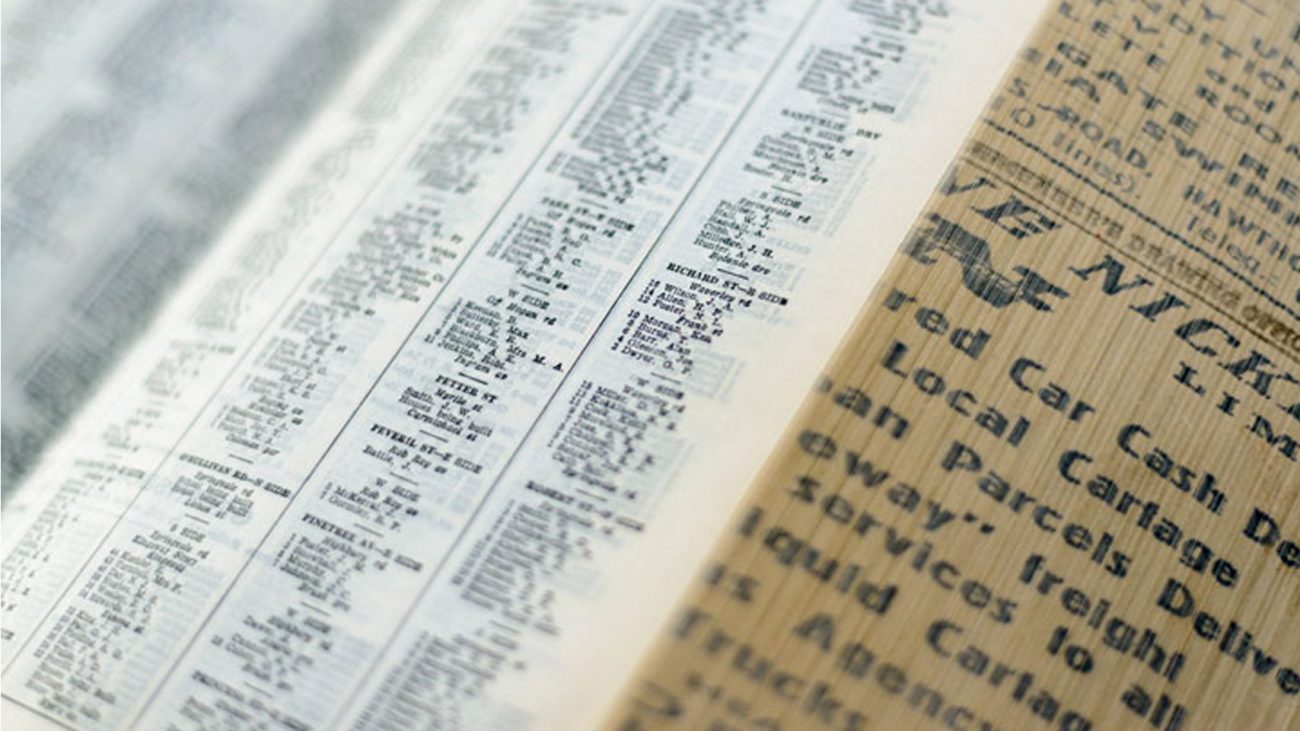
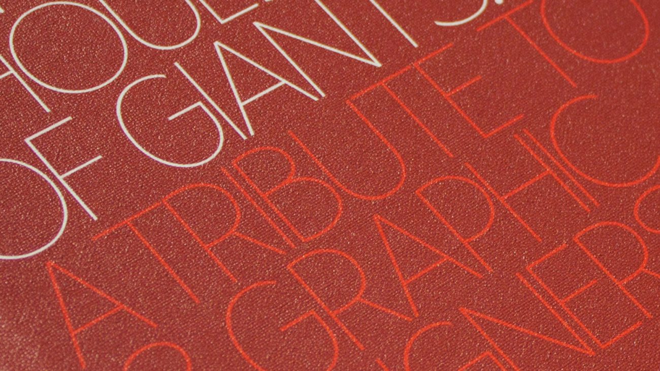
On the Shoulders of Giants
Rumi
Pepo
It was around about Here
Paper City
Lion
Blak Cook Book