Brisbane Anzac Square
design Letterbox | architects Tanner Kibble Denton (Sydney)
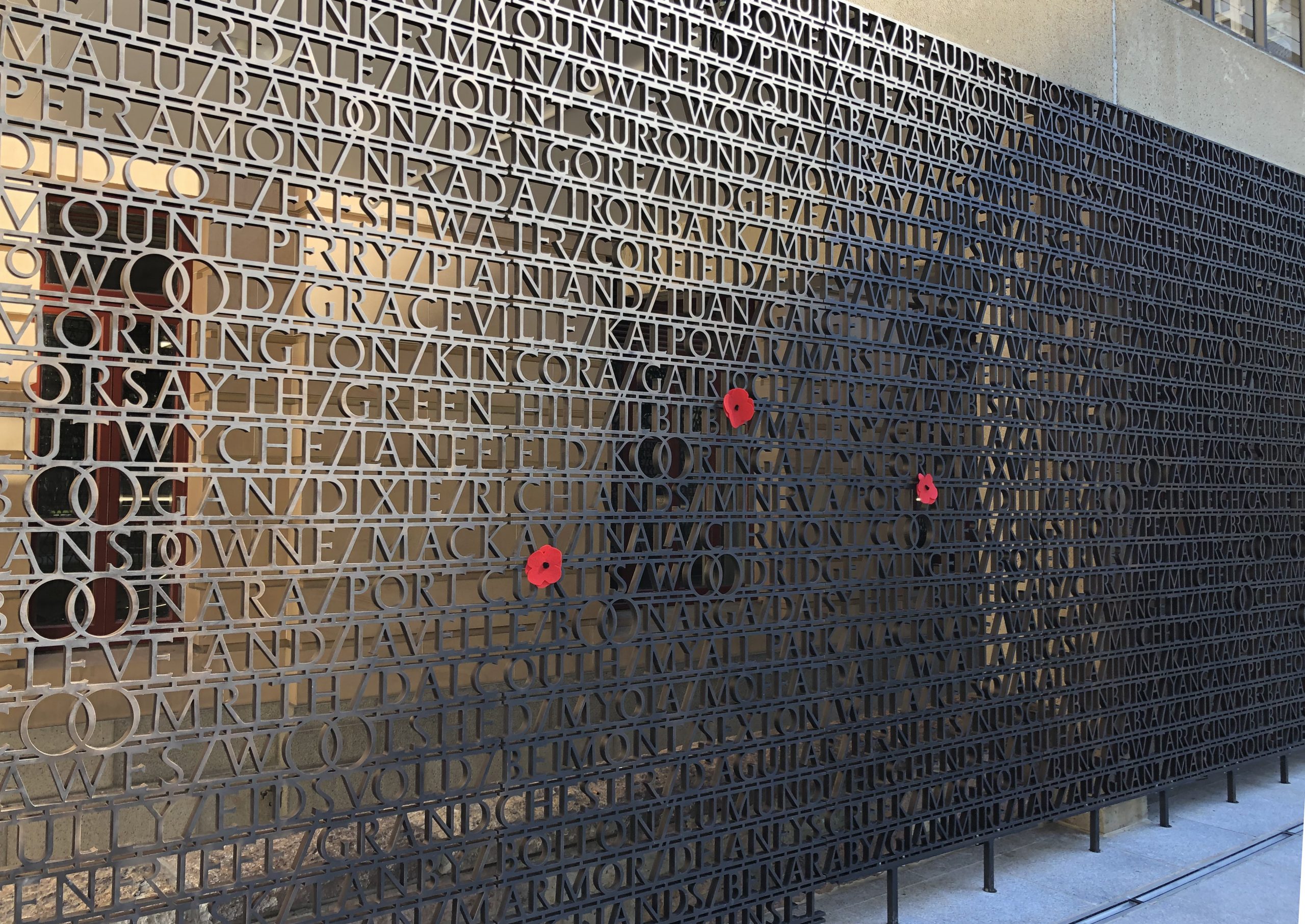
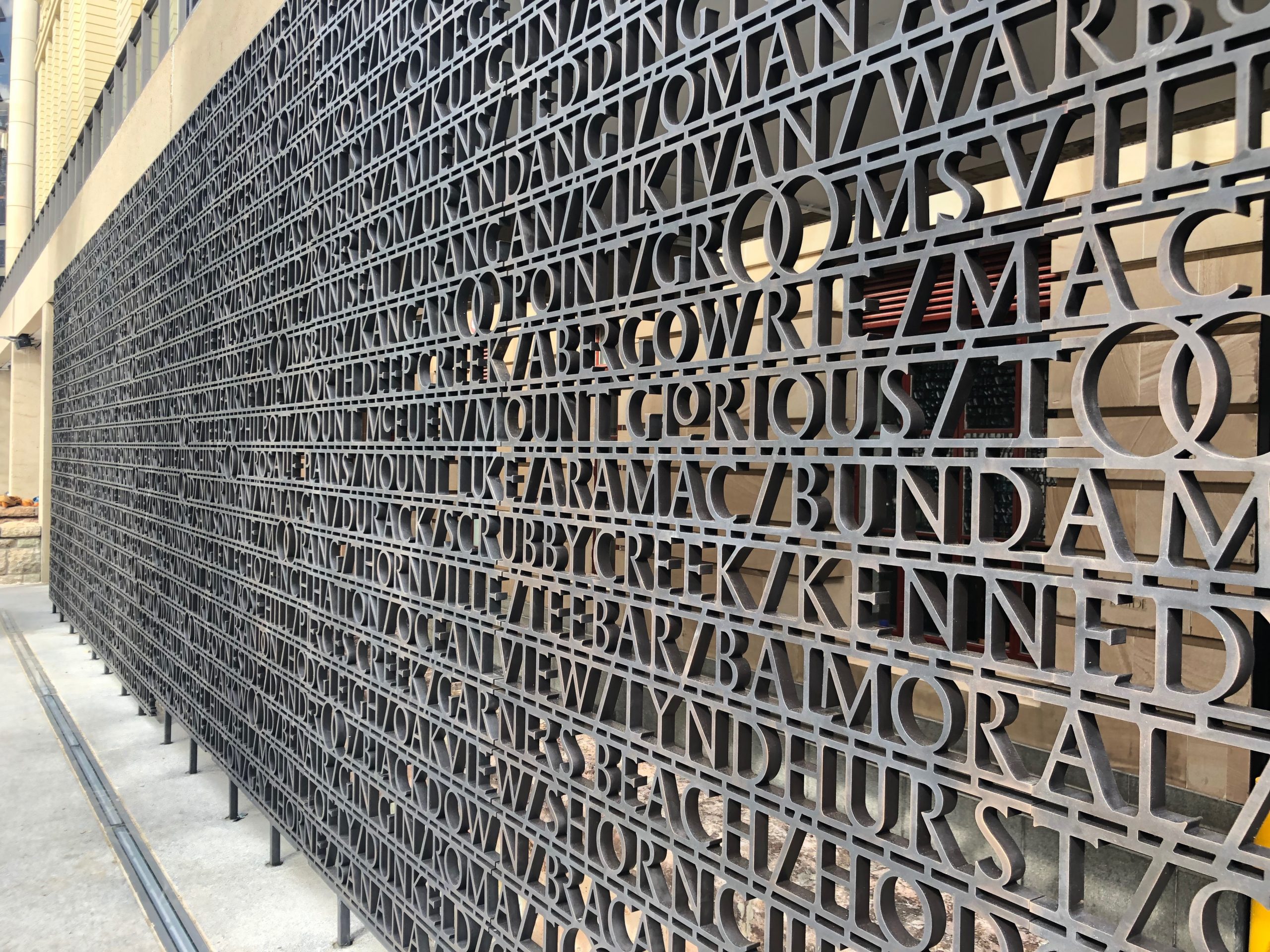
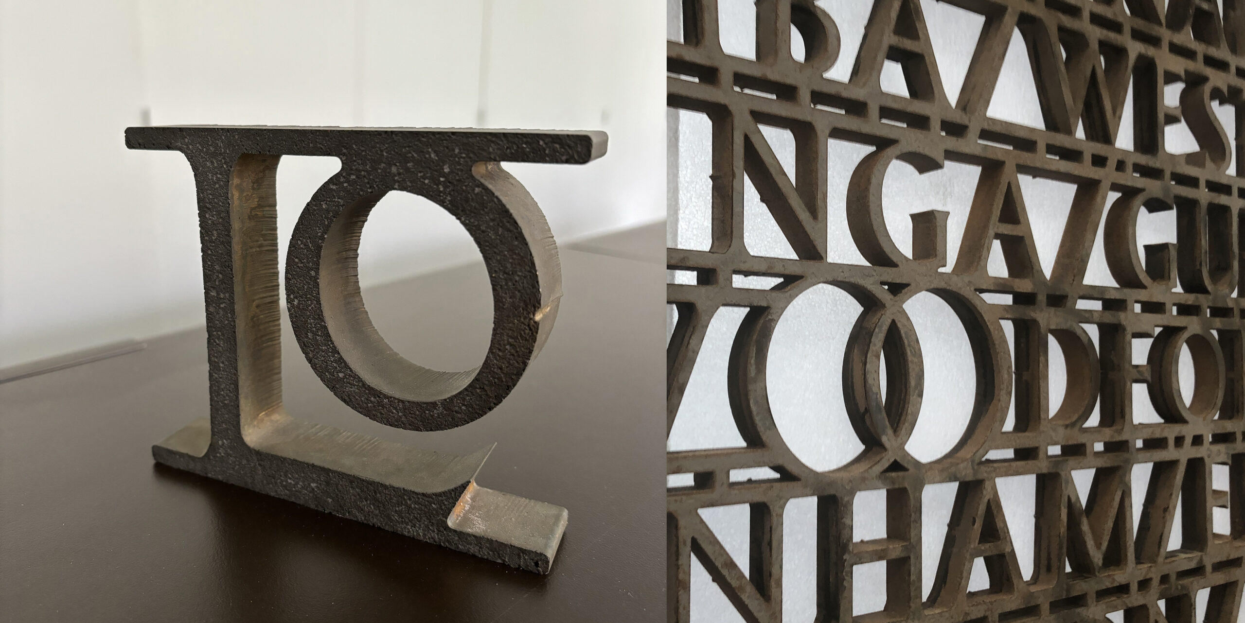
2072 town names designed across 200 square metres of bronze.
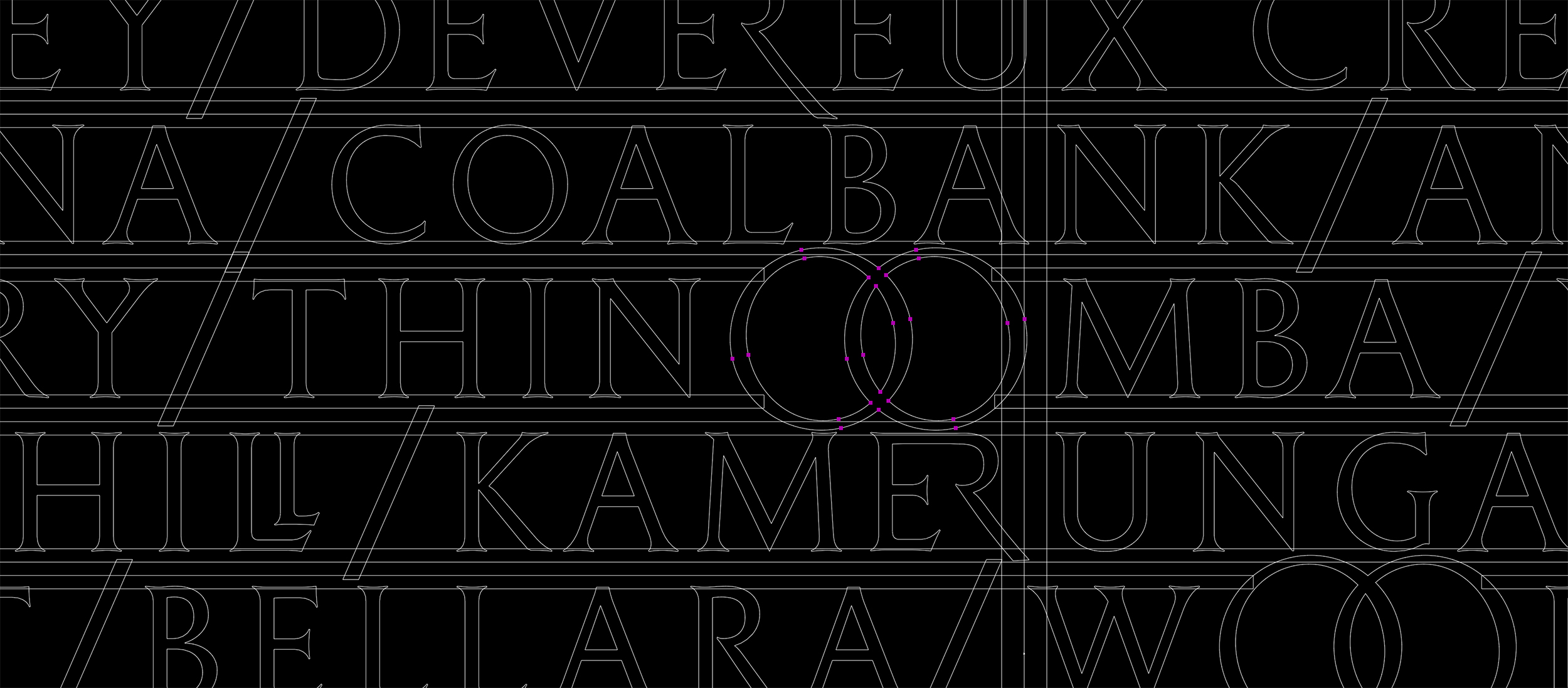
As part of a substantial refurbishment of Brisbane’s renown Anzac Square, we were commissioned to design a series of large-scale typographic commemorative works. A key element were the 2072 names of Queensland towns from which servicemen and women originated. Close observation of the list showed a predominance of double ‘O’s (Toobanna, Toobeah, Toogoolawah, Toolburra etc) reflecting the preservation of original Indigenous location names. The ‘OO’ forms offer both clarity and utility – not only expressing a local typographic complexion but also breaking up any monotony of an all-capitals (titling) listing. They also provided greater structural strength across the horizontal bronze work.

the anzac square project | a closer look
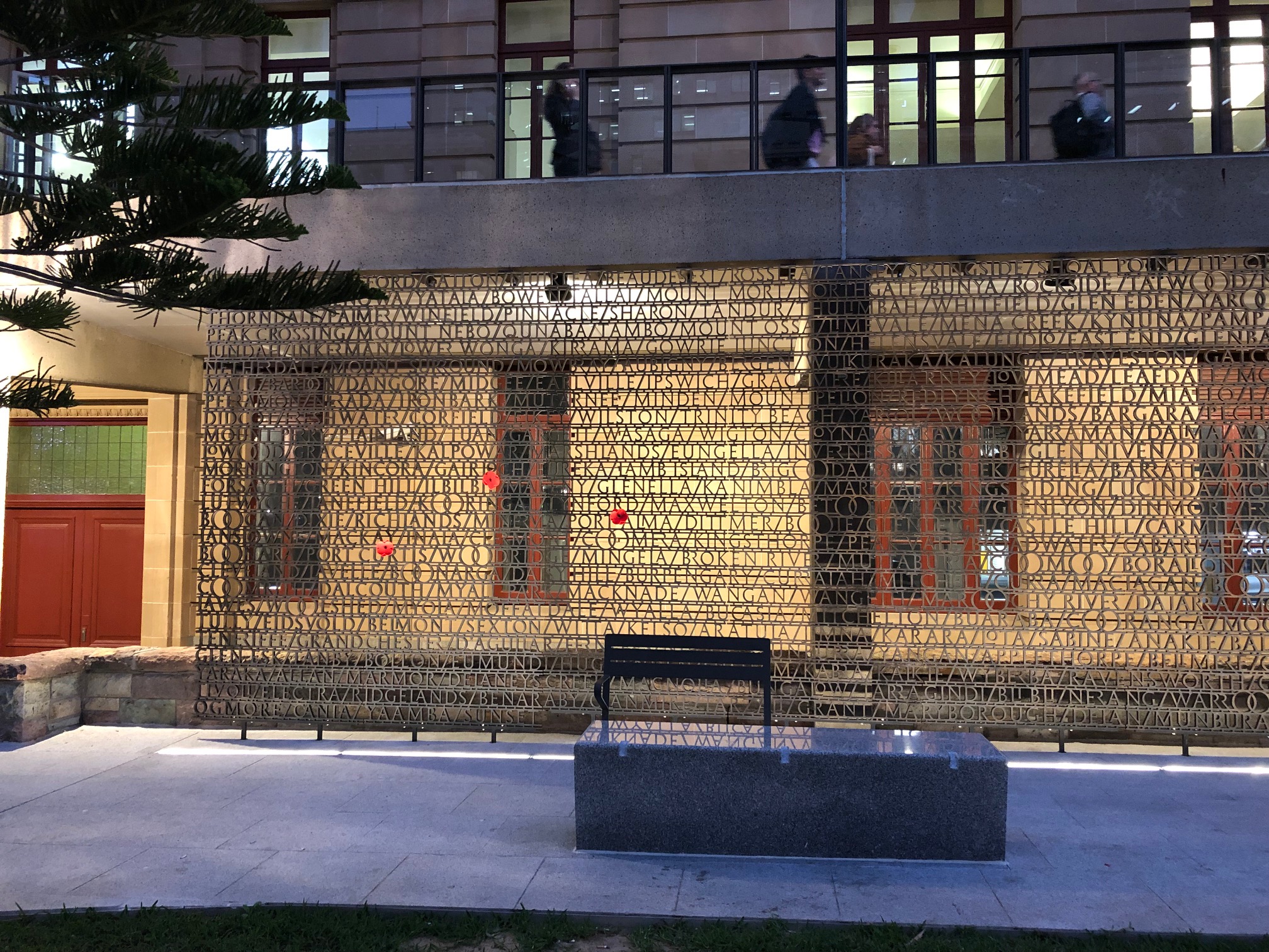
Where Circular drew upon local stories, and To The Beach combined utility with expression, the Anzac Square project (2018), proposed a more ambitious idea – telling the story of place through recognising a localised language. Commissioned through Sydney architectural firm TKD for the Queensland Government and the Federal Veteran Affairs Office, the project called for the design of four bronze commemorative screens spanning over 200 square metres framing Brisbane’s Anzac Square, situated between Elizabeth and Ann Streets in Central Brisbane. Wishing to avoid pictorial depictions of war, soldiers or specific battle scenes, the architects decided to instead approach the design of the screens from a typographic perspective. The eventual content for the typographic interpretation provided as a listing of the 2072 Queensland towns from which servicemen and women originated. This list had been carefully researched and exhaustively compiled through the State Library of Queensland. Upon reading the list of Queensland town names, a typographic patterning became evident. There was a unique predominance of double ‘O’s in the town names – Toobanna, Toobeah, Toogoolawah, Toowoomba, Toolburra etc. This feature reflected the Queensland Government’s preservation of original Indigenous location names, the phonetic translation of which makes the ‘OO’ sound common.
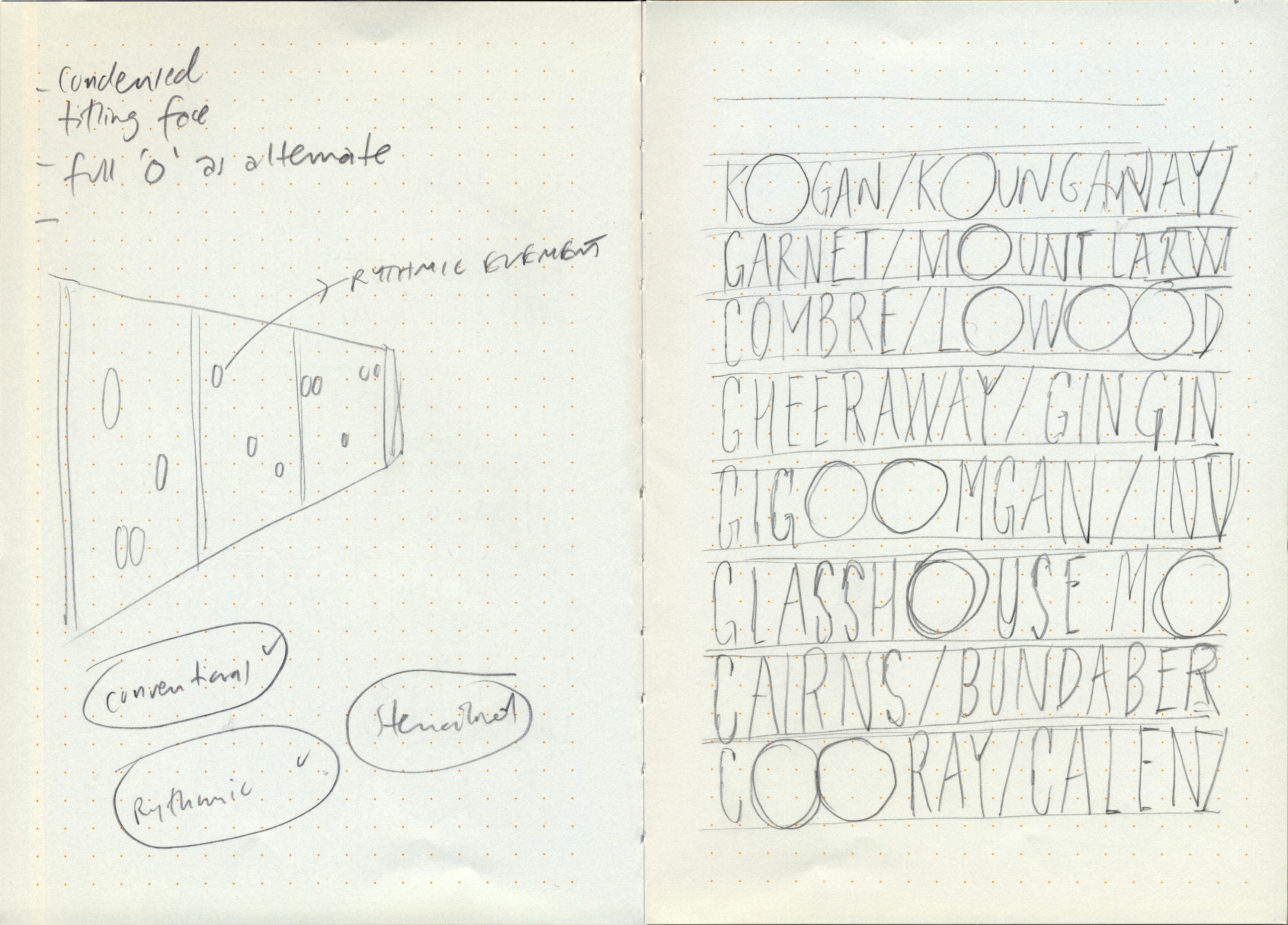
An early design sketch (2017) drawn in Airport train transit to a site visit.
The acknowledgement of the underlying indigenous provenance of the words emerged out of my typographic observations of place, language and sound. This could be framed as a ‘typographic way of knowing’– a knowledge that is not only manifest through the design but can also lay the foundations of expressing place through verbal and visual storytelling. In the specific case of the Anzac Square commemorative screens, it is a story encompassing the historical legacies of colonised languages. Building upon the melding of expression and utility developed through To the Beach, the development of the ‘OO’ forms offer both typographic clarity and structural support. Not only are they bringing a local complexion to the memorial and breaking up the potential monotony of an all-capitals (titling) listing, the uniquely ligatured ‘OO’s connect the vertical lines, give greater structural strength to the bronze work and can also be used as receptacles for poppies and other flowers.
The typographic design was also informed by the lighting system designed for the site. The screens needed to appear as a lightweight texture of letters, to be read as a mass rather than a formal listing. The town names were placed randomly, deliberately discouraging people to seek out specific towns, instead making the screen legible as a collective, shared experience. The slim laneways on the other side of the screens became a surface onto which reverse typographic textures could be projected upon.
The clarity of recognising this typographic pattern was due to being an outsider looking inward. When the design concept of referring to local language was presented to the many tiers of Queensland Governmental boards involved, the positive response was almost always the same – a sudden realisation of the familiar. Many expressed that it was like seeing something they had always known and lived amongst. Yet it was the perspective of an ‘informed outsider’ that detected these patterns that had previously been ‘hidden in plain sight’. In recognising and employing these patterns and repetitions throughout the design, this ‘typographic lens’ transformed these into an political expression of locality, language and place on a grand scale.