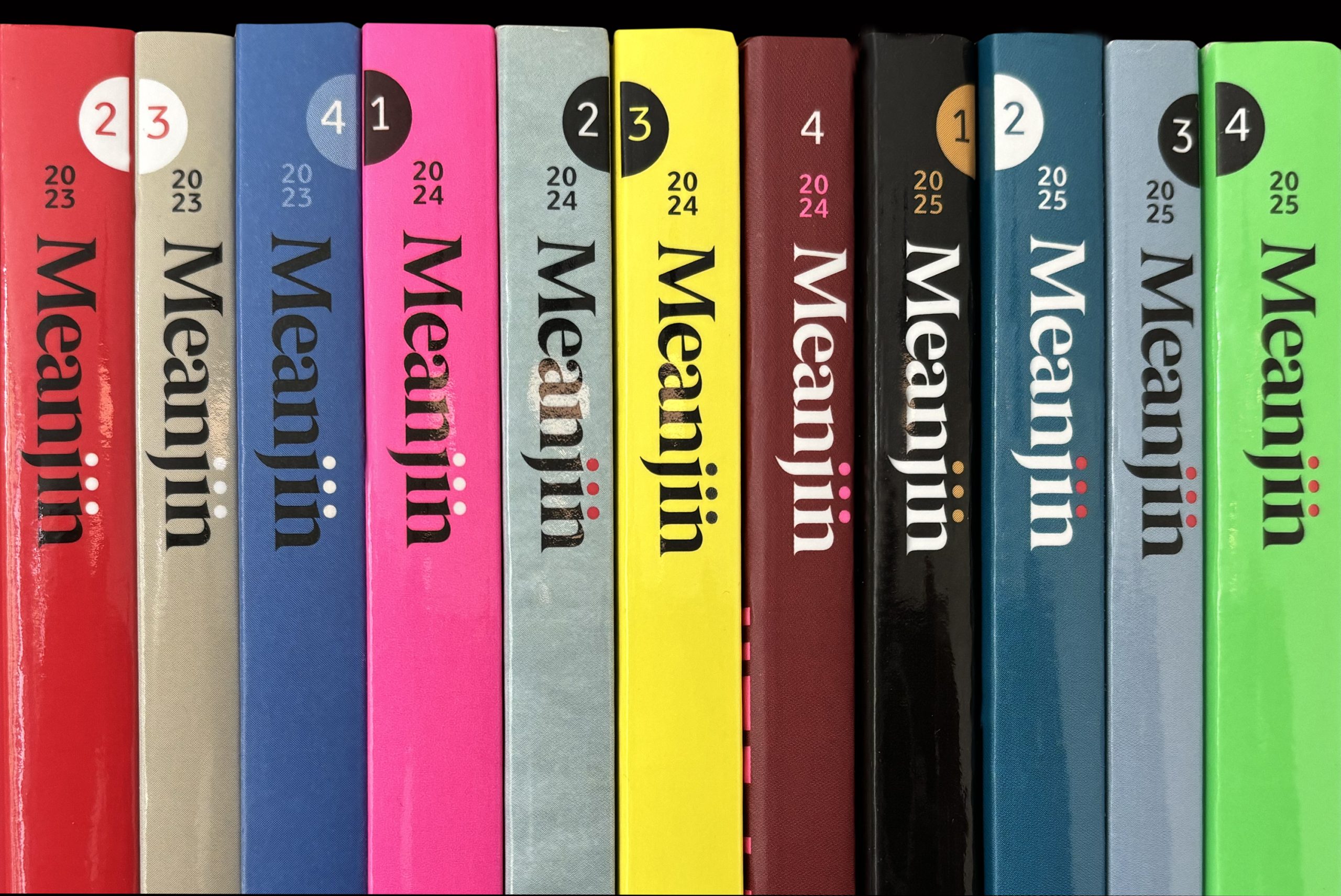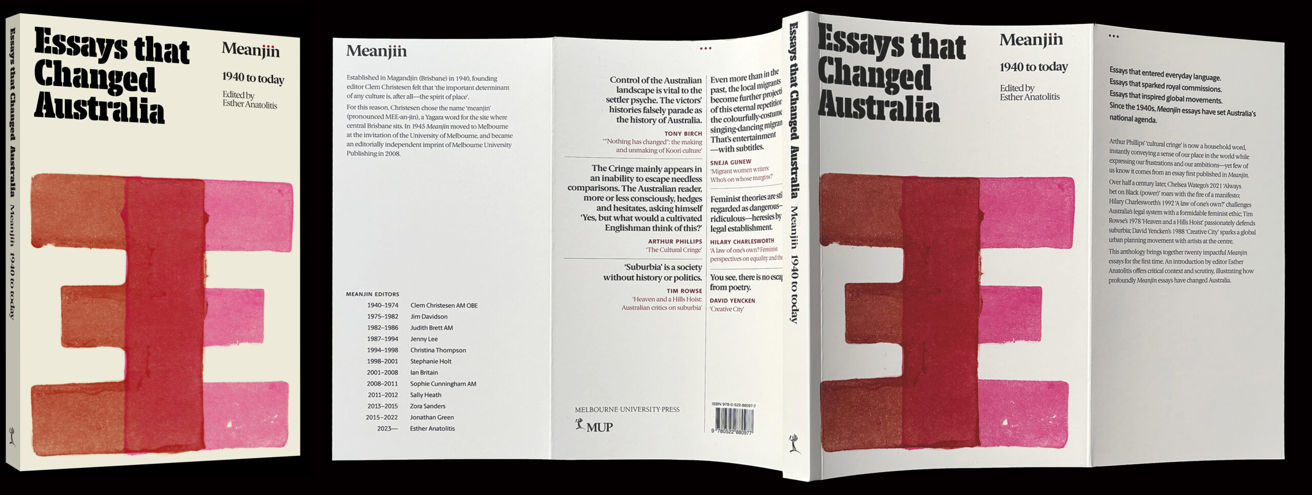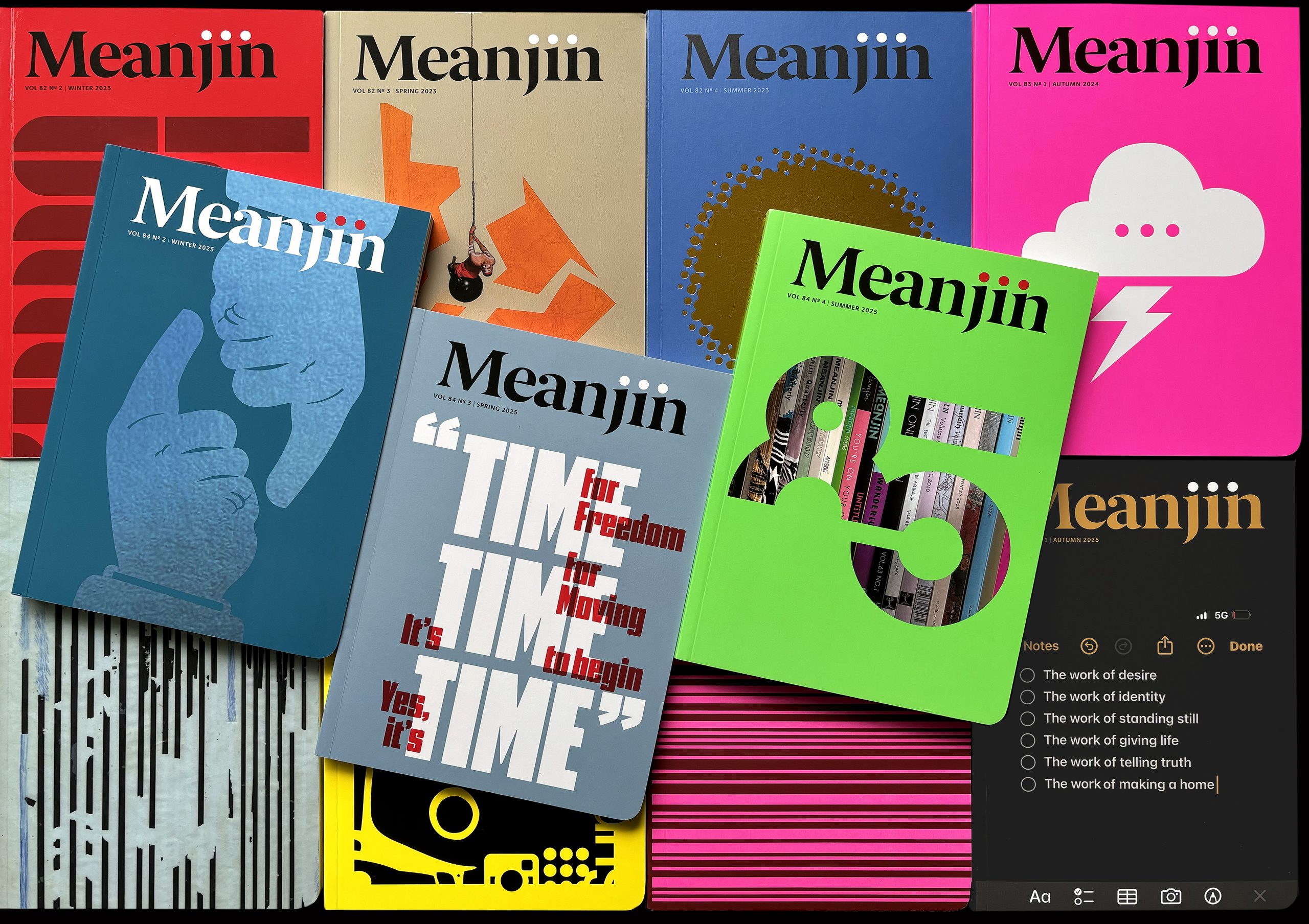
Meanjin
design Letterbox | editor Esther Anatolitis | publisher Melbourne University Press
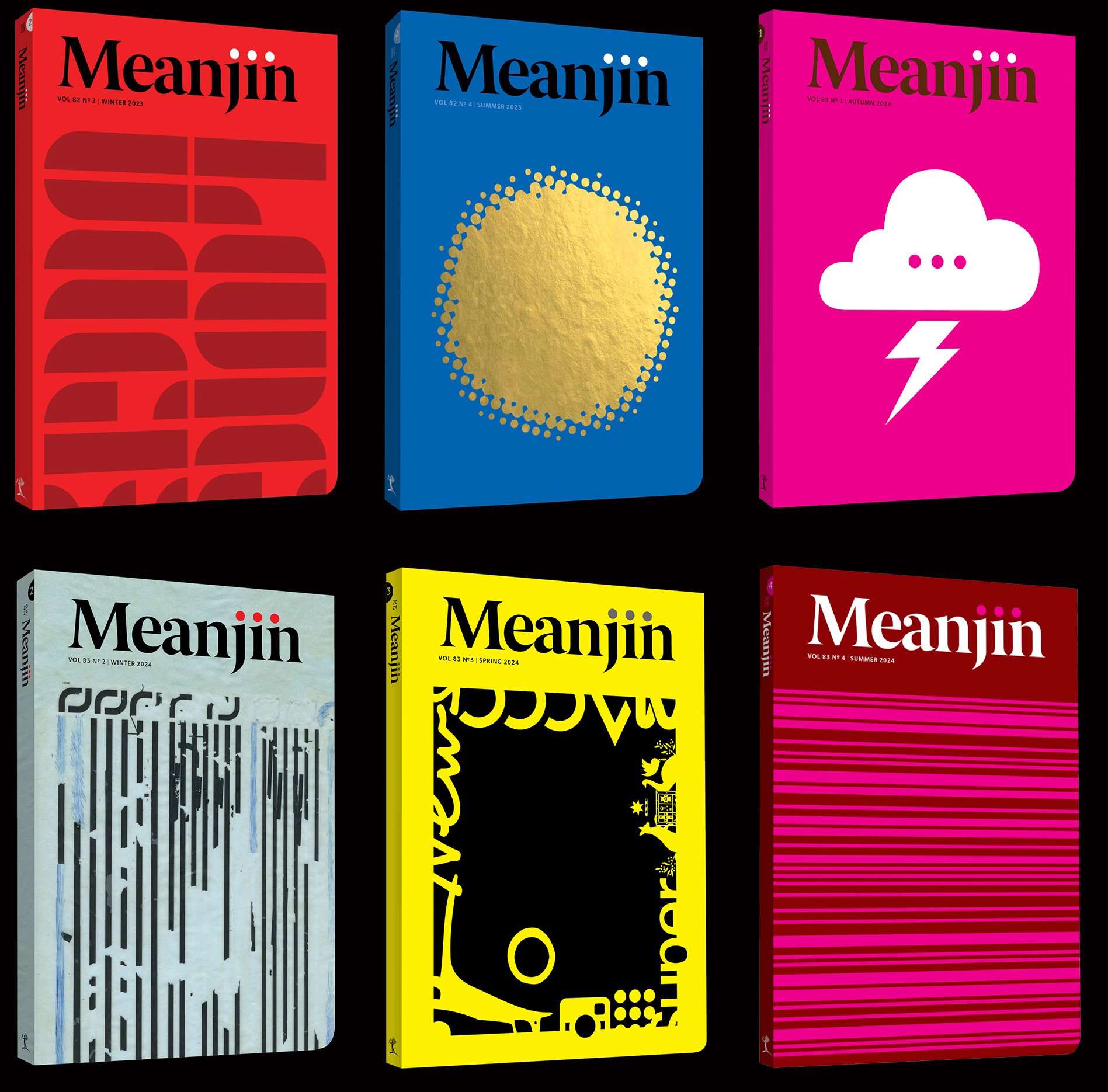
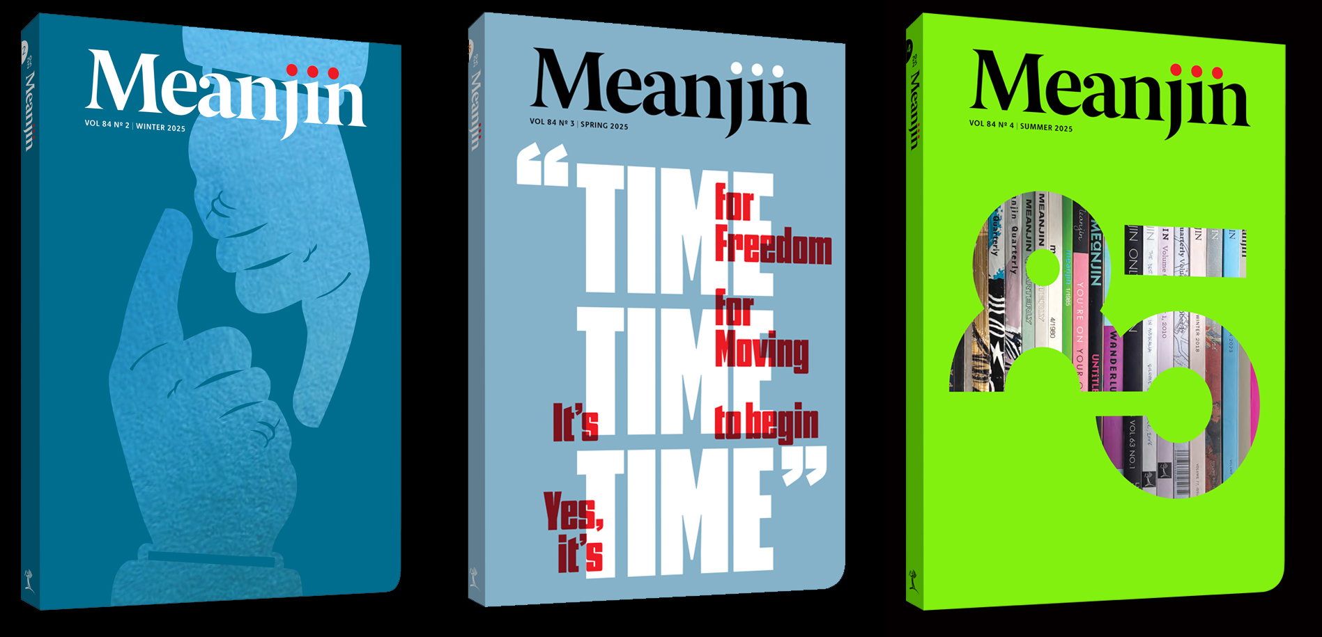
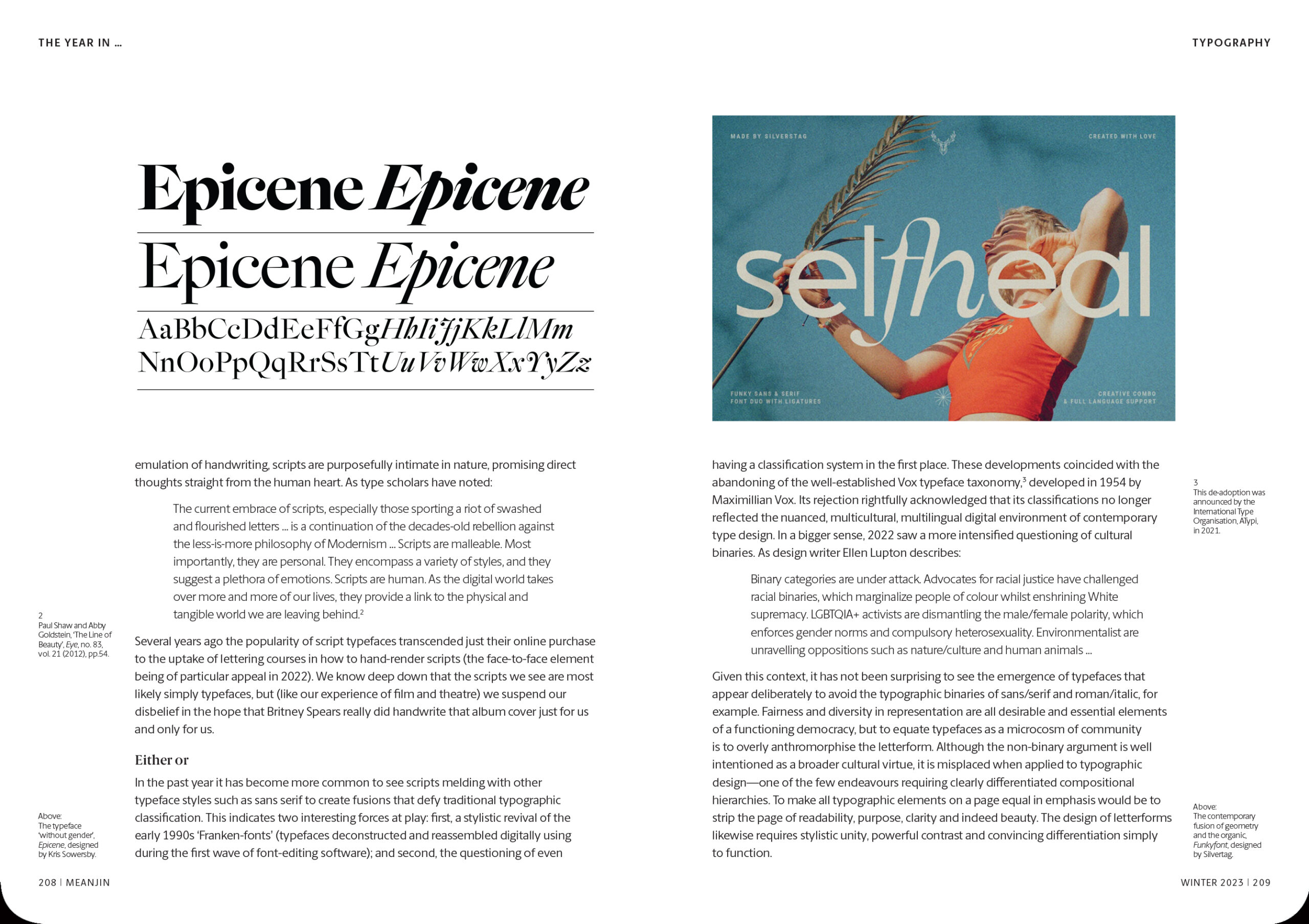
Redesigning a renowned literary journal founded in 1940 presented a design challenge that was both exciting and daunting. Although the redesign celebrated this rich legacy, Meanjin needed to speak to new audiences with different cultural experiences and expectations.
Our design strategy emphasised the character of Meanjin as both bold and subversive. Central to this is the ‘ellipsis’ formed by the name’s unique letter combination, playfully extended by the addition of a third dot. But it is in the meaning of the ‘ellipsis’ where the real story lies – the welcome of response, anticipating further discussion. The ellipsis form represented and reinforced Meanjin as a space for ongoing cultural and literary discourse.
Despite these publishing ideals, Meanjin was controversially closed in late 2025, highlighting the limitations of free political expression, even in supposed democracies like Australia.