Stettler
designer Wayne Stettler digitisation Letterbox
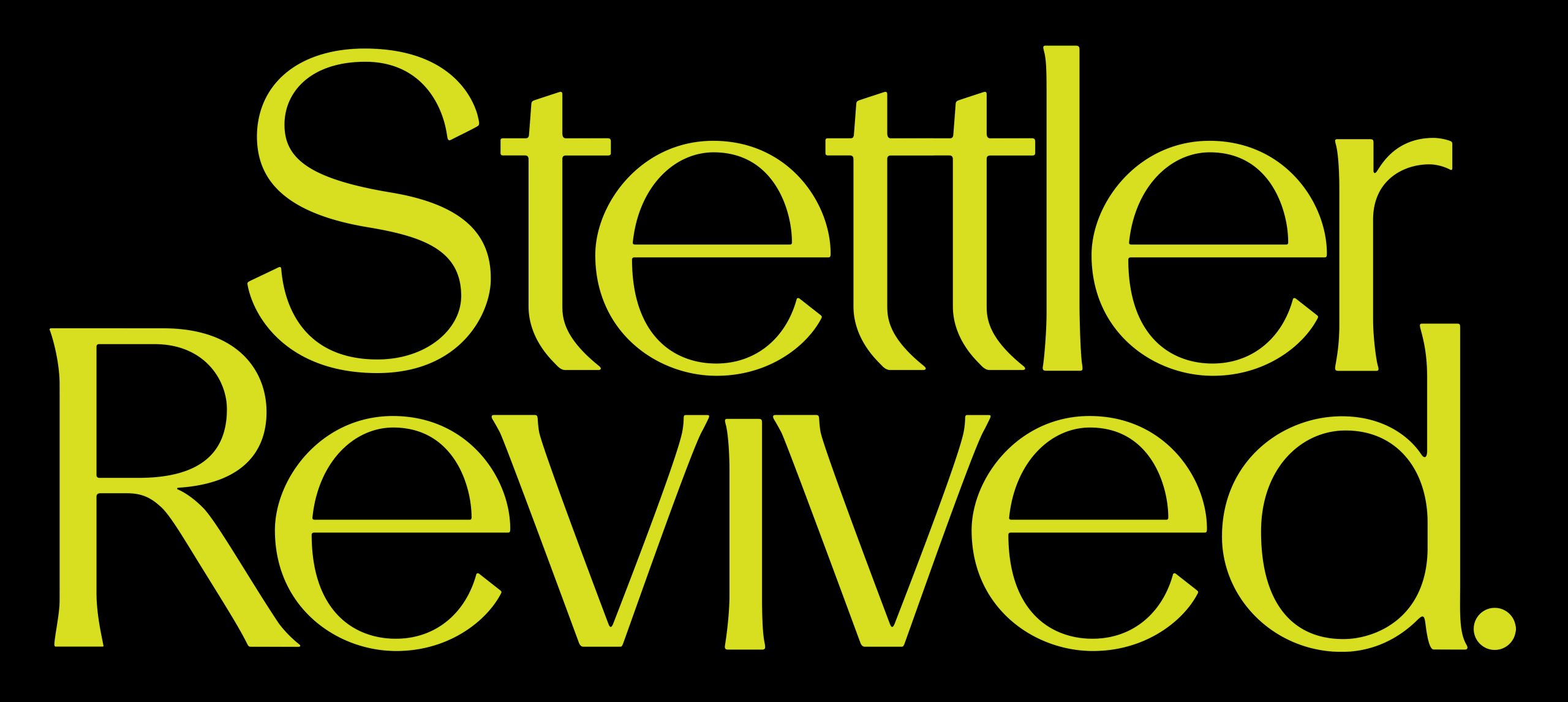
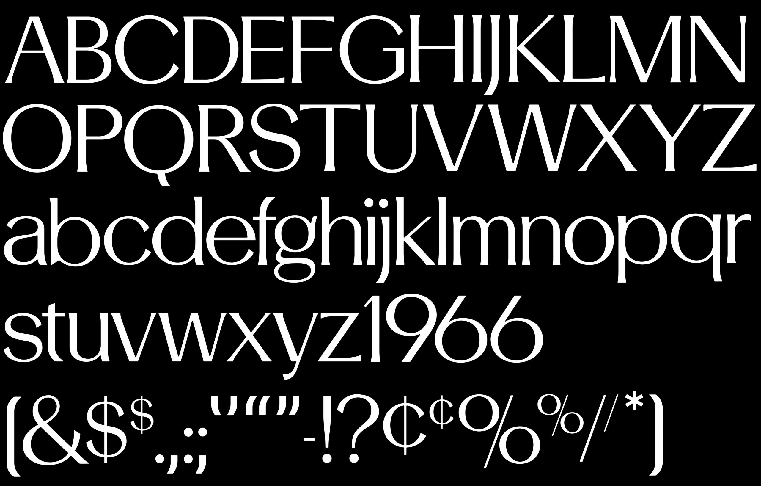
Drawn exclusively for the titling of the At Dusk, Under the Clocks exhibition, this typeface is based on Stettler designed in 1965 by Wayne Stettler (1934–2011).
The Pennsylvanian-based designer is perhaps better known for Niel Bold (1966), a popular packaging and advertising typeface. This completely redrawn face embraces the spatial intimacy of the phototypeset era, working best when set very tight (it is a contemporary of Lubalin & Carnase’s Avant Garde after all). Stettler is a forgetten gem, well worth polishing for a whole new generation. In accordance with the estate of Wayne Stettler, the redrawn typeface is not available for purchase.
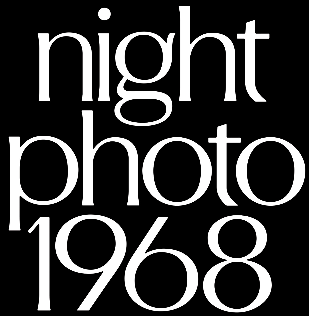
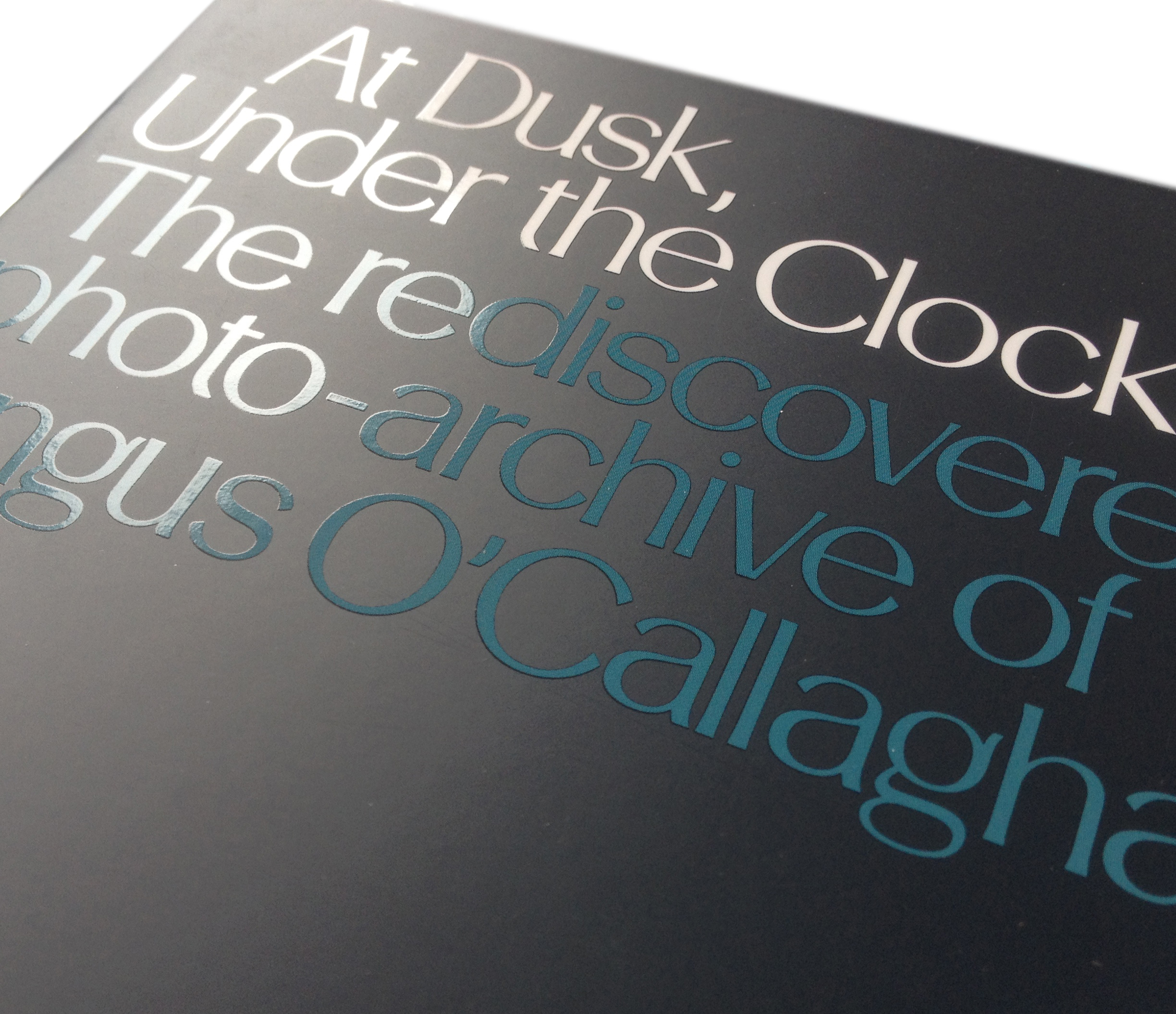
Stettler used in the exhibition catalogue for At Dusk, Under The Clocks (2014)
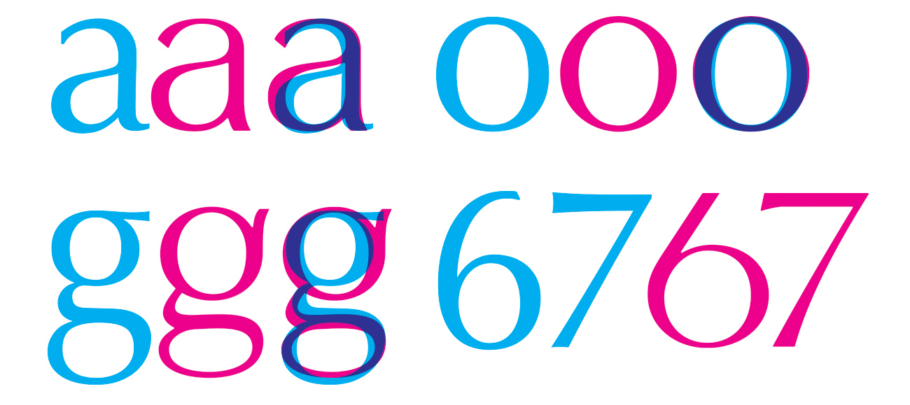
Structural comparisons between Stettler (magenta) and Hermann Zapf’s Optima (Cyan)