Typographic Stories of City Streets
writer Rick Poynor Published Design Observer on 3 September 2012.
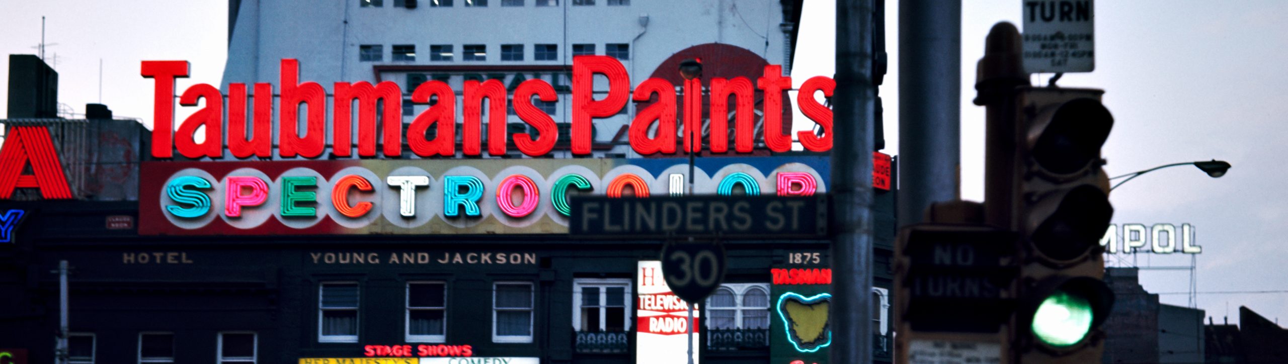
This beautifully atmospheric photograph was taken in Melbourne, at the city’s busiest intersection, by a school teacher named Angus O’Callaghan. The exact year of the twilight scene is unknown, but it’s thought to be around 1969. O’Callaghan had rediscovered an earlier interest in photography and between 1968 and 1971, in the evenings and at weekends, he would wander the streets of the city taking pictures with two Yashika twin-lens reflex medium-format cameras — one for black and white and one for color. He hoped his pictures might make a book. No one was interested and he filed away his negatives and transparencies in a shoe box where they remained unseen for decades.
Now, at last, the picture has found its way into print, along with two other fine shots by O’Callaghan, in a book titled Characters: Cultural Stories Revealed through Typography by Australian designer and Melbourne resident Stephen Banham. I can’t claim any detachment when I warmly recommend Banham’s book. We have known each other for years — I interviewed him a decade ago for Eye — and he asked me to write a foreword, so I did. His book is even better than it promised to be on the basis of the proofs he sent me, a significant study of the way that type and letterforms can be interpreted as vivid narratives of life and history in our cities. It’s a worthy companion to earlier books about public lettering by Nicolete Gray, James Sutton, Jock Kinneir, Phil Baines and Catherine Dixon, and the investigations of street signs in Herbert Spencer’s Typographica.
Banham focuses entirely on Melbourne and the concentration on a narrow national subject might be assumed to limit the book’s appeal, though he keeps his options open with a general-sounding title. That’s a wise decision because Characters has just as much to say to someone living in Memphis, Manchester or Madrid. Its thick layering of examples and deep sense of history and place are its point. Banham’s attentive readings demonstrate a procedure for noticing and investigating our urban typographic fabric that can be applied to cities everywhere, and rather than assemble a broad array of superficially appealing locations, it’s the specificity of his undertaking that serves to make his case. To know a city’s signs as well as Banham knows Melbourne’s you probably need to live there
I have chosen here to show a few of the book’s historical photos, though many of the shots Banham presents are contemporary pictures of more recent signs. For objects assumed to be primarily a matter of utilitarian communication, public letterforms are instilled with reserves of expression that only seem to grow deeper and more poignant over time. Rob Walker writes of dancing about architecture and one reason we might want to do such a thing would be to try to embody, through the organised articulation of our limbs, the emotional sensations that buildings — these mute symphonic masses — can evoke in us. Architecture, especially older, more visually elaborate forms of architecture, is a kind of frozen music, as Goethe termed it, with themes and movements, rhythms, counterpoints and grace notes. The letters that enrich buildings and complicate them with an epidermis of linguistic meaning are much the same. In their forms and progressions, they suggest the body and postures of a dancer, as though the letters are also dancing about architecture — there are many instances of alphabets composed of bodily forms. In their now antiquated period styles, these old letterforms have absorbed and condensed the atmosphere of the times that shaped them, of the people whose lives washed around them, into musical symbols, like lines of notation flowing along the rooflines and across their facades.
Perhaps those who weighed up O’Callaghan’s picture of the Taubmans Paints sign when it was taken found it to be merely ordinary. (His photographs were finally discovered, and then exhibited in 2010, when a gallery director saw them at a school auction.) Everyone in the city would know the junction of Flinders and Swanston streets. The Young and Jackson Hotel, one of Melbourne’s oldest pubs, is still there, though it’s now crowned by a huge electronic message display, an architectural disparity just as glaring, if not quite as charming, as the old paint ad. Yet whatever it looked like in reality (and I reckon it would have looked rather fine), in O’Callaghan’s picture the hot red sign spread across molten pillows of Spectrocolor, and accented by the sharp gothic points of the Olympic tyres sign, is a fabulous apparition of 1960s prosperity presiding over the bustling street corner in the velvety evening light.