After the Shouting:
The Post-Grapus Generation
writer Stephen Banham published Monument Magazine and Baseline Magazine (UK) in 1999.
Perhaps the most succinct way to visualise contemporary french graphic design is to conjure up the image of a teenager simply turning up the volume of a walkman as a response to a parent’s lecture. After all, it is said that every generation wishes to dismiss the one preceding it, erasing it in the glory of the present and this is certainly the case for contemporary french graphic designers who are seeking to redefine their practice just as their predecessors did.
Although contemporary french graphic designers cannot fail to acknowledge the strong design heritage that lies behind them – from the typographic origins of Maximilien Vox, Charles Peignot, A.M Cassandre through to Roger Excoffon and Adrian Frutiger – it is still the socially-motivated Grapus group of the late 1960’s that holds the all important point of departure for the younger generations of graphic designers now working in Paris.
The involvement of graphic design in social and political life appears to be deeply rooted within French culture. The keystone of an entire generation of designers in the 1970’s and 80’s was Grapus – a collective whose members included amongst others Pierre Bernhard, Gérard Paris-Clavel and Jean Widmer.
Grapus, whose social awareness emerged from the Paris riots of May 1968, ‘was a figurehead in the political and social action pursued through the medium of graphic design’1 redefining the term ‘graphic design’ in France from being that of the trade of a commercial artist, illustrator or typographer into one that would be directly involved with social change. This influence held strong not just in practice but also into education, going some way to ensure further generations would carry this belief.
It is said that in the post Grapus environment, French graphic design is caught between the forces of ‘globalisation and grassroots. Between social generosity and corrupt merchantilism’2. A more geographically-based explanation of the french position is one borne of external design influences – the Swiss love of order colliding with the social agitation of the Polish. I would suggest a third ingredient has now been added to this mix – American graphic design. The influence of Emigré and David Carson, like elsewhere in the world, is a profound yet potentially homogenising one. The American design culture brings with it a strong commercial sense and the conspicuous (aka the design superstar) which may in time have a marked effect on the more culturally-specific work of Parisian designers.
So what does Grapus mean for contemporary French designers? The three member all-female design group, Therese Troika find it very important, indeed complimentary, to integrate socially-orientated design work with their commercial commissions. As a result, they find their week’s work ranging from doing exhibition design for the Louvre museum through to designing banner logos for an upcoming public housing demonstration. This social sensibility defines itself as being involved with the rights of the citizen but is independent from the political alliances that characterised the reign of Grapus. ‘Although we know what we owe much to Grapus … we have an entirely different attitude to power. The Grapus were men very excited with power relations – against the client, against the authorities. We deliberately define ourselves at the opposite of this kind of client relationship. Our work is based on a certain quality of listening’.
Although design groups like Therese troika continue to pursue social objectives there is no doubt that this belief in ‘graphic intervention’ both defines and divides generations of french designers. Younger designers, who, as Therese Troika put it, ‘Don’t produce logotypes, they produce egotypes’3, state that they take a more ‘pragmatic’ approach to their design, dismissing the agendas of their predecessors as ‘redundant’ – politics is considered an external thing, something not to be directly involved with the design process. This is not to be viewed as apathy but rather a separation of political views from the agenda of the design piece. This ‘generation gap’ is bound to widen as the current crop of design students – those born after the upheavals of 1968 – will feel absolutely no connection at all with the need to intervene into areas of social change through their graphic design.
Christophe Jacquet, a designer widely known as Toffe, sternly rejects what he describes as ‘the heavy, often moralistic , socially orientated work of Grapus‘, preferring to encourage personal politics and engagement. “I don’t like the way graphic design always decides on a final solution – it’s not a perfect thing. Maybe instead we can put the work on the table and say ‘right, let’s start the discussion”. His work, a mix of commissioned work and personal projects, reflects this honesty in expressing where the designer lies in the scheme of the work – more like a series of questions and plays rather than self-contained solutions. Toffe sees no division between the process of design and the process of living. “It’s all performance”4.
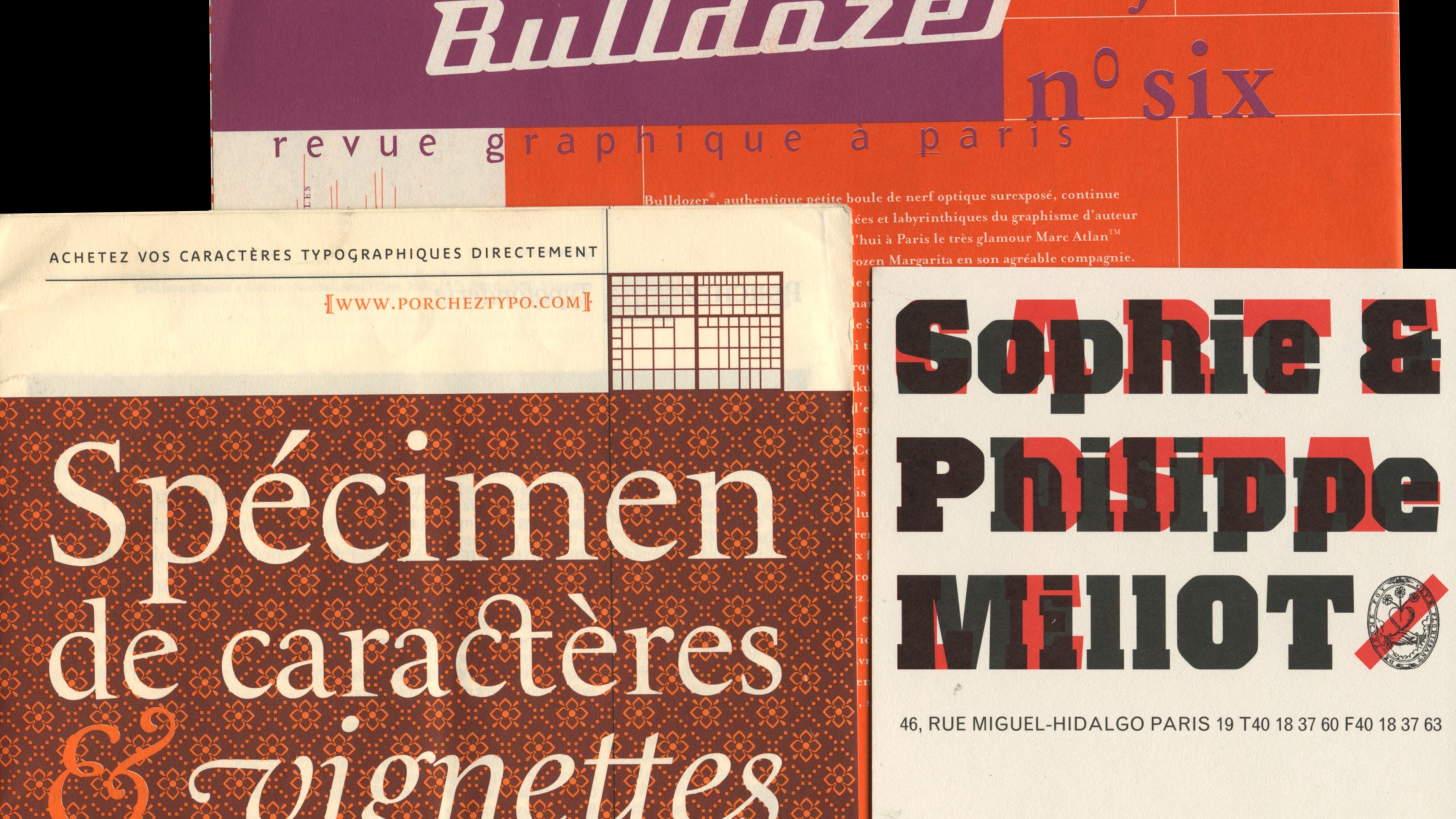
“Students are quite comfortable with the fact that designing a yoghurt package is not going to change the world’6 says Jean-Francois Porchez, a noted young French type designer and teacher of typography at the Ecole Nationale Superieure des Arts Decoratifs . Porchez’s own work has included Parisine – the new typographic system for the Paris Metro system, FF Angie – released by Fontshop and Le Monde – a customised face commissioned by the national newspaper of the same name. ‘For a period of about 20 years, crafts such as typography were put to the side. The Grapus drive for design to see value only in political and social content meant that the corporate work, seen as less worthy, went to the swiss influenced designers such as Jean Widmer. As a result, the typographical choices were very limited. But with the fading influence of the Grapus generation coupled with the advent of type technology that now enables younger designers to design type, there is now a resurgence of french typography’. As if to formally signal this emergence, the 1998 ATypI conference, convened by Porchez and held in France, focussed on the nation’s new typographic designs. In addition, the publishing of Lettres Francaises, a book chronicling new French type designs, also signifies a confidence in the nation’s typographic future.
Previous to Porchez’s commission to produce a customised font for the extensive Paris metro system, the signage was an odd mix of the previous Frutiger and a curious 90% compressed Helvetica. To add an element of humanity to the often cold, harsh and unfriendly atmosphere of the hectic Paris Metro, Parisine offers the commuter a softness through rounder typographic forms. One criticism of this new typographic system is the lack of any overall usage guidelines in its implementation. As a result, the often inconsistently set Parisine is not seen at its best and does not do Porchez’s work justice.
One young designer prominent at this occasion was Philippe Millot, who, when asked what motivates his generation, given the lack of social agenda, responds “I think the motivation lies in the poetry of graphic design. We are simply wanting to produce good work, expressive work, at times experimental, but meaningful on a more intimate level”. Millot, like many of his generation, have embraced a love of typography into their work. Personally influenced by french type designer Roger Excoffon, who ‘it can be said that he was … responsible for the corporate identity of France‘7, Millot suggest that french designers may consider the pre-Grapus designers as a point of reference to once again combine a love of typographic craft and cultural identity.
Unlike Australia, very few graphic design graduates go out on to start their own practices, preferring to work for their professor’s studios and the like. It is therefore not unusual to find these independents forming collectives where a variety of talents can be accommodated. On a more practical level, this allows for the opportunity to participate in the french pitching system, whereby major commissions are awarded to competitors only after months of speculative work.
M/M, founded by Michael Amzalag and Mathias Augustiniak, are one of the first of a new generation of graphic designers prepared to set up their own design methodologies. Dismissing the college choice of either being a modernist under Jean Widmar or a revolutionary under Pierre Bernhard, M/M are now producing work for the likes of Martine Sitbon, Yohji Yamamoto, the fashion chain, APC and many music labels, aided by Amzalag’s former involvement with music magazine Les Inrockuptibles. What is most notable is the multiplicity of their output – it doesn’t always look like graphic design. Drawing upon a wide range of cultural references, it achieves an ambiguity of meaning that is more akin to our notions of fine art. “we are quite happy changing the world in a very small way”8 said Augustiniak in the matter-of-fact manner of his contemporaries.
At its most order-obsessed, even contemporary French graphic design can suffer a familiar Modernist austerity and banality – the kind borne from any strictly ideologically based-solution. The initial corporate identity of the fashion chain, APC, designed by Rik Bas Becker, is an unfortunate case in point. It has recently been taken over by M/M who are providing more depth although still puzzled by a brief that states that the APC identity should be ‘undesigned’. This illustrates a common systemic problem in graphic design – clients in France are simply not used to briefing graphic designers.
Another independent collective, the six member Labomatic, work on commissions for the entire group as well as on projects for each individual. Two of the founders of Labomatic, Pascal Béjean and Frédéric Bortolotti, co-produce, with Anne Duranton and Philippe Savoir, Bulldozer magazine – a publication created to lift the profile of French graphic design both within and outside of France. The national cultural identity so prized in former generations of french designers seems to have faded. According to Béjean ‘There is little point in putting a French label on the style. This is possibly the age of the universal designer – Bulldozer’s form is universal but its concerns remain French. After all, we all read the same publications, watch the same films, so why should our design be dramatically different? 9.
Seemingly oblivious to the politics of Grapus is the Paris-produced publication Specimen. Not directly concerned about profiling figures or issues in contemporary design, every issue offers a thematic cultural study. Previous issues have featured the cultures of mexican wrestling (issue 2), Australia (issue 1) and the immigrant experience (issue 4). Its producers, Olivier Andreotti and Pénélope Monnet, are now centring their future projects on more limited edition book/art objects rather than the broader world of magazine publishing10. Publications such as Specimen can be viewed as indicative of the present generation in that they offer an observance of culture without a heavy-handed social critique. Whilst the older members of the design profession may view this as passive and ‘blind to the real world’11 it may appear to others as refreshing non-judgemental in nature.
One of the measures of a healthy graphic design culture is to gauge the dialogue and debate that exists within the field. To this end there is certainly heated debate between the various generations of French graphic designers with their respective agendas. This has resulted in a progressive period as the profession questions whether it should directly reference its past or discard it for an entirely new approach to design. In Paris at least, current graphic design appears to be shedding the tattooed skin of the older militant generation and looking elsewhere. Which direction that is or whether that view is inward or outward is still the subject of passionate discussion. Whilst conscious not to simply trade on its heritage, french graphic design is using this valuable experience to define itself once again in an increasingly uncertain global future for graphic design.
1. Commitment and re-commitment, Les Aprétes, 1996.
2. Ambivalence, Signes (Signs) Magazine 15/16, Michel Wlassikoff, 1996.
3. Discussion with Therese Troika, Paris, December 1998.
4. Discussion with Toffe, Paris, January 1999.
5. Discussion with Jean Francois Porchez, Paris, December 1998.
6. Discussion with Phillipe Millot, Paris, January1999.
7. Discussion with M/M, Paris, January 1999.
8. Discussion with Pascal Bejéan, Paris, January1999.
9. Discussion with Specimen, Paris, January 1999.
10. Interview with Gerard Paris-Clavel, Eye magazine, no.27 Vol 7, 1998.
Top image: Parisine, 1996. Typeface designed for the Paris Metro system by Jean Francios Porchez (detail), Address card designed by Philippe Millot, 1998 (detail), Bulldozer issue O from 1994. Produced by Pascal Béjean, Frédéric Bortolotti, Philippe Savoir and Anne Duranton.