Accidents Not So Grotesk
writer Stephen Banham published Letterbox site for the Character 3 Forum (2005)
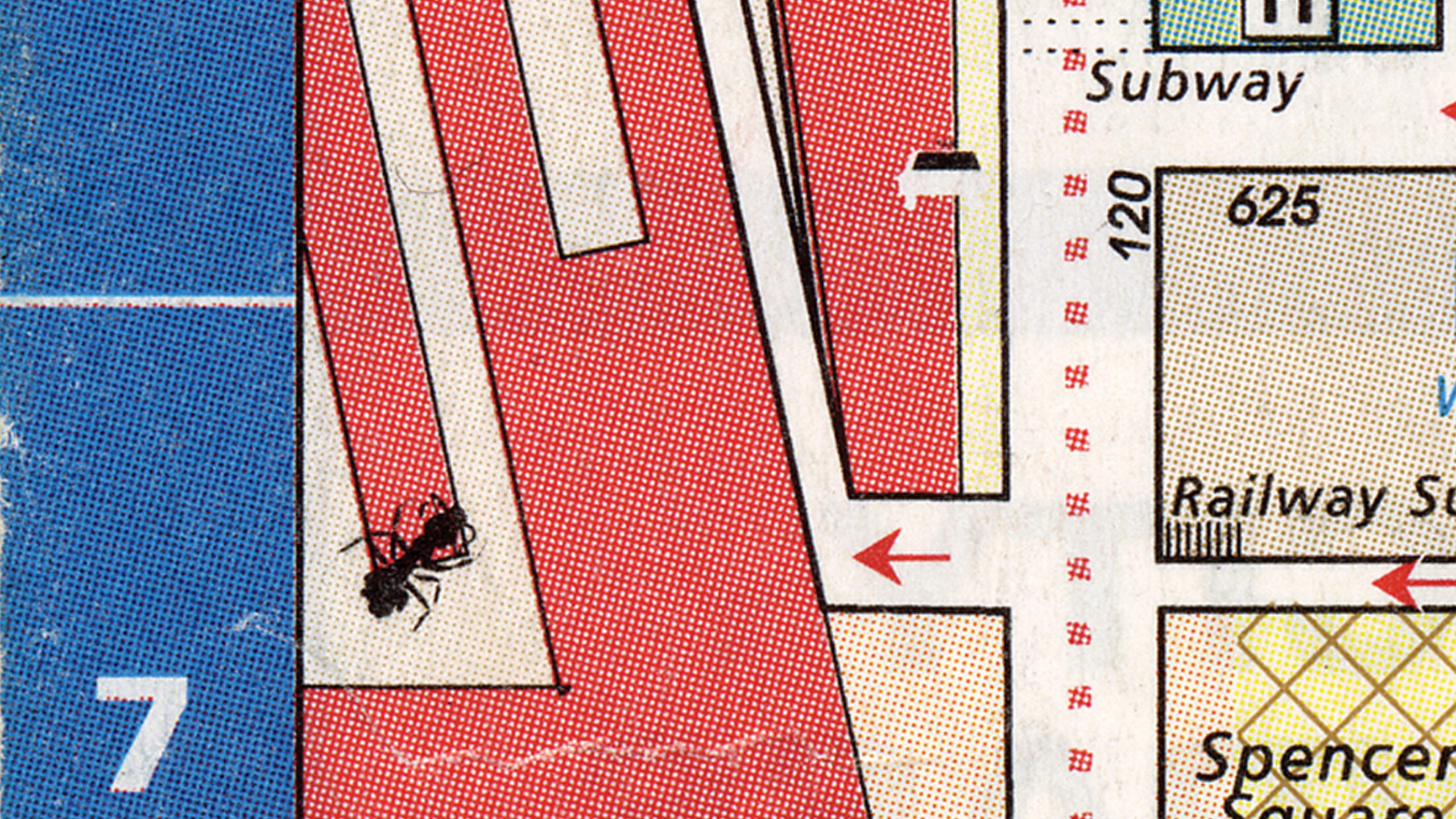
During the printing of the 1999 Melways Directory (the most popular Melbourne streetmap), a solitary ant accidentally wandered onto the black printing plate of Page 1A, a detail of the central city. Embedded into the printing plate, its image was printed on 20,000 copies of that edition. The ant was positioned over what is now Southern Cross Railway Station, creating a surreal image of a giant mutant insect menacing the commuters.
What is so appealing about this story is that it adds a new layer of storytelling to graphic design. Maps are after all abstracted topographic depictions of geography so the addition of a humble ant brings to it a welcome organic element. Within the Melways Mapping office the ant has gained an almost folkloric status – everybody knew of the ant and of the ‘special edition’ that year.
To suggest that the more interesting aspects of graphic design are often those found on the outskirts – the things that happen before or after the actual design process – is not a new idea perhaps for practitioners but for a broader public not often exposed to discussions of design, the role of accident offered an immediate and accessable entry point.
The ‘ant’ story is but a small part of the exhibition Accidents Not So Grotesk curated by Letterbox for the Melbourne Design Festival. It focuses on the the role of accidents, those odd and unpredicted happenings that influence, contribute or just plain skew the creative process, and how they may offer a rich vein of possibility for graphic design.
The exhibition was part of Character 3 – a series of free public forums discussing the social and cultural aspects of graphic design and typography. Past Character events have included discussions on whether a city can / should be style-guided, why does graphic design position itself political neutral and has also featured 26 letters a second, Australia’s first typographic film festival.
The idea of focussing on the role of accident emerged from a hopeful yet unsuccessful project of calling upon the Australian graphic design community to display errors they have made in the design process and the outcomes (a kind of graphic design bloopers). The great enthusiasm yet complete absence of actual submissions to the call reinforced that whilst there is curiosity and interest surrounding the idea of creative errors, our profession does not take kindly to publicly airing its human frailties. Acknowledging this fact, it was decided to rephrase ‘mistake’ with ‘accident’ – therefore allowing the all-important element/excuse of the external force (fate) to play its hand. That was much better received.
The Accidents Not So Grotesk exhibition itself consists of huge trolley-like boxes (some 2.6 metres high and 1.2 metres wide) parked in Melbourne’s Federation Square. On each panel were displayed in bold typography (featuring FF Quadraat as well as our very own Kevlar Slab and Scriptface Terital) the stories of accidents – covering the topic in general at first first and then more specifically relating to the creative fields then finally to graphic design itself. The scale and unapologetic public presence of the accident boxes made them quite a point of interest to locals and tourists alike. After all, everyone loves a story.
All typography in the exhibition was stencilled directly onto the boxes, integrating the letterforms into the tactility of the coarse wooden surface. Needless to say, this process was extremely time-consuming and laborious – the task being rewarded with what are quite unique structures.
The introduction to accidents was deliberately positioned for reading upon arrival to enable the general public to engage with the notion of accident as a phenomena – such as the possibility of learning from accident ;
In May 1990, a container ship carrying Asian cargo to North America encountered very rough seas in the North Pacific, and several steel containers of athletic shoes fell overboard, broke open, and dumped some 80,000 shoes into the sea. The shoes floated nicely and were swept along by the ocean currents until they made landfall along the western coast of North America.
Knowing the location where the shoes entered the sea, and the eventual destinations they reached, enabled oceanographers to map ocean currents and better understand how the narrowing and broadening of the currents, and the eddies they create, led to the transport and dispersal of a tracer, in this case, the floating shoes… this experiment has been inadvertently repeated twice more, in January 1992 when containers with 29,000 bathtub toys washed overboard in the North Pacific, sending blue turtles, yellow ducks, and green frogs to the beaches near Sitka, Alaska, and again in December 1994 when some 34,000 hockey gloves were ‘lost in sea’.1
And even included the more commonly known tales of accident contributing to our everyday lives:
The invention of post-it notes came about by sheer accident. In 1970, Spencer Silver was working on developing a strong adhesive for 3M research laboratories. Instead he developed an incredibly weak one. In 1974, another 3M scientist, Arthur Fry, used some of Silver’s weak adhesive to keep his markers in place in his hymn book. In 1980, 3M started distributing Post-It Notes nation-wide. 2
The role of mistake was then discussed within the context of the creative process. This included the errors made in research and how these can be read differently from different perspectives;
What’s the colour of the universe? Karl Glazebrook and Ivan Baldry of the Johns Hopkins University in Baltimore, Maryland, worked out a method of combining light from 200,000 galaxies within two billion light years of earth to answer this seemingly frivolous question. By converting this cosmic spectrum into the colour the human eye would see when exposed to it, the scientists were able to announce in January 2002 that the universe is somewhere between pale torquoise and aquamarine (close to Pantone 7472 or 7465). Several months later, the scientists had to reluctantly concede that due to a bug in their coding, the true colour of the universe is closer to a somewhat more disappointing beige. Like say, Pantone 4545. Glazebrook was quoted as saying’ there’s no error in the science. The error is in the perception’. 3
For such a young and still-to-be-defined profession as graphic design (though so prone to over-defining itself) embracing accident may allow new perspectives on how to view a design project. Though not strictly concerning accident in its true definition, these stories were included in the exhibition as they offered expansive and lateral possibilities;
There’s a university in Buffalo, in New York State. The Campus there was relocated twenty years ago, so the architect could completely redesign it. He built the entire site but didn’t put any paths in – he just left it as gravel. There’s very heavy snowfall in New York in winter, and as the campus began to be used, students began to navigate around the campus, leaving paths in the snow, so if there were a lot of people walking on the path, it would end up very wide, and the ones that weren’t used as much were narrower. The architect then sent a helicopter up to make an aerial photograph of the campus, then plotted all these ‘desire lines’ on a map and built the paths in the same positions with the same widths as the desire lines. 4
Melbourne graphic designer David Lancashire’s ‘Ansett typefaces’ were generated by allowing the turbulence of the plane’s journey to dictate the design of the letter forms. Each font is named after the flight number. He also experimented with drawing typefaces in the back of taxis and in the dark, allowing the phenomenon of chance to take an active role in the design. 5
Finally, the role of the random was introduced as a way of engaging the general public to see the alphabet beyond the standard keyboard character set and font menu. Who could resist the experimental projects of Letterror for this;
The Beowolf typeface, by Dutch type designers Erik Van Blokland and Just Van Rossum of Letterror, is a typeface that gradually (and seemingly randomly) deteriorates and changes every time it is used. Using what Letterror call ‘random technology’ Beowolf is programmed differently each time it is printed – giving the user the sense that the typeface is in a constant state of flux.
In 2003 Letterror produced a typeface called Twin that changes its form in response to real-world factors such as temperature fluctuations and traffic conditions. When it is 10 degrees Fahrenheit below zero, the characters are formal – featuring sharp and distinct serifs. If the temperature reaches 100 degrees (37.7 degrees Celcius) they morph into a rounded informal, its letterforms becoming rounded. When a heatwave is imminent, motorists passing an electronic billboard might view an advertising message with rounded letters, while squarer text might signal an approaching cold front. Over time, the designers have learned to associates the typeface’s shape with the weather. In winter, the serifs can made the typeface look more severe. In warmer weather, designer Erik Van Blokland describes the summertime version as “friendly and rounder”.
Although the exhibition employed humour to engage the public, the perils of maintaining the status quo service provision model – without acknowledging or embracing a more humanistic and lateral approach to design was clearly spelt out to all by a paraphrase of a text by Petr Van Blokland;
Corporate IDMaker is a web based server program that simulates the design process for corporate identities. It takes information from a customer, selects what it needs from a predefined set of elements and ready-made formats from a library and creates solutions that will fit the customer’s needs. The output can be downloaded from a website.
The program works through a decision tree. The result of every cycle is presented to the customer as a menu of visual options to select from. With this choice as input for the next cycle, the program narrows down its scope of possible options to a workable design. The process leads to a set of corporate basic elements: a logo, a selection of typefaces, a colour scheme, a grid and layout formats. The customer can go through a list of applications for stationery, forms, folders, brochures, website and (of course) a corporate manual. The customer adds them to their shopping cart and the total amount is charged to their credit card. 6
The open public forum itself drew over 400 people and featured a panel of speakers whose perspectives were varied and colourful, ranging from UK Design writer Anna Gerber (author of All Messed up; Unpredictable Graphics) to a mathematician/ comedian who proved that accidents in fact are ‘ideas for free’ and are a natural part of the evolutionary process.
Thank you to Samantha Neumann, who discovered the squashed ant in the Melways during her Honours Project. A wonderful and very perceptive find.
1. Uncertain Science, Uncertain World, p.140, Henry M. Pollock, Cambridge University Press 2003.
2. All Messed Up – Unpredictable graphics, Anna Gerber, Lawrence King Publishers 2004.
3. All Messed Up – Unpredictable graphics, Anna Gerber, Lawrence King Publishers 2004.
4. Ryan Gander, Dot Dot Dot 6 (2002).
5. Stephen Banham, Character 3 (2006).
6. Petr Van Blokland, Corporate ID Maker: Proposal/Notes (Dot Dot Dot 4)