Face & Place
writer Stephen Banham published Desktop Magazine Issue Nº293
In 1998 I produced a series of ‘typographic proclamation’ stickers which we mailed out worldwide for free. One of these brashly stated ‘Never trust fonts named after cities’. It proved to be one of the most popular stickers and was a direct comment on the system fonts prevalent in the early days of desktop publishing, namely London, New York, San Francisco, Monaco, Athens and the most well known of these, the low-res classic Chicago. These names were not coincidental but rather the result of a deliberate naming regime instituted by Apple. Looking across the history of typeface design, relating fonts to geography is nothing new. In fact, the relationship between ‘place’ and ‘face’ has been a recurring motif across the history of typography.
In the days of hot metal, typefaces with a geographic reference may have inferred a national or regional identity and said something of the designer’s cultural background. Frederick Goudy’s Deepdene, for example, refers to the quaint American country town (and his residence in an old mill) from which he worked in the 1930s. More importantly this localised reference gestures to the ‘home-grown’ charm of many of Goudy’s typefaces during this period. In the digital age, naming a font after a location has the added benefit of lending it a physicality, a connection with the ‘real world’. It makes our associations with that typeface more tangible and memorable. It also avoids the inevitable accusations of vanity that come from naming a font directly after its creator.

For type designers, the naming of their ‘offspring’ has always been a popular topic of discussion, and understandably so – it’s how people will refer to and more importantly recall this product of immense toil. Broadly speaking, naming regimes have followed three main traditions: the artistic naming tradition whereby the designer embues the typeface with one’s own ‘signature’, akin to a painting or sculpture (it is little surprise that designers such as Eric Gill, who hailed from an artisan-craftsman tradition, is best known for his sans serif namesake). The trade naming convention expresses a more utilitarian view of type, placing the emphasis squarely on the function and purpose of the typeface. And so we have the ambitiously named Univers, the descriptively named Plakat (meaning poster in German) – and there’s no prizes for guessing what the intention the designers of Nuptial Script had in mind with their contribution.
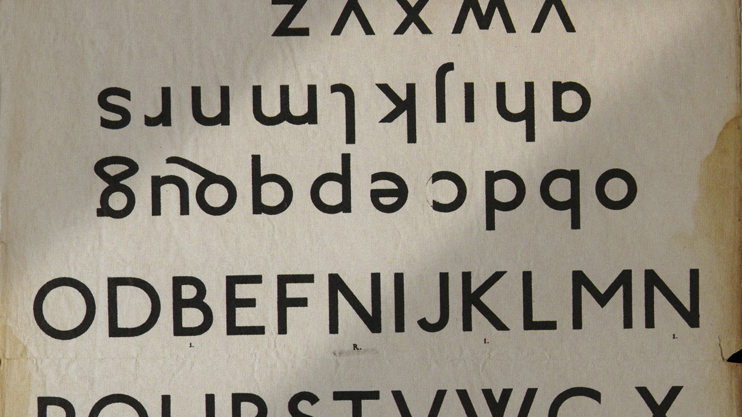
But it is the geographic naming tradition (and through this, a cultural promotion such as Helvetica or Zurich) that seems to carry the most resonance. And it is a naming system that lends itself to entire sets or families. House Industries took this one step further in 2000 by releasing the Chalet family, each style differentiated not only by a different ‘cool’ city but also an era – Chalet London 1960, London 1970, London 1980, New York 1960, New York 1970 etc1. Likewise Emigré enlightened us with the geography of California by introducing us to Tarzana and Oakland.
1. In the promotional material for the Chalet family, the fonts were said to be a revival of the work by forgotten Swiss modernist, René Albert Chalet. It transpired that he was in fact a complete fiction, part of a playful hoax.