Polite Signage
writer Yoko Akama published Desktop Magazine Nº 284
Whether it is standing, smoking, drinking or delinquency, public signage forever dictates a series of authoritative ‘nos’ to regulate public behaviour. Letterbox and Frankston City Council have sought to redefine this with the Polite Signage Program. So please, please read on.
Public signage is a silent sentinel warning us of impending danger ‘WATCH OUT’, controlling us in what we do ‘NO TURNING RIGHT’, and signalling helpful public amenities like ‘TOILET 100M’. Its bold, upper case, sans-serif command carries an authoritative tone and non-negotiable instructions of what we should or shouldn’t be doing in public. Its presence is often ignored as another urban blemish, until the time we realise that we actually need instructions. So, when public signage speaks to us in a friendly, human tone, or even makes us chuckle, it tends to stand out from the norm. Especially if it’s in a place like Frankston, a southern suburb of Melbourne that suffers from a bit of a rough reputation. Public safety is one of the major concerns for its residents.
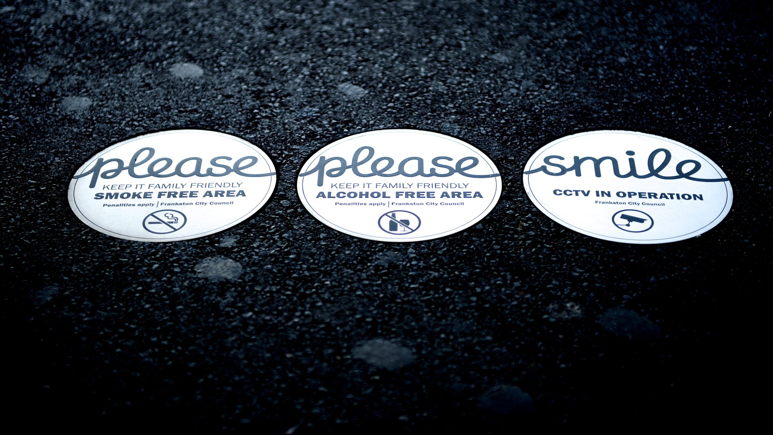
‘Please, please smile’ is a series of the Polite Signage program, commissioned by the Frankston City Council and designed by Stephen Banham’s studio, Letterbox. If you’re already familiar with Banham’s sharp wit, his desire for design to contribute socially and his well-regarded flair for typography (this is putting it mildly), you’ll see that this project is also imbued with his unique character (excuse the pun). ‘Smile – CCTV in operation’, and ‘please keep it family friendly, alcohol free area’, is a series of in-ground circular signage plates in a friendly, almost childlike script. Its success with the commissioning city council has led it to even consider using the ‘please, please smile’ phrase as its tagline, which goes to show how catching this concept can be. Who would’ve thought that public signage could be so infectious?
Another example of the Polite Signage program, ‘to the beach’, is a 1.2-metre high metal typographical sculpture that greets visitors arriving at Frankston Railway Station. It beckons them to a trail that winds down to the foreshore, an oft forgotten and obscured asset of the area that needed to be rediscovered to celebrate it as a signature attraction. In contrast to the heavy metal construction weighing in at 2.4 tonnes, the sign is very light-hearted. ‘To the beach’ is bright red, curly script, expressing a sense of fun and excitement – a presence to eclipse the negativity that often overshadows the railway station. Plans are underway to have short stories and poems carved into the footpath to accompany the casual stroller down to the beach. It is a public invitation to enjoy Frankston’s beautiful coastline. Apparently, it’s already caused a bit of a buzz among local residents and beyond as a local landmark. Hopefully, this will be one of many small positive changes towards destigmatising Frankston’s reputation.
The Polite Signage project asks us to revalue the public assets that we share, whether they be public toilets, buildings, spaces or a reputation. It does so with a whiff of cheekiness and an abundance of trust. Politeness is about showing respect and courtesy, and meaning this by what we do and say to one another. The Polite Signage project demonstrates this sincerity by walking the talk, and not by commanding us as a proxy for an authority. It speaks to the goodness and the playfulness in all of us, to create and cherish a communal asset, rather than telling us that we ought to care (because penalties apply). As any experienced parent, teacher or manager would know, encouragement and positive reinforcements often work better than compliance. As Banham remarks, the signage was meant to ‘bring an element of joy to the street’.
The civic role played by signage increases in salience when we consider signs as symbolic forms that shape and interface with communities. The attitude contained and expressed within these symbolic forms is important because communities are a social construct – in other words, we create them by interacting with one another. We do this within a set of interactions and behaviours that have meaning and expectations between their members. This is constantly being created through actions based on shared expectations, values, beliefs and meanings between individuals. All things social and cultural are stored and transmitted by symbols. Signage is symbolic forms that create and construct the kinds of communities we want to be, and this is a significant step, particularly for a notorious neighbourhood like Frankston. The Polite Signage program is symbolically expressing the shifts and changes that are occurring to the communities themselves. And the wonderful thing about this is that we do this simply, but powerfully, by smiling.
Photo by Matt Irwin Photography, courtesy of the Frankston City Council. Typography by Letterbox. Design & Project Management by Frankston City Design Group.