Space For All
writer Stephen Banham published Letterbox site
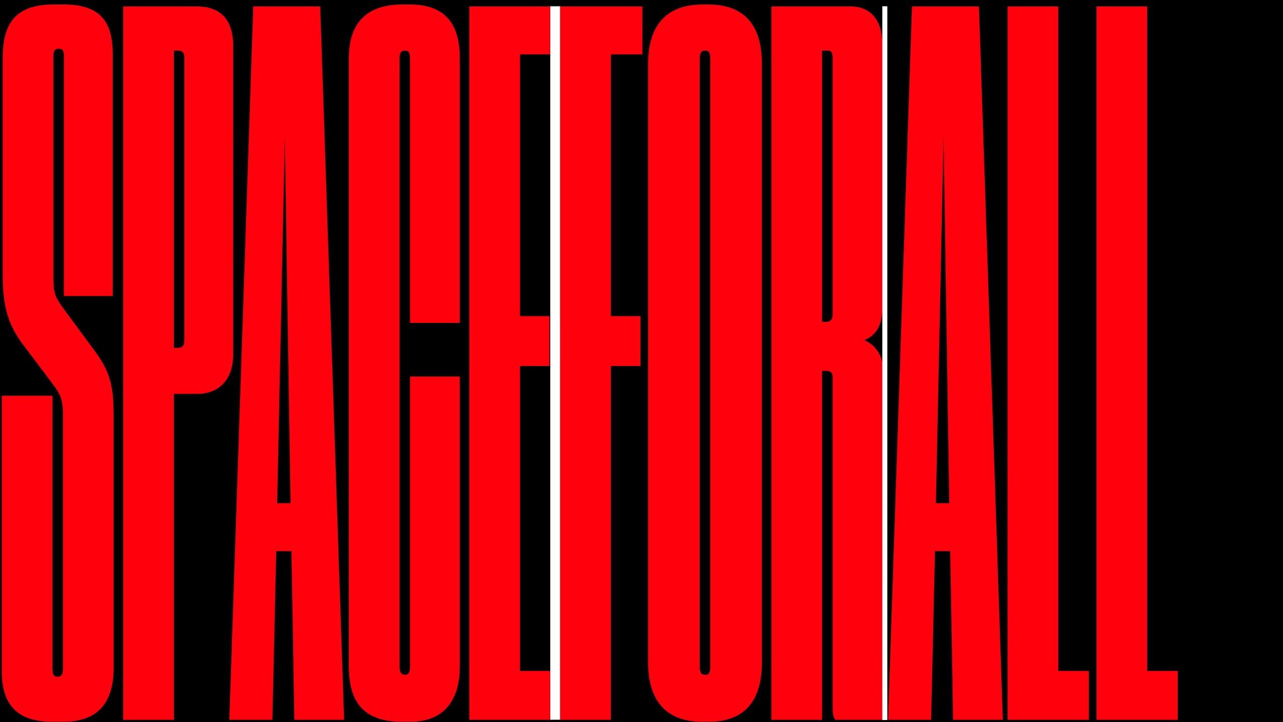
Many years ago whilst standing in a student cafe looking at the accommodation notice board for a room to rent, I found myself startled by one particularly striking notice. Its bold headline stated massage the rapist. After trying to imagine what kind of an odd share household this would be, it dawned on me that it was in fact an ad for a massage therapist. A simple letter spacing problem. Nothing could have showed me in more graphic form the fundamental importance of spatial relationships in typography. So is it just the spaces between our words that are vanishing?
Nevertheless these ambiguities were not unusual during this period (the 1980s) as it was common to see the illegible results of ridiculously widely tracked text (the phrase ‘because I can’ comes to mind). Traditional typographers, their profession now open to the less skilled graphic designers, were outraged at these spatial abuses of their craft. Articles appeared in the typographic press1, stating that the sacred word outline was being broken down into an unreadable patterned carpet of letters. Their protests during this ‘desktop adolescence’ were targeted at the common phenomena of filling space rather than carefully composing space.
And there is a much evidence to suggest that spatial awareness has improved. Generally speaking, graphic designers have become more engaged and sensitive to typographic matters – the choice of typefaces and books on typography have exploded beyond expectation whilst formal typographic education has recovered from the brief and ill-informed time of institutions believing that the use of a computer would mysteriously deliver typographic proficiency. But perhaps the most significant change however has been the rise and rise of ‘the brand’. What had once been the domain of marketers has now become the lucrative lifebuoy for a design industry still trying to define (and justify) itself. So what has the rise of branding got to do with typographic spacing?
The answer lies in what this zeal for branding has reinforced within graphic design; firstly, the sacred emphasis on the identity of the graphic form (the logo) and secondly, the almost pathologically enforced mechanics of its imposition (the style guide). With these two basic ingredients we have the basic ingredients of the brand’s visual identity – albeit along the lines of conventional post-war modernist formula. It’s when it gets to the typographic aspects that things start to get a bit odd.
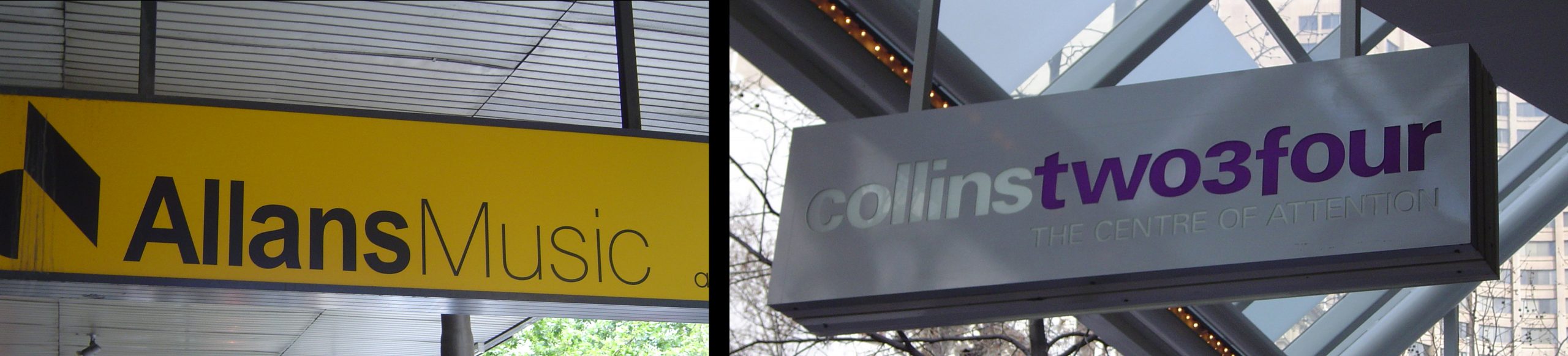
Branding’s adherence to the clear identity and ownership of a word (or words) is of course fundamental to its existence. These words have to be seen as more than just the combination of the words they are – they should be seen as a mark. A distinct graphic identity. Inconvenient internal spaces, such as word and letterspaces, tend to break down this neat effect. A branding mind-set would suggest perhaps it’s best to leave them out altogether.
The sandwiching together of different weights of the same font (a formulaic approach to corporate identity at best) may be acceptable in a context where only one or two words are being used, but now there is no shortage of instances where entire sentences and editorial headlines all run together to form an illegible procession of letters. These can be found in publications where the perfumed air of branding is given greatest prominence, such as in the slavishly aspirational Age (Melbourne) Magazine.
Looking at these glossy pages the reader could be forgiven for mistaking branding with textual information, confusing the selling from the telling. It’s the typographic equivalent to advertorial by which editorial content and advertising material are engineered to blur.