Tall Storeys
writer Stephen Banham published Desktop Magazine
It’s a story familiar to most graphic designers: a paper rep calls by the studio, and after a little chit-chat they invariably bring out the latest printed sample that displays their stock and trade at its best. It’s an elegant, beautifully crafted, masterfully printed prospectus: lush pages overflowing with the luxurious sheen of multi-layered varnishes and foils. What at first appears to be a print piece for a perfume or luxury handbag store inevitably ends up being for something quite different: a new apartment development.
But flipping through these richly aspirational spreads, one is left with the niggling feeling that something is missing, that these pages are somehow hollow. After further contemplating this paper monument and its projected social status, the absence becomes apparent: its superficial beauty belies not only a lack of content but perhaps more importantly, truth. With its foggy vignettes of women dreamily sipping coffee, model couples contemplating fruit at a market, or the all-too-familiar bearded hipster astride a fixed-wheel bike, the cultural references are every bit as narcissistically reflective as the mirror finish of its foiled pages. It is an immediate but ultimately shallow beauty.
Cash-cows
But follow the embellishment trail and you’ll find the graphic design cash-cow – an industry or sector whose momentary boom calls for the services of graphic design. It’s nothing new of course; the Australian graphic design industry has always had its cash-cows. Coinciding with the public listing of many corporations in the 1980s, the annual report soon became the ‘pages of plenty’ for the design industry. Produced to exude confidence and impress shareholders, these reports represented the gravy-train of the graphic design industry, with their well funded and welcoming, lush production values.
The annual report season was, for many studios, a peak period that could sustain them through the rest of the year. These report pages, festooned with layers of every kind of varnish and foil, spoke of an economic optimism that now rings hollow given that hindsight tells us that this prosperous era was followed soon after by the deep recession of the early 1990s.
By the end of the millinium, when annual reports had been reduced to mere PDFs, the graphic design cash-cow had wandered off to greener pastures. Following political and educational policy changes coupled with rising affluence and social aspiration, the marketing of private schools became the highly profitable focal point of the graphic design industry. The gloss varnishes soon followed.
And now in the second decade of the new millennium, it is the urban development sector at the centre of ‘branded differentiation’. It is in many ways the perfect package for marketers – a popular (often manic) desire to live close to the city, permissive planning ministers, cheaper forms of pre-fabricated design and construction (often completely cutting the architectural profession out of the equation) all neatly packaged in the wrapper of an over-heated housing market.
Pick up a weekend newspaper and it becomes immediately apparent that the only bloated sections are those that deal with real estate. Pages groan under the weight of endless block advertising for a multitude of new apartment developments, ranging from one or two storeys high to unapologetic high-rises. And it’s a great fit – the design language of these advertisements sits so seamlessly alongside neighbouring lifestyle pages, creating a single aspirational narrative.
In regards to playing a part in differentiation in the marketplace, designers are taught from day one that ‘the more generic the product, the more you brand.’ The word ‘part’ is particularly pertinent given this is, in fact, a theatre of differentiation. In this context this is branding at its worse – pixel thin, insincere and above all, mischievous in its ‘dressing up’ of the product.
The typographic language is one of promise – a gold-encrusted suggestion of distinctive high status, craftsmanship, artistry and exclusivity. But when watching the speedy construction of pre-fabricated concrete tilt-slabs used in many of these developments, these noble promises seem very remote indeed.
Across Melbourne, the poor design of many new apartments has led to recent criticism highlighting the inability of many new apartments to offer even just the most basic levels of light and air-flow: it was reported that kitchens were often located in corridors, and nearly a quarter had windowless bedrooms. Built for investors rather than for owner-occupiers, many of these developments have often been described as the ‘slums of the future’. The speculative nature of many of these apartment complexes (and their branding) gives a prominence on the ‘now’, with little regard given to the longer-term issues of architectural quality or even investment. As one prominent architect told me, “the buildings won’t last as long as the mortgage.” Shortcuts in design and construction are responding to a development boom where speed and budget, rather than liveability, are paramount.
Such anonymous (and often just plain poor quality) developments yearn for a point of difference. Better still a fabricated culture or provenance. Contrast this with the common features found in the visual language used to create the identities of these developments: heavily photoshopped stock photography, self-consciously fashionable scripts, inline titling faces and just about every printing embellishment you can think of, all uttering the same monotonous aspiration.
Working for these developments sits on Milton Glaser’s renowned list of 12 steps on the graphic designer’s Road to Hell somewhere between number three – Designing a crest for a new vineyard to suggest that it has been in business for a long time and number eight – Designing a promotion for a diet product that you know doesn’t work. To use the words of the developers themselves, “The trick is, for marketing people, to convince people that what you’re offering is essentially a better life.”
The situation around poor quality apartments has become so bad that many members of the Australian Institute of Architects have refused to have their name associated with such developments. The Institute’s president, John Clements, said that some developers would simply employ another designer if an architect made a stand on apartment quality standards. The choice of architect is of course part of the branding itself: a marketing draw-card with many new apartments is the hiring (and therefore association with) a high-profile architect, only to then later dump the architect and water down the design features.
The fact that the most impressive design features of many new real estate developments are not to be found in the bricks and mortar (a term has become more of an anathema than ever due to its rarity in contemporary construction methods) but rather the ink and paper of the prospectus, speaks volumes of the complicity of graphic design in this scheme.
At the crux of the issue is a fundamental disconnection between the messages produced through design and the realities of the developments they seek to promote. Although the construction design standards are not governed by the graphic designer, as a profession we do have an inherent ethical investment in making sure that what we produce is at least a vaguely accurate response to the realities around us.
For graphic design this argument has much wider ramifications than just the milking of this present cash-cow. Beyond the confines of its industry, graphic design cannot expect to be accepted as a valid cultural form, and find its own voice, if it continues to show a complete inability to engage with the integrity of the messages it produces. A good starting point would be to look at companion creative industries such as architecture and recognise that a professionally united ethical discernment is indeed possible.
In this respect, the graphic design industry is an enigma. Its practitioners are constantly bemoaning their low standing and lack of control in design projects – yet they seem fearful of taking steps towards elevating their professional status. As the ‘givers of status’ to others, this creates a particularly ironic position.
The conventional ‘service-provider’ model of the graphic design industry may never seek or be granted autonomy, but as the social and cultural importance (and ubiquitous presence) of visual communication is recognised, it may be time to question our passivity. Otherwise the cost of passive ‘neutrality’ will be high – relegating graphic designers as the artisans of aspiration, peddlers of pretention, makers of myth and the producers of a lot more tall stories.
Play the Tall Storeys game and match the branding to the development.
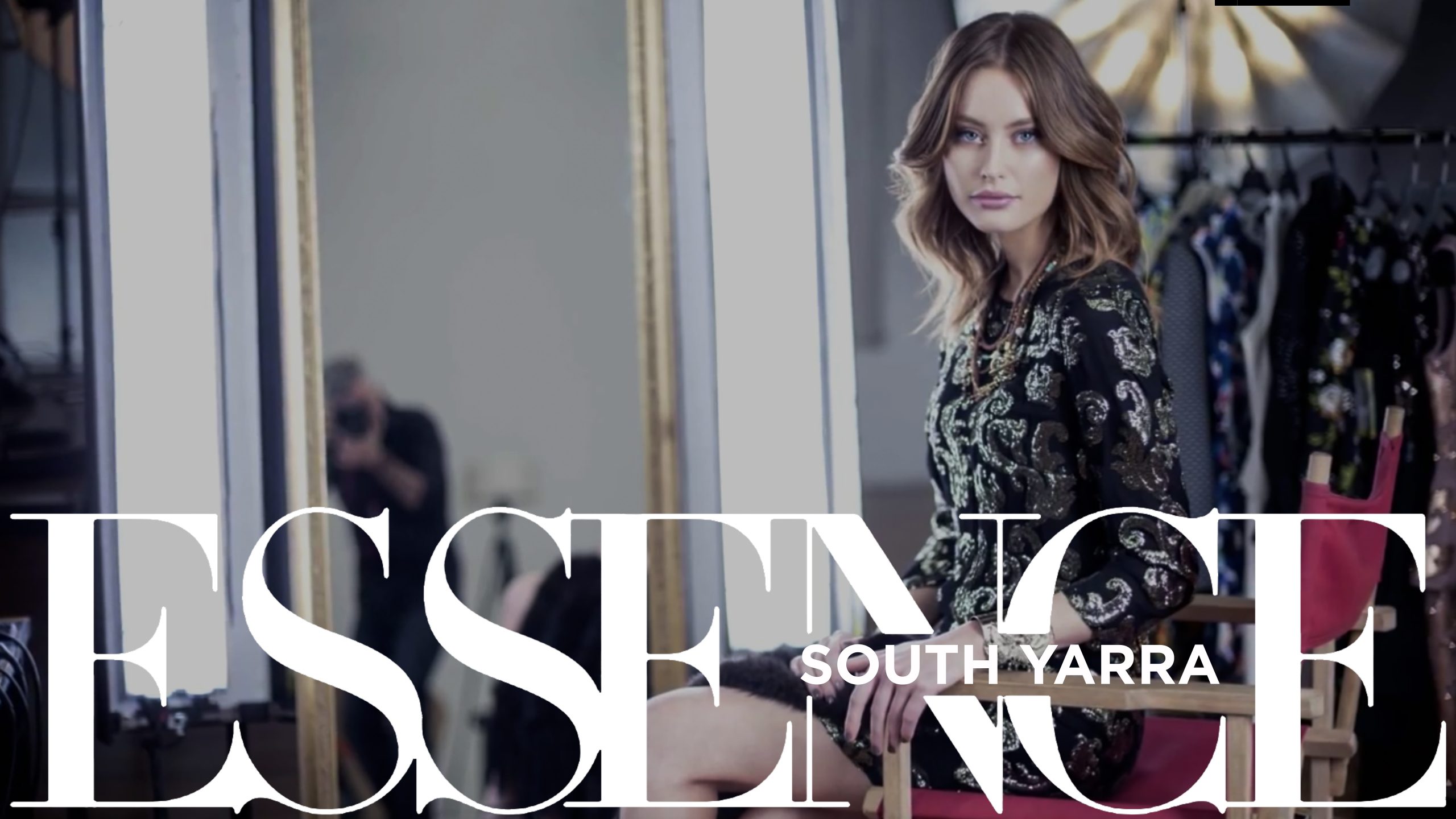
Top Image: Art direction of the Essence South Yarra film by Hayman Design.