We are Family
writer Stephen Banham published Letterbox site
The scenario in the office was becoming a familiar one – a client casually passing by one of the monitors would pause, let out an exclamation of either astonishment or at times pure horror – what they would be looking at was a screen full of flesh with all its detailed hairs, blemishes, wrinkles and disturbing orifices. What was even more entertaining was their speculation as to what we were working on.
Designing the graphics for the Australian Pavilion for the 2003 Venice Biennale was a particularly exciting process given that the artist chosen to represent Australia is Patricia Piccinini. Her work, developed over a practice of some 12 years, is an intriguing and often disturbing investigation into the definitions of our very being – what is it to be human, what is it that makes us human, how do we negotiate contemporary scientific redefinitions of our very DNA structure?
Given the all-too-common lack of reflection within graphic design culture, we thought it may be of worth to reflect upon the development of the Biennale design work, from the initial briefing right to the completion of the various applications of the project. This may offer an insight into the actual process of design.
The Brief
The Venice Biennale brief itself was, like so many in the arts industry, a curious mix of specific hard-headed marketing objectives coupled with the ‘bigger picture’ and less tangible cultural objectives. Featuring mispellings of both my own name and (more importantly) the artist’s name, the Australia Council brief called for strong and clear branding of the Australian exhibition, promotion of Patricia Piccinini as an outstanding Australian artist to European and international markets and to maximise international interest in and awareness of Australian visual arts practice. Ever present throughout the brief was a distinctly ambassadorial responsibility – the view of Australia, Patricia and that was ever-present in my mind throughout the entire design project.
The staging of this design project was split over three distinct periods – the pre-exhibition period, the vernissage period (a preview for buyers and collectors) and the actual Biennale period (open to the general public for some five months). Each offered a distinct emphasis – a sense of anticipated graphic excitement, a more conscious commercial promotion of the artist and the reinforcing of the exhibition itself respectively.
The applications of the design work were many and varied – including letterheads, brochures, banners, postcards, bags and of course, the catalogue itself. Of central importance was the recommendation from the Australia Council that the ‘design supports rather than overwhelms the work’. This humility is a familiar element in any designer works within the visual arts sector, where the design reflects and references the central artwork rather than being the creative focus.
The Rationale
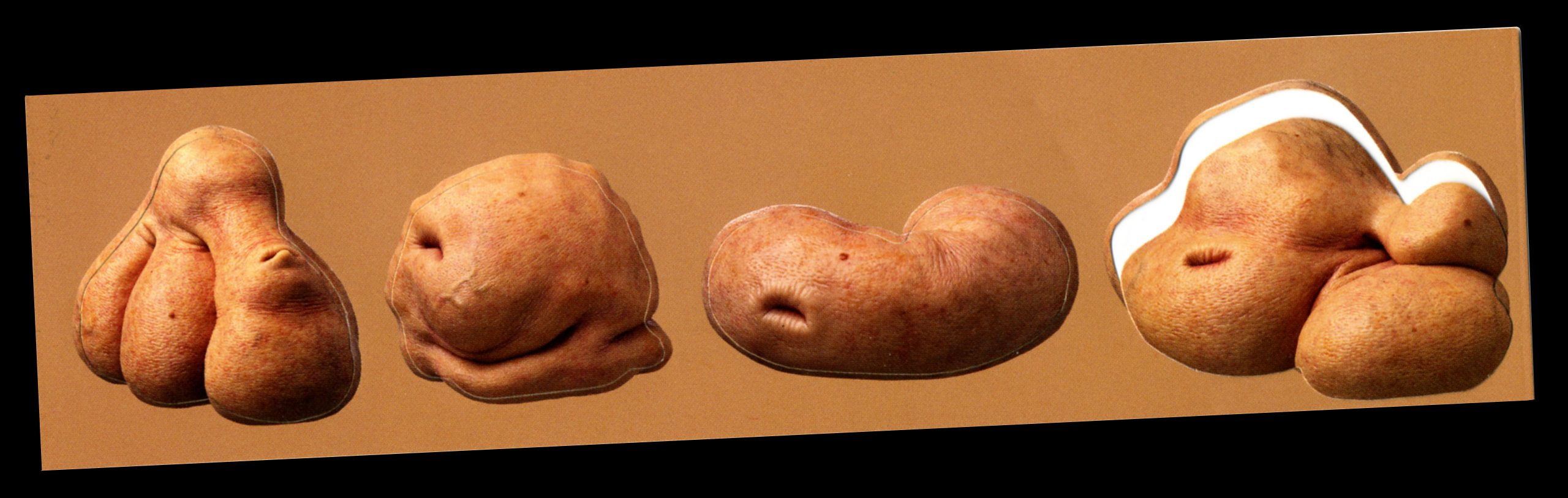
The catchy and aptly titled ‘We are Family’ show primarily focussed on works that appeared to be related in some way, often through a genetic lineage or species. We took these related relationships between forms as a cue for the first of the presentations in which we described the graphic design as ‘showing that elements are related to each other’. So that a ‘family structure’ in the identity could be built linking various elements with threads rather than be identical, literal applications of the core identity. Piccinini’s Girl with Stem Cells (2003) was chosen as the basis of the identity since the family of five stem cell forms offered the variety and disturbing playfulness.
This idea of having a series of ‘family member’ was particuarly suited to one of the first applications we suggested – forme-cut stickers of the stem cell lifeforms. Each stem cell could literally be stuck to any surface, given names or applied anywhere in guerrilla fashion. This way the stickers would become a puzzling (and potentially collectable) code – solved only by a secondary sticker showing the family in its entirety with the name of the artist and exhibition.
A secondary device, a chromatic one, was also developed. A series of five skin tones would be used throughout the range of pieces. By using this device the organic qualities of the work could be expressed in an obtuse sense as well as showing that the design is linked.
Coupled with this fleshy palette and its curious family of skin cells came the typographic aspect. The simplicity of a sans suited the modernity and clarity of the work so after an exhaustive search, FF SuperGrotesk B was chosen. This choice offered a range of weights – along with a handsome set of numerals for the frequent captioning information. As is often the case, it was the right choice but not the perfect one. In caps, Patricia Piccinini’s name presented an ill-fitting repetition of rounded, open and spacious letterforms quickly followed by a vertical geometric forest of the I’s and N’s. The answer lay in slightly customising (condensing) the width of the C and introducing more personality with a Trarzana-like kick in the uppercase R.
The media folder, made from a simple, functional forme, was to be used in a neutral vessel for the promotional pieces for the exhibition. Using two skin tones it implied the inside and outside of an organic form. The forme-cut stem cells stickers provided further graphic embellishment should it be required.
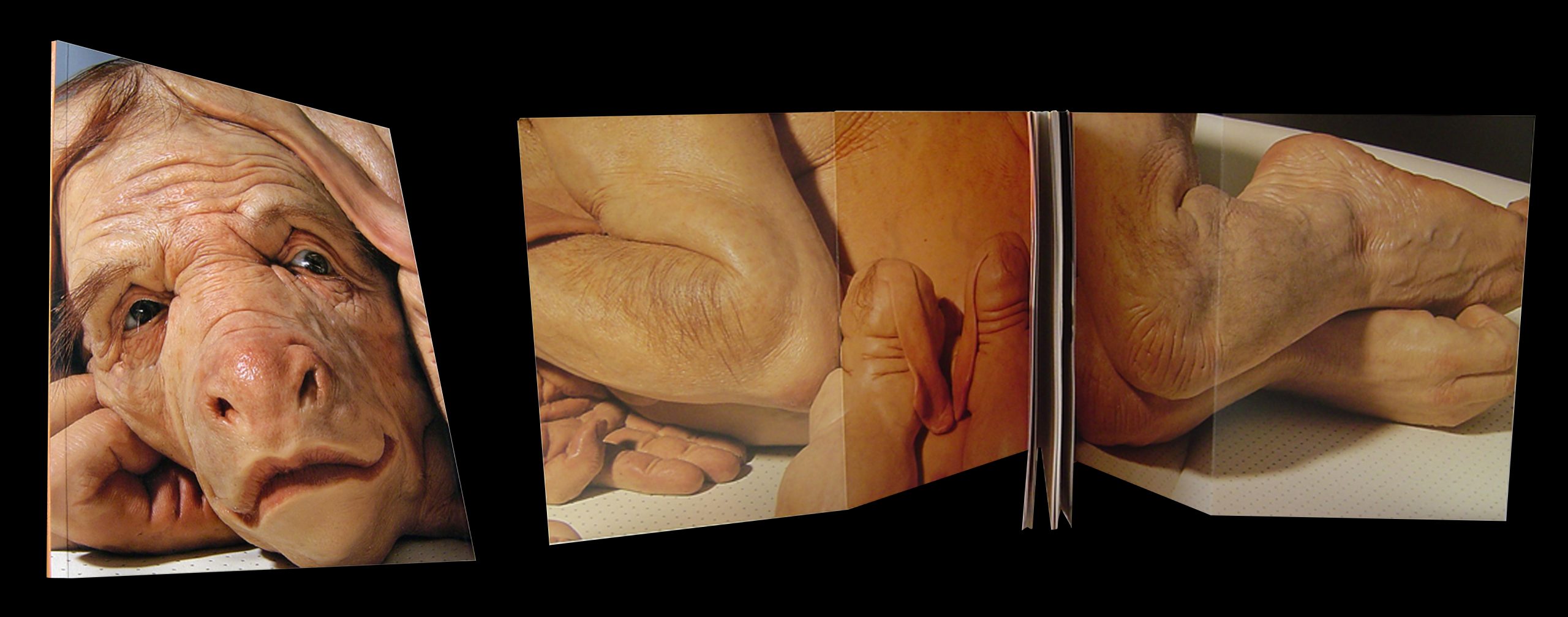
As the primary ”take-away” from the Australian pavilion, the room brochure is typeset in both English and Italian. Its purpose was to intrigue as eventually inform. The brochure satisfied both these criteria by creating an experience of discovery. One side featured a large square format poster whilst the other side provided a map, footnotes and images of the key pieces. The viewer, intrigued by a curious detail of flesh, mole and hair, opens up the brochure to be greeted with an almost actual-size face of the human/pig/cow Mother from Young Family (2003).
the War of the Bag
Any visitor to the Biennale takes part in a ‘buffet-style’ art experience, going from one pavilion to the next (there are over 60 in total) madly collecting information and freebies along the way. Each country’s representative artist is competitively placed alongside their international contemporaries so the force of graphic recognition and drama is of immense importance. These pavilion bags, containing the catalogue purchases, are carried all over not just Venice but are also taken home to all the corners of the globe. It has been said that ‘he who has the visitor carrying their bag, wins…’ meaning that the bags of other countries are placed inside the most exciting bag. Australian contributions to previous biennales such as Howard Arkley’s in 1998 had capitalised on this with the bags featuring bold depictions of Arkley’s vision of Australian suburbia emblazoned on the bags. This had also encouraged the long term use and souveniring of the Biennale bags themselves.
The 2003 Biennale bag is a large one, perhaps with the hope of ingesting the other bags, and like the work of Piccinini, graphically compelling and disturbing. The flabby weight of the skin infers the heavy content of the bag and its cubic nature conjures up the possibilities of the bag itself being a lifeform of some curious kind.
The most lush of all the applications, the catalogue, features a huge gate fold cover of the Young Family (2003). The cover is completely filled with the mother and her engaging expression of resignation. There is an intentional absence of typographic branding. The striking power of this (almost actual size) sculpture is enough in itself, particularly when presented as a repeated set such as in a bookstore display etc. The skin tones used throughout create a simple navigational system for the different sections of the catalogue.