All Lit Up
Writer Ray Edgar Published The Age Melbourne Magazine in October 2011.
Bright lights. Big city. It’s always been a seductive combination. While neon may help signify a metropolis, there is a unique poetry to every city’s night sky. Where else but in Melbourne would you have once looked across the skyline and seen Allen’s, Skipping Girl, Slade Knitwear and Craven A? Sceptics may scoff, but it’s too simplistic to dismiss such advertising signs as capitalism writ large and insidiously across the globe.
“At some point, signage and letterforms transcend their origins in advertising and create cultural markers of location and memory in our lives,” says Stephen Banham, author of Characters, a new book on Melbourne’s typography. “When those signs are removed or destroyed, we lose part of our collective memory and the continuity with a sense of place.” He’s not alone in his beliefs. Proof of the long-held, deeply felt passion for our city’s street signage is in the activists who fought and preserved signs for Slade Knitwear (RING, Residents in a Neon Glow), Pelaco (Get Shirty) and the Skipping Girl (Friends of Audrey).
But it’s not just flashy advertising that excites Banham; it’s signage in all its incarnations, from the hand drawn to the high tech, from manhole covers to the bolder neon on our skyline. Described by some as a typo-archaelogist, to others he is a type evangelist. However you describe this graphic designer, it’s a broad church over which he presides, and there are rich diggings to be unearthed, from the city to the boondocks. Characters, which Banham spent three years researching, is part of his ongoing ambition to make graphic design more accessible to the public. “It’s deliberately not geeky,” says the graphic designer and lecturer in typography at RMIT. “I didn’t want it to be the font nerd thing — identifying each and every individual font. That’s one of the fastest ways to destroy a good story. This book is very much about the content rather than the form.”
Featuring some 100 signs, Characters traces the evolution of the Allen’s Sweets sign on Southbank (which was added to over the years before it was demolished), revisits fears that letters from the Nylex clock, eroded by wheat dust, would eventually fall down and crush someone; and relates the mystery of the Skipping Girl — nobody knows who she was modelled on, although likely candidates are real-life girls Alma Burns; Kitty Minogue, sister of Jim Minogue, who sketched the winning entry in a design competition; and Irene Barron, a junior artist at Claude Neon, the company that built the sign. (Barron once said, “I had to skip because I was the youngest so I skipped to get the animation of the frock, the rope and my feet.”) It’s also a mystery why there was a skipping girl at all — what it had to do with vinegar is anyone’s guess. Like the nostalgic narrator contemplating the Nylex clock in Paul Kelly’s song Leaps and Bounds, Banham remembers just about everything: how many times the Pelaco sign features in the film Dogs in Space, which part of AC/DC’s Long Way to the Top film-clip features the Graham Hotel in Swanston Street…
Among the many lesser-known landmarks are those that have disappeared, such as former signage spectaculars from confectioners Allen’s and MacRobertson’s. Others just need to be searched for, such as Bourke Street’s Diamond House with its ‘Fred Flintstone’ type, or the thread of evidence left behind the Adelphi Hotel’s angled signage, which reveals the former business of rag trader Ephraim Yoffa. Others, such as the once-planned neon Chloe atop Young and Jackson, need to be imagined. Banham also has a fondness for more obscure signage. Driving along the Western Highway, across the desolate plains of Rockback, he spotted an old toilet block identified in handpainted “safari” type. It was the remnants of a long-forgotten lion park, which led Banham to uncover an old rivalry between two long-gone theme parks, Bullens and Ashton’s (up the road).
“The sign is trying to communicate this sense of adventure and the exotic, and yet the truth of it is that it’s a toilet block in a very depressing, flat area of outer Melbourne,” he says. “It will only be a matter of time before the toilet block is knocked down and it becomes a housing estate. So it’s important to capture these things before they go.” While marvelling at the safari type on the suburban savannah, Banham began to feel strangely close to his home town. “I began to think this project has taken me to places I’d never normally go,” he reflects. “And I realised that’s what the book is about. It’s about making discoveries about a city you think you know.” A perfect example of the big game to be bagged is Walter Burley Griffin and Marion Mahony’s 1924 Capitol Theatre on Swanston Street. The celebrated building with its iconic ceiling has had several signage makeovers on its entrance. In an attempt to make the building continually contemporary, its name has been reinterpreted with a faux art-deco font on the awning sign, a 1950s wild west-style font in the arcade floor, and 1970s space- age type on the walls. With Banham as guide, the curious can track the original signage to a corner behind the building where, mounted like a trophy, there is a relief panel with the Capitol’s name. The Capitol featured on a recent tour of a dozen signage landmarks that Banham hosted during the Melbourne Writers Festival. Of the 40 attendees, says Banham, only two were graphic designers.
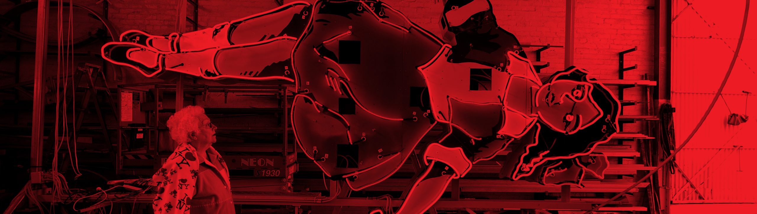
Just as the Melbourne Open House series this year saw 100,000 visitors peek behind the facades of our inner-city buildings, Banham sees a growing interest in our signage. “People are really eager to learn more of the hidden narratives concealed down laneways,” he says. “After the tour, people spoke about their memories of those signs or its significance to their parents,” he says. “Signs are a reminder of the way we think and feel emotionally about a city.” Banham’s Characters alludes to type and people, including Ian “Podgy” Rogers, a neon maintenance man whose anecdotes are as colourful as the signs he worked on. “The Craven A Filter was one of the largest roadside signs ever made,” he recalls. “It was just over Princes Bridge at the start of the railway. Had over 800 bloody globes in it. Late one night, I was working on it and I was that bloody tired. Rang my missus and said, ‘I won’t be home tonight. I’m going to sleep with this sheila called Craven A. She’s cravin’ for me.’ “She asked where I was and I said, ‘I’m sitting up in the sign above the Yarra River and I’ve got about an hour of work to do. I’ll have a sleep here tonight.’ So I crawled into the corner, put my toolbag under my head and didn’t wake up until eight the next morning.”
If Banham was a character, his proselytising enthusiasm for neon signs might make him “bold italic”. A few years ago, he gained international notoriety (in, admittedly, fairly rarefied circles) through a quixotic campaign called Death to Helvetica, his gripe with the popular Swiss typeface being that it had become the default font since its invention in the ’50s. “It was so prevalent it was deadening the landscape.” In many ways, that’s what he fears will happen with signage today. Branding was once all about one distinctive message. Now the technology evident on signs such as the one above Young and Jackson allows us to flash a multitude of images without fixing on any. We are perhaps more visually sophisticated and technologically advanced, yet Banham argues we lose a part of our cultural identity because of it. Inevitably, there are also many who loathe signage. While illuminated signs look great at night, even an apologist might despair at the web of unsightly scaffolding during daylight hours. “During the 1960s there was an intense period of pulling down signage,” says Banham. “Architectural theorists like Robin Boyd were absolutely rallying against that blight on landscape. Now we appreciate letterforms are part of our urban landscape, not an ugly addition to it. It would be a mistake to say this is a Melbourne style because you can’t flatten it that way. Melbourne is a big city that keeps changing.” Meanwhile, Banham fantasises about an equivalent to Earth Hour which celebrates our dimmed but not forgotten signage and in which, instead of turning off the lights, all the neon goes on at once, igniting another dada poem, an abstract ode to Melbourne.