
Little Symbols: The Typographic Landscape of Pieter Huveneers
writer Stephen Banham published RMIT Design Archives Journal Vol 11 Nº1 (2021)
Pieter Huveneers is only now being justly acknowledged as a pre-eminent figure in Australian design and his considerable archive of works at the RMIT Design Archives offers us many insights. It uncovers the life and processes of an émigré graphic design practitioner spanning the latter half of the twentieth century – not just the mechanical production of final artwork for printing but also the emerging modes of corporate communication, particularly the then-fledgling forms of market research and the application of ‘total design’.
————————————————
abstract
This paper argues that one of the many legacies left by graphic designer Pieter Huveneers is the indelible mark his corporate identity work made on the streets of our cities. Far from being ‘placeless’ (as communication design is often considered to be) Huveneers’ work forms a part of how we understand our urban experience. Using his design for Telecom, Australia Post, Westpac,
Myer and Target as a collective case study, this essay investigates the relationship between the city and graphic design, drawing on recent research on the typographic landscape.1
Total design involves the wider practice of ‘managing design’. Although Peter Behrens’ identity scheme for AEG in 1907 is regularly cited as the first large-scale application of design management,2 the latter rose in prominence with the growth of large and complex American corporations in the post-war period. Examples of these include Paul Rand’s identity system for IBM (1960), Otl Aicher’s work for Lufthansa (1962) and F.H.K. Henrion’s development of the KLM identity systems (1961).3
————————————————
Throughout his career Huveneers was at pains to express the depth of understanding demanded of the client to enable a ‘total design’ approach. One of the original proponents of ‘total design’ was the English product designer Stuart Pugh, who defined it as ‘the systematic activity necessary, from the identification of the market/user need, to the selling of the successful product to satisfy that need – an activity that encompasses product, process, people and organisation.’ 4 Huveneers was also careful to point out the difference within the realm of graphic design between ‘corporate image’ and ‘corporate identity’, the former being the sum of impressions a company has made upon the public, while the latter he defined as the visual appearance of a company to denote particular positive characteristics. Quoted in Geoffrey Caban’s seminal study A Fine Line (1983) Huveneers remarked: We do design systems, not just little symbols which we stick on things. We cover as much of the commercial side as the design side and we become completely involved with the operation of the company, not just the graphics. We are constantly in touch with the top management of a company. To get the feel of a company we might also talk to workmen, foreman or other personnel. We ask for complete access – unless we have this we can’t get under the skin of the company. We try to become totally involved with the objectives of a company – where they want to be in ten years time.5
As The Herald reported in an interview in 1981, Huveneers described his design process as an immersive and experiential journey almost akin to method-acting: One aim of the programs is to ensure the desired image of the company is conveyed to consumers, the press, staff, general public, shareholders and government. But Huveneers is forced to ‘live’ each company for which he designs a new identity package…. ‘You must have full access to everything. I would always insist on that’, Dutch born Mr. Huveneers said, stabbing his index finger at the table. ‘There must be nothing barred. You must be allowed to walk in anywhere and go and sit in certain meetings so that you can fully, in a short time, live that company.’6
Within the continuum of Australian graphic design history, one of the many legacies Huveneers has left us is this systematically structured mode of ‘totalised’ practice. Embracing the concepts underpinning ‘total design, his practice produced an array of corporate identity programs which served as case studies (such as Australia Post and Telecom following the division of the Postmaster General in 1975) for the popular uptake of such processes by subsequent Australian graphic designers such as Ken Cato and Garry Emery a decade later.
Huveneers arrived in Australia considerably influenced by English and continental design precedents, including the powerfully objective graphic language of the Swiss International School. This was to contribute to a gradual momentum of modernity within the local graphic design industry several decades later. As design historian Denise Whitehouse notes ‘… emerging designers like Brian Sadgrove, Max Robinson and Ken Cato faced with the demands of new corporate, commercial and institutional clients, found practical guidance in the Swiss School’s definition of design as a problem-solving practice grounded in a scientific approach to visual organisation and a deep understanding of the conceptual nature of visual language.’7 Although revolutionary at the time of its inception, the notion of ‘total design’ had, by the 1980s, become the conventional paradigm in ‘modern corporate communications’.
Although Huveneers emphasised the totalised understanding of a client’s business, its ultimate manifestation in the public eye is the single reductive design mark itself – the logo. It is precisely this distilled and tightly-focussed ‘pointy-end’ of a total design program that enables it to scratch itself into the collective psyche of the public through its constant use. Its omnipresence, indeed ubiquity, throughout our built environment ultimately lends itself an enduring quality.
Due to the nature of these publicly familiar marks, the work of Huveneers offers a peculiar opportunity to be viewed through the fragments left outside the archive, namely the physical traces of his design work in the street. His work on corporate identities including Telecom, Australia Post, Westpac, TAA, Myer, Target and ICI define his impact as an intrinsically public one. In Huveneers’ case, the question
at the centre of legacy – ‘what is left decades after?’ – may lie in the set of ‘publicly-owned’ logos,8 those marks he so playfully, almost dismissively, described as ‘little symbols’. It is with a hint of irony that these marks – consolidations of a larger ‘total’ consideration – endure long after the underlying company strategies, often buried deep in archival correspondence, have long since faded from memory.
So just how ‘present’ are the traces of Huveneers upon the streets of Melbourne? For the purposes of containing a workable area of investigation, my field of observation was restricted to two city blocks of central Melbourne. This covered an area between Collins Street and Bourke Street, framed by Elizabeth Street to the west and Swanston Street to the east.
What became apparent when walking these blocks was not only the ease of finding traces of Huveneer, but also how dense their distribution was within this framed streetscape. In many instances it was possible to document several of his corporate identities within the one photograph.
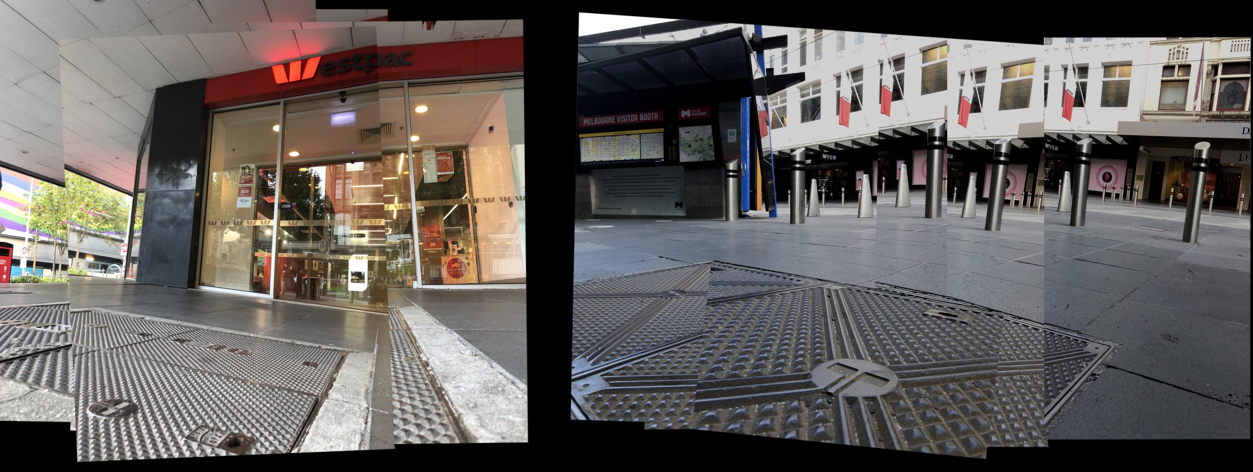
I begin with the most southern site, the south-western corner of Collins and Swanston Streets, with a building known as ‘Wales Corner’.9 The presence of Huveneers on this site is not accidental. The 16-storey ‘curtain of glass’ headquarters had been built in 1966 for the Bank of New South Wales, which then changed its name to Westpac Banking Corporation in October 1982 following its acquisition of the Commercial Bank of Australia.10 The work is a masterstroke of simplicity and informational compression. Although the name Westpac is a portmanteau of ‘Western’ and ‘Pacific’, the design of the now ubiquitous 1982 Westpac logo wisely retains the ‘W’ which had been the logo of the Bank of New South Wales, popularly known as ‘the Wales’. Nearly four decades later, the expansively-orientated bright red elements of the Westpac logo can be read as both typographic and iconographic, bridging a linguistic divide and opening the communication up to an international audience. As Huveneers reflected in an 1982 interview with the Brisbane Courier-Mail newspaper:
The styling of Westpac is good, and there’s been a great acceptance now. The retention of the W was of course an essential part. The W has a very high recall in the market area, the West Pacific area. A third of the world’s population live there adjacent to Australia.11
Photographing this logo-festooned (arguably over-branded) Westpac Bank on ‘Wales Corner’ today, you have to stand on another of Huveneers’ works – the Telecom logo (1975) solidly cast into an iron pit-cover. In contrast to the story of the Westpac logo, the Telecom identity emerged from division rather than amalgamation. With the splitting up of the Postmaster General’s Department on 1 July 1975 (known as vesting day) came the formation of two distinct bodies dealing with nationwide communication – the Australian Postal Commission (trading as Australia Post and aiming to be entirely self-funding) and the Australian Telecommunications Commission (trading as Telecom Australia, now Telstra).12
The Telecom logo celebrates Huveneers’ capacity for the power of visual abbreviation. Primarily typographic in nature, the central letter T for Telecom was designed to symbolise the semaphore system embracing the world, represented by a circle. The Telecom symbol is by far the most common and frequent of Huveneers’ work within the Melbourne (and presumably national) streetscape. This is primarily due to its nature as a symbol of long-term infrastructure, reinforced by the enduring materials with which it is cast – iron and concrete pit-covers and the like. This is particularly impressive given that Telecom was partially privatised in July 1997 and re-branded as Telstra by Melbourne design firm Flett Henderson and Arnold (FHA).
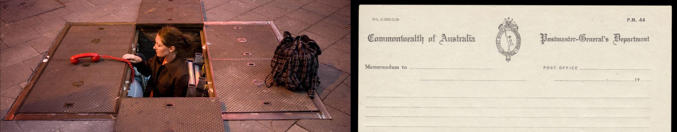
The way in which a corporate logo can become a site of urban culture was demonstrated in 2008 when a Telstra phone pit was used as a setting for a theatre performance. Entitled Underwhere, the production was a collaboration between a small independent arts company and Telstra. The main performer, Lucy Wilson (a stepdaughter of Huveneers), was initially inspired to produce the play when she kept noticing her stepfather’s Telecom logo on countless manhole lids. She performs the play standing in one of the Telecom/Telstra phone pits.13
Moving a block north to Bourke Street, you discover another Telecom phone pit lying in the shadow of the looming Myer department store façade. Huveneers designed the typographic identity for the iconic Melbourne Emporium in the late 1970s, famously advising the owners to drop the ‘s’ from Myers, making it simply ‘Myer’.14 This particular project highlights the importance Huveneers placed on naming as part of brand representation. As Oliver Harvey wrote in a 1982 interview with Huveneers, ‘One of the several things to be considered is the name of the company. A study is designed to confirm the value of the name for attracting goodwill in today’s market’. To which Huveneers added … it should be approached with a clear understanding on the part of the company of what corporate communication can contribute, and a designer must understand what the commercial processes can contribute to deliver the right identification to truly represent the nature and character of the industry now and for the next 10 to 15 years.15
Standing in front of the Myer façade adorned with Huveneers’ identity some 40 years later, you are struck by the enduring longevity of Huveneers’ identity work for the Myer Emporium, particularly given the massive shifts and disruptions in department store trading in the interim.
Within a few easterly paces, and partially screened by Melbourne’s plane trees, is another of Huveneers’ works writ upon a monumental façade – the Target department store logo. Arguably less complex in its design form than Telecom or Australia Post, this massive bright red mark is displayed at both eye height for passers-by and upon the top section of this considerable frontage. A trajectory from Huveneers’ previous work for Myer can be seen in this commission – Myer had purchased the right to use the name Target from its North American owners in 1971, opening up a diversified offer to the customer. Baillieu Myer, the group director of retail diversification at the time, described the decision: ‘Target in America, the concept, the quality, value in the broader sense – I felt that they were the one that we should model ourselves on’.16 From a design perspective, Huveneers’ role was to refine and apply the Target branding throughout the Australian stores. Huveneers companioned the mark with the typeface Franklin Gothic, an American sans serif popular and widely available to typesetting houses at the time. Although it lacks the design originality of Australia Post and Telecom, both home-grown commissions that allowed Huveneers to design from the ground up, the ‘adaptation’ of the American Target brand to an Australian context still shows the ability of Huveneers to thoughtfully orchestrate the nation-wide unrolling of a consumer brand.
Whilst observing and documenting the ‘embedding’ of Huveneers’ design legacy into the Melbourne streetscape, it becomes apparent that the second most frequent mark (running a close second to Telecom) is the logo for its counterpart, Australia Post.
Unlike the more ubiquitous but quieter Telecom logo (countless numbers of which are cast onto man-hole covers underfoot), the Australia Post mark is made for immediate and distant recognition, orientated to the viewer and floated within a bright, ‘fire-engine’ red background.
Designed to be clearly and reliably identifiable in the public gaze, the Australia Post logo on pillar boxes positioned on nearly every city block is a monument to graphic simplicity. This is in stark contrast to the original Postmaster General’s mark which features the Greek mythological figure of Hermes standing inside a tall oblong shape topped by an Australian Kangaroo and Emu crest. Other insignia used by the PMG Department, such as their uniform buttons, simply feature a royal crown. Within this context, the starkly graphic revisions by Huveneers in 1975 following the division of the PMG suggests a de-coupling of Australia from the crown through its modern reconfiguration as a pragmatic, consumer-facing set of organisations.
Within a bold background of bright red, Huveneers cleverly positions the internationally recognised postal-horn device, a potent symbol of communication history, to form a letter P for Post. The circular element surrounding this represents movement, direction and global connection of people and communities. That the logo is still being used several decades after its design is testimony to its clarity and effectiveness.17 Although there have been updates to the orbiting typographic system within the brand,18 the core identity has remained the same, close to half a century later.
Seen through the lens of Baudelaire’s ‘flaneur’, the streets of the city itself becomes a living archive of Huveneers, a testimony to his contribution to design. Scattered across each city block of Melbourne is an array of immediately-familiar corporate identities – or as a journalist noted of the designer during a 1981 interview ‘… the rest of Australia sees the work of Pieter Huveneers around them every day’.19 Built into the very fabric of the city, these marks proudly stand etched into stone, cast into metal or fabricated into illuminated acrylic signage. Many (like Telecom) sit silent, muted by redundancy, whilst others continue with their original purpose of identifying a contemporary entity (Australia Post, Myer etc).
Far beyond the formal design archive, the ‘public’ marks left by Pieter Huveneers leave us a trail, a way of mapping our city. Particularly in the case of his marks for organisations no longer operating, they have outgrown their initial role as corporate communications only to transform into markers of memory and place – a form of urban orientation. They can be viewed and understood as a set of stories and representations rather than complete abstractions – the identities for Telecom, Australia Post, Myer and Westpac are readily identifiable marks within our typographic landscape. The renowned designer Garry Emery once noted this important relationship between mark and place.
Identity, or point of difference, is also essential for successful place making. Urban legibility – or the way the city can be read or interpreted by people needing to orient themselves in order to find their way around – is important in all public spaces.20
Huveneers’ role within the mapping of a city is to be the dropper of breadcrumbs, leaving distinctive marks that help us navigate our city streets. Aligning our own experience and recollection of place enables these necessary connections, or as Hall points out, ‘like memory, geography is associative’.21
Huveneers’ corporate identity work becomes an ingredient in what has been described as a ‘typographic landscape’: … what we call typographic landscape is the landscape formed by a subset of graphic elements in the urban environment: characters that form words, dates and other messages composed of letters and numbers. Typography is here understood in a broad sense, including reference to alphabetic and para-alphabetic characters obtained from processes that would otherwise be better described as lettering (painting, engraving, casting etc.) and not only from automatic or mechanical processes that characterize typography in a more restricted sense.22
This idea of the typographic landscape has also been discussed by Nicolette Grey, Alan Bertram, Jock Kinneir, Phil Baines and Catherine Dixon, all of whom have articulated that the ‘visual, aesthetic and cultural identity of the city is made up of, amongst other things, its graphic elements’.23 Huveneers’ identity markers of institutions and corporations have also become identity markers of place in Australia. And, like many other forms of design, they offer a particular capacity to exist comfortably and silently beyond the formal archive or gallery, bleeding deeply into the public realm and collective psyche. Their historical presence persists into the contemporary experience of the city, and in doing so acknowledges a broader continuum, challenging the unhealthy fixation within graphic design culture with ‘the now’. The enduring lifespan of these marks long beyond their corporate life-span serves to reinforce the key strengths of Pieter Huveneers’ work – rigorous, well-considered and researched conceptual underpinnings executed with simplicity and precision. These firm foundations ensure that, even 40 years later, it is ultimately the ‘little symbols’ that remain, both in our streets and in our collective sense as Melburnians.
1 Stephen Banham, ‘The Legible City: Stories of Place Told Through a Typographic Lens’. Doctor of Philosophy (PhD), RMIT University; 2019
2 Frank Whitford, Bauhaus (London: Thames and Hudson), 21.
3 Adrian Shaughnessy, FHK Henrion: The Complete Designer. (Unit Editions, 2013), 92.
4 Stuart Pugh, Total Design: Integrated Methods for Successful Product Engineering. (London: Addison-Wesley, 1991), 5.
5 Geoffrey Caban, A Fine Line: A History of Australian Commercial Art. (Sydney: Hale & IreMonger, 1983), 38.
6 Michael Venus, ‘The symbol of success’, The Herald, 14 Feb 1981.
7 Denise Whitehouse, ‘A Matter of Influence: the Swiss School and the Growth of the Graphic Design Profession in Australia’, Design History Australia Research Network. http://dharn.org.au/a-matter-of-influence-the-swiss-school-and-the-growth-of-the-graphic-design-profession-in-australia/
8 ‘Publicly owned’ is used in a sense of a collective belonging and familiarity rather than a technical/legal ownership.
9 The multi-storey building at the corner of Collins and Swanston Streets, known as Wales Corner, was designed by architects Stephenson & Turner and constructed in 1964–66 for the Bank
of New South Wales.
10 https://www.westpac.com.au/about-westpac/westpac-group/company-overview/our-history accessed 28 Feb 2021
11 Oliver Harvey, ‘The man who markets images’. The Courier Mail Brisbane, 17 July 1982, 21.
12 Marcella Hunter, Australia Post. Delivering more than ever. (Sydney: Focus Publishing, 2000), 8.
13 Sue Moss, Real Time Issue #78 April–May 2007, 36. https://www.realtime.org.au/out-of-the-underworld/ accessed 1 June 2021
14 Stella Barber, Your Store Myer: The Story of Australia’s Leading Department Store. (Melbourne: Focus Publishing, 2008), 112.
15 Oliver Harvey. ‘The man who markets images’. The Courier Mail Brisbane, 17 July 1982, 21.
16 Stella Barber. Myer. The story of Australia’s leading department store. (Melbourne: Focus Publishing, 2008), 112.
17 Stephen Banham, Characters: Cultural Stories Revealed Through Typography. (Melbourne: Thames and Hudson Australia, 2011), 68.
18 The supportive typography of the Australia Post brand has changed from Helvetica (Meidinger) to Univers (Frutiger) to AP Letter (Sharmal) to AP Type (Chan).
19 Michael Venus, ‘The symbol of success’, The Herald, 14 Feb 1981.
20 Garry Emery and Suzie Attiwill, Outside Inside Out: Inside Outside In. (Melbourne: Images Publishing, 2002).
21 Stephen Hall, Introduction to You are Here. Personal Geographies and Other Maps of the Imagination, (New York, Princeton Architectural Press, 2004), 15.
22 A. Farias, P. Gatto, P. Gouveia, ‘Letters and Cities: Reading the Urban Environment with the Help of Perception Theories’, Visual Communication Vol 8 (3), (Sage Publications, 2009), 338.
23 A. Farias, P. Gatto, P. Gouveia, ‘Letters and Cities’, 336.