We are Family
writer Stephen Banham published Letterbox site
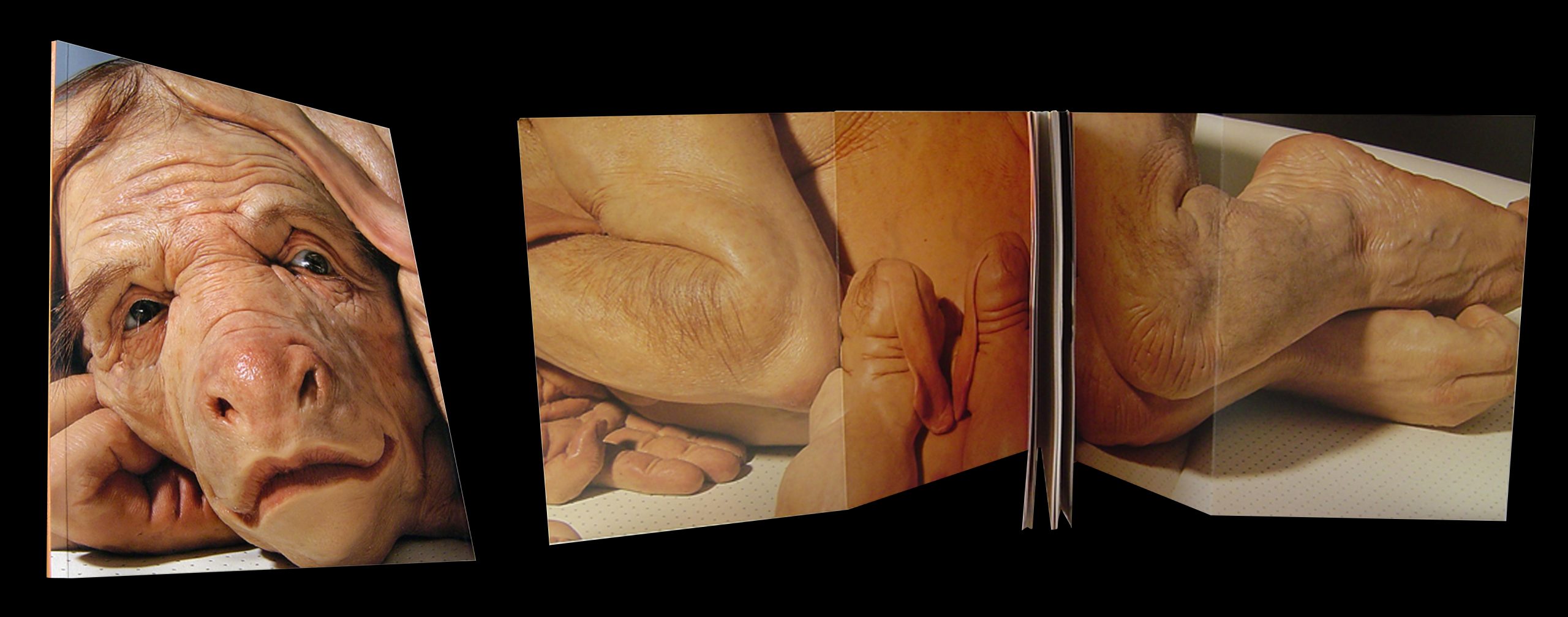
The scenario in the office was becoming a familiar one – a client casually passing by one of the monitors would pause, let out an exclamation of either astonishment or at times pure horror – what they would be looking at was a screen full of flesh with all its detailed hairs, blemishes, wrinkles and disturbing orifices. What was even more entertaining was their speculation as to what we were working on.
Designing the graphics for the Australian Pavilion for the 2003 Venice Biennale was a particularly exciting process given that the artist chosen to represent Australia is Patricia Piccinini. Her work, developed over a practice of some 12 years, is an intriguing and often disturbing investigation into the definitions of our very being – what is it to be human, what is it that makes us human, how do we negotiate contemporary scientific redefinitions of our very DNA structure?
Given the all-too-common lack of reflection within graphic design culture, we thought it may be of worth to reflect upon the development of the Biennale design work, from the initial briefing right to the completion of the various applications of the project. This may offer an insight into the actual process of design.
The Brief
The Venice Biennale brief itself was, like so many in the arts industry, a curious mix of specific hard-headed marketing objectives coupled with the ‘bigger picture’ and less tangible cultural objectives. Featuring mispellings of both my own name and (more importantly) the artist’s name, the Australia Council brief called for strong and clear branding of the Australian exhibition, promotion of Patricia Piccinini as an outstanding Australian artist to European and international markets and to maximise international interest in and awareness of Australian visual arts practice. Ever present throughout the brief was a distinctly ambassadorial responsibility – the view of Australia, Patricia and that was ever-present in my mind throughout the entire design project.
The staging of this design project was split over three distinct periods – the pre-exhibition period, the vernissage period (a preview for buyers and collectors) and the actual Biennale period (open to the general public for some five months). Each offered a distinct emphasis – a sense of anticipated graphic excitement, a more conscious commercial promotion of the artist and the reinforcing of the exhibition itself respectively.
The applications of the design work were many and varied – including letterheads, brochures, banners, postcards, bags and of course, the catalogue itself. Of central importance was the recommendation from the Australia Council that the ‘design supports rather than overwhelms the work’. This humility is a familiar element in any designer works within the visual arts sector, where the design reflects and references the central artwork rather than being the creative focus.

The Rationale
The catchy and aptly titled ‘We are Family’ show primarily focussed on works that appeared to be related in some way, often through a genetic lineage or species. We took these related relationships between forms as a cue for the first of the presentations in which we described the graphic design as ‘showing that elements are related to each other’. So that a ‘family structure’ in the identity could be built linking various elements with threads rather than be identical, literal applications of the core identity. Piccinini’s Girl with Stem Cells (2003) was chosen as the basis of the identity since the family of five stem cell forms offered the variety and disturbing playfulness.
This idea of having a series of ‘family member’ was particuarly suited to one of the first applications we suggested – forme-cut stickers of the stem cell lifeforms. Each stem cell could literally be stuck to any surface, given names or applied anywhere in guerrilla fashion. This way the stickers would become a puzzling (and potentially collectable) code – solved only by a secondary sticker showing the family in its entirety with the name of the artist and exhibition.
A secondary device, a chromatic one, was also developed. A series of five skin tones would be used throughout the range of pieces. By using this device the organic qualities of the work could be expressed in an obtuse sense as well as showing that the design is linked.
Coupled with this fleshy palette and its curious family of skin cells came the typographic aspect. The simplicity of a sans suited the modernity and clarity of the work so after an exhaustive search, FF SuperGrotesk B was chosen. This choice offered a range of weights – along with a handsome set of numerals for the frequent captioning information. As is often the case, it was the right choice but not the perfect one. In caps, Patricia Piccinini’s name presented an ill-fitting repetition of rounded, open and spacious letterforms quickly followed by a vertical geometric forest of the I’s and N’s. The answer lay in slightly customising (condensing) the width of the C and introducing more personality with a Trarzana-like kick in the uppercase R.
The media folder, made from a simple, functional forme, was to be used in a neutral vessel for the promotional pieces for the exhibition. Using two skin tones it implied the inside and outside of an organic form. The forme-cut stem cells stickers provided further graphic embellishment should it be required.
As the primary ”take-away” from the Australian pavilion, the room brochure is typeset in both English and Italian. Its purpose was to intrigue as eventually inform. The brochure satisfied both these criteria by creating an experience of discovery. One side featured a large square format poster whilst the other side provided a map, footnotes and images of the key pieces. The viewer, intrigued by a curious detail of flesh, mole and hair, opens up the brochure to be greeted with an almost actual-size face of the human/pig/cow Mother from Young Family (2003).
the War of the Bag
Any visitor to the Biennale takes part in a ‘buffet-style’ art experience, going from one pavilion to the next (there are over 60 in total) madly collecting information and freebies along the way. Each country’s representative artist is competitively placed alongside their international contemporaries so the force of graphic recognition and drama is of immense importance. These pavilion bags, containing the catalogue purchases, are carried all over not just Venice but are also taken home to all the corners of the globe. It has been said that ‘he who has the visitor carrying their bag, wins…’ meaning that the bags of other countries are placed inside the most exciting bag. Australian contributions to previous biennales such as Howard Arkley’s in 1998 had capitalised on this with the bags featuring bold depictions of Arkley’s vision of Australian suburbia emblazoned on the bags. This had also encouraged the long term use and souveniring of the Biennale bags themselves.
The 2003 Biennale bag is a large one, perhaps with the hope of ingesting the other bags, and like the work of Piccinini, graphically compelling and disturbing. The flabby weight of the skin infers the heavy content of the bag and its cubic nature conjures up the possibilities of the bag itself being a lifeform of some curious kind.
The most lush of all the applications, the catalogue, features a huge gate fold cover of the Young Family (2003). The cover is completely filled with the mother and her engaging expression of resignation. There is an intentional absence of typographic branding. The striking power of this (almost actual size) sculpture is enough in itself, particularly when presented as a repeated set such as in a bookstore display etc. The skin tones used throughout create a simple navigational system for the different sections of the catalogue.
Space For All
writer Stephen Banham published Letterbox site
Many years ago whilst standing in a student cafe looking at the accommodation notice board for a room to rent, I found myself startled by one particularly striking notice. Its bold headline stated massage the rapist. After trying to imagine what kind of an odd share household this would be, it dawned on me that it was in fact an ad for a massage therapist. A simple letter spacing problem. Nothing could have showed me in more graphic form the fundamental importance of spatial relationships in typography. So is it just the spaces between our words that are vanishing?
Nevertheless these ambiguities were not unusual during this period (the 1980s) as it was common to see the illegible results of ridiculously widely tracked text (the phrase ‘because I can’ comes to mind). Traditional typographers, their profession now open to the less skilled graphic designers, were outraged at these spatial abuses of their craft. Articles appeared in the typographic press1, stating that the sacred word outline was being broken down into an unreadable patterned carpet of letters. Their protests during this ‘desktop adolescence’ were targeted at the common phenomena of filling space rather than carefully composing space.
And there is a much evidence to suggest that spatial awareness has improved. Generally speaking, graphic designers have become more engaged and sensitive to typographic matters – the choice of typefaces and books on typography have exploded beyond expectation whilst formal typographic education has recovered from the brief and ill-informed time of institutions believing that the use of a computer would mysteriously deliver typographic proficiency. But perhaps the most significant change however has been the rise and rise of ‘the brand’. What had once been the domain of marketers has now become the lucrative lifebuoy for a design industry still trying to define (and justify) itself. So what has the rise of branding got to do with typographic spacing?
The answer lies in what this zeal for branding has reinforced within graphic design; firstly, the sacred emphasis on the identity of the graphic form (the logo) and secondly, the almost pathologically enforced mechanics of its imposition (the style guide). With these two basic ingredients we have the basic ingredients of the brand’s visual identity – albeit along the lines of conventional post-war modernist formula. It’s when it gets to the typographic aspects that things start to get a bit odd.
Branding’s adherence to the clear identity and ownership of a word (or words) is of course fundamental to its existence. These words have to be seen as more than just the combination of the words they are – they should be seen as a mark. A distinct graphic identity. Inconvenient internal spaces, such as word and letterspaces, tend to break down this neat effect. A branding mind-set would suggest perhaps it’s best to leave them out altogether.
The sandwiching together of different weights of the same font (a formulaic approach to corporate identity at best) may be acceptable in a context where only one or two words are being used, but now there is no shortage of instances where entire sentences and editorial headlines all run together to form an illegible procession of letters. These can be found in publications where the perfumed air of branding is given greatest prominence, such as in the slavishly aspirational Age (Melbourne) Magazine.
Looking at these glossy pages the reader could be forgiven for mistaking branding with textual information, confusing the selling from the telling. It’s the typographic equivalent to advertorial by which editorial content and advertising material are engineered to blur.
Accidents Not So Grotesk
writer Stephen Banham published Letterbox site for the Character 3 Forum (2005)
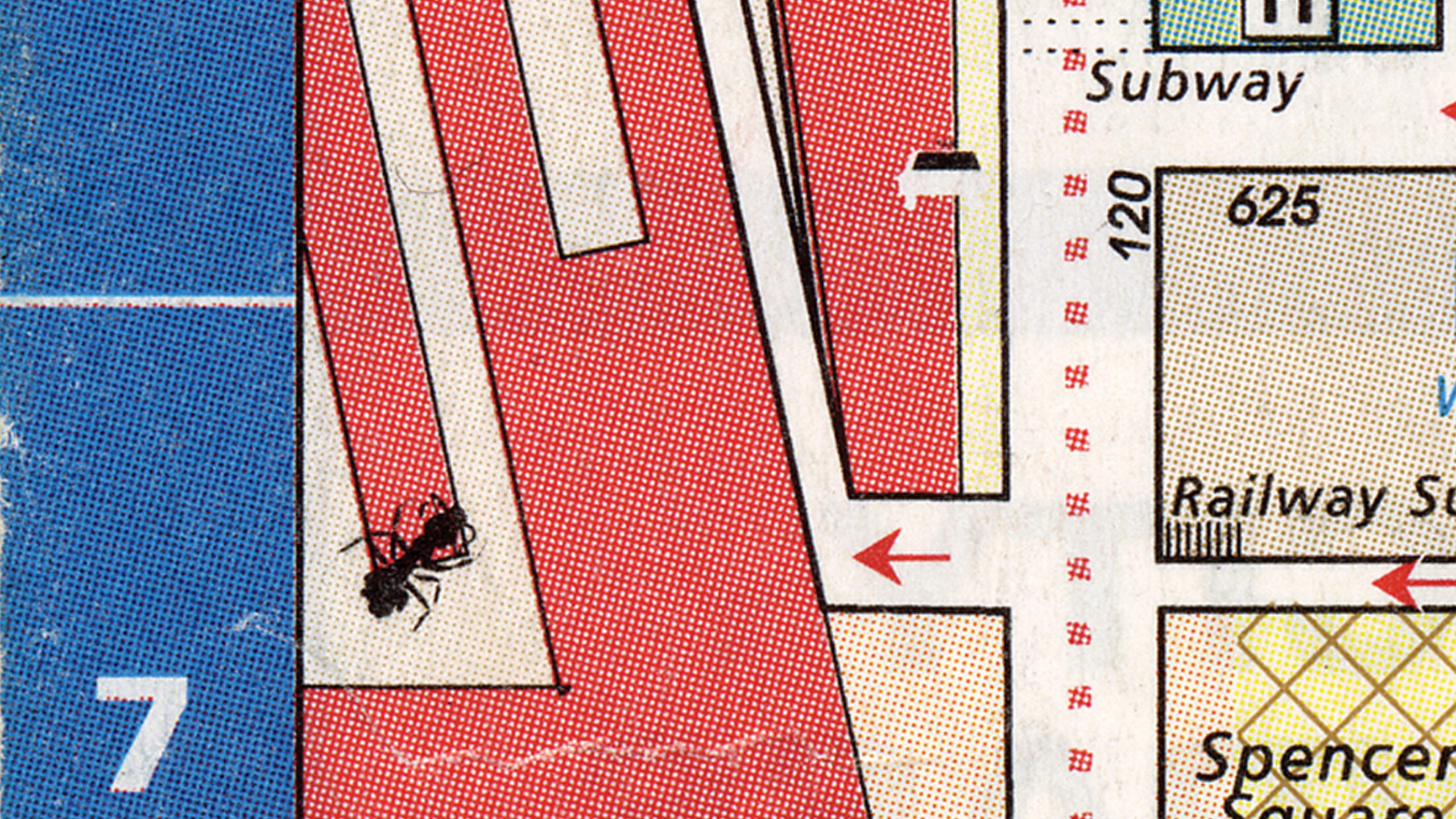
During the printing of the 1999 Melways Directory (the most popular Melbourne streetmap), a solitary ant accidentally wandered onto the black printing plate of page 1A, a detail of the central city. Embedded into the printing plate, its image was printed on 20,000 copies of that edition. The ant was positioned over what is now Southern Cross Railway Station, creating a surreal image of a giant mutant insect menacing the commuters.
What is so appealing about this story is that it adds a new layer of storytelling to graphic design. Maps are after all abstracted topographic depictions of geography so the addition of a humble ant brings to it a welcome organic element. Within the Melways Mapping office the ant has gained an almost folkloric status – everybody knew of the ant and of the ‘special edition’ that year.
To suggest that the more interesting aspects of graphic design are often those found on the outskirts – the things that happen before or after the actual design process – is not a new idea perhaps for practitioners but for a broader public not often exposed to discussions of design, the role of accident offered an immediate and accessable entry point.
The ‘ant’ story is but a small part of the exhibition Accidents Not So Grotesk curated by Letterbox for the Melbourne Design Festival. It focuses on the the role of accidents, those odd and unpredicted happenings that influence, contribute or just plain skew the creative process, and how they may offer a rich vein of possibility for graphic design.
The exhibition was part of Character 3 – a series of free public forums discussing the social and cultural aspects of graphic design and typography. Past Character events have included discussions on whether a city can / should be style-guided, why does graphic design position itself political neutral and has also featured 26 letters a second, Australia’s first typographic film festival.
The idea of focussing on the role of accident emerged from a hopeful yet unsuccessful project of calling upon the Australian graphic design community to display errors they have made in the design process and the outcomes (a kind of graphic design bloopers). The great enthusiasm yet complete absence of actual submissions to the call reinforced that whilst there is curiosity and interest surrounding the idea of creative errors, our profession does not take kindly to publicly airing its human frailties. Acknowledging this fact, it was decided to rephrase ‘mistake’ with ‘accident’ – therefore allowing the all-important element/excuse of the external force (fate) to play its hand. That was much better received.
The Accidents Not So Grotesk exhibition itself consists of huge trolley-like boxes (some 2.6 metres high and 1.2 metres wide) parked in Melbourne’s Federation Square. On each panel were displayed in bold typography (featuring FF Quadraat as well as our very own Kevlar Slab and Scriptface Terital) the stories of accidents – covering the topic in general at first first and then more specifically relating to the creative fields then finally to graphic design itself. The scale and unapologetic public presence of the accident boxes made them quite a point of interest to locals and tourists alike. After all, everyone loves a story.
All typography in the exhibition was stencilled directly onto the boxes, integrating the letterforms into the tactility of the coarse wooden surface. Needless to say, this process was extremely time-consuming and laborious – the task being rewarded with what are quite unique structures.
The introduction to accidents was deliberately positioned for reading upon arrival to enable the general public to engage with the notion of accident as a phenomena – such as the possibility of learning from accident ;
In May 1990, a container ship carrying Asian cargo to North America encountered very rough seas in the North Pacific, and several steel containers of athletic shoes fell overboard, broke open, and dumped some 80,000 shoes into the sea. The shoes floated nicely and were swept along by the ocean currents until they made landfall along the western coast of North America.
Knowing the location where the shoes entered the sea, and the eventual destinations they reached, enabled oceanographers to map ocean currents and better understand how the narrowing and broadening of the currents, and the eddies they create, led to the transport and dispersal of a tracer, in this case, the floating shoes… this experiment has been inadvertently repeated twice more, in January 1992 when containers with 29,000 bathtub toys washed overboard in the North Pacific, sending blue turtles, yellow ducks, and green frogs to the beaches near Sitka, Alaska, and again in December 1994 when some 34,000 hockey gloves were ‘lost in sea’.1
And even included the more commonly known tales of accident contributing to our everyday lives:
The invention of post-it notes came about by sheer accident. In 1970, Spencer Silver was working on developing a strong adhesive for 3M research laboratories. Instead he developed an incredibly weak one. In 1974, another 3M scientist, Arthur Fry, used some of Silver’s weak adhesive to keep his markers in place in his hymn book. In 1980, 3M started distributing Post-It Notes nation-wide. 2
The role of mistake was then discussed within the context of the creative process. This included the errors made in research and how these can be read differently from different perspectives;
What’s the colour of the universe? Karl Glazebrook and Ivan Baldry of the Johns Hopkins University in Baltimore, Maryland, worked out a method of combining light from 200,000 galaxies within two billion light years of earth to answer this seemingly frivolous question. By converting this cosmic spectrum into the colour the human eye would see when exposed to it, the scientists were able to announce in January 2002 that the universe is somewhere between pale torquoise and aquamarine (close to Pantone 7472 or 7465). Several months later, the scientists had to reluctantly concede that due to a bug in their coding, the true colour of the universe is closer to a somewhat more disappointing beige. Like say, Pantone 4545. Glazebrook was quoted as saying’ there’s no error in the science. The error is in the perception’. 3
For such a young and still-to-be-defined profession as graphic design (though so prone to over-defining itself) embracing accident may allow new perspectives on how to view a design project. Though not strictly concerning accident in its true definition, these stories were included in the exhibition as they offered expansive and lateral possibilities;
There’s a university in Buffalo, in New York State. The Campus there was relocated twenty years ago, so the architect could completely redesign it. He built the entire site but didn’t put any paths in – he just left it as gravel. There’s very heavy snowfall in New York in winter, and as the campus began to be used, students began to navigate around the campus, leaving paths in the snow, so if there were a lot of people walking on the path, it would end up very wide, and the ones that weren’t used as much were narrower. The architect then sent a helicopter up to make an aerial photograph of the campus, then plotted all these ‘desire lines’ on a map and built the paths in the same positions with the same widths as the desire lines. 4
Melbourne graphic designer David Lancashire’s ‘Ansett typefaces’ were generated by allowing the turbulence of the plane’s journey to dictate the design of the letter forms. Each font is named after the flight number. He also experimented with drawing typefaces in the back of taxis and in the dark, allowing the phenomenon of chance to take an active role in the design. 5
Finally, the role of the random was introduced as a way of engaging the general public to see the alphabet beyond the standard keyboard character set and font menu. Who could resist the experimental projects of Letterror for this;
The Beowolf typeface, by Dutch type designers Erik Van Blokland and Just Van Rossum of Letterror, is a typeface that gradually (and seemingly randomly) deteriorates and changes every time it is used. Using what Letterror call ‘random technology’ Beowolf is programmed differently each time it is printed – giving the user the sense that the typeface is in a constant state of flux.
In 2003 Letterror produced a typeface called Twin that changes its form in response to real-world factors such as temperature fluctuations and traffic conditions. When it is 10 degrees Fahrenheit below zero, the characters are formal – featuring sharp and distinct serifs. If the temperature reaches 100 degrees (37.7 degrees Celcius) they morph into a rounded informal, its letterforms becoming rounded. When a heatwave is imminent, motorists passing an electronic billboard might view an advertising message with rounded letters, while squarer text might signal an approaching cold front. Over time, the designers have learned to associates the typeface’s shape with the weather. In winter, the serifs can made the typeface look more severe. In warmer weather, designer Erik Van Blokland describes the summertime version as “friendly and rounder”.
Although the exhibition employed humour to engage the public, the perils of maintaining the status quo service provision model – without acknowledging or embracing a more humanistic and lateral approach to design was clearly spelt out to all by a paraphrase of a text by Petr Van Blokland;
Corporate IDMaker is a web based server program that simulates the design process for corporate identities. It takes information from a customer, selects what it needs from a predefined set of elements and ready-made formats from a library and creates solutions that will fit the customer’s needs. The output can be downloaded from a website.
The program works through a decision tree. The result of every cycle is presented to the customer as a menu of visual options to select from. With this choice as input for the next cycle, the program narrows down its scope of possible options to a workable design. The process leads to a set of corporate basic elements: a logo, a selection of typefaces, a colour scheme, a grid and layout formats. The customer can go through a list of applications for stationery, forms, folders, brochures, website and (of course) a corporate manual. The customer adds them to their shopping cart and the total amount is charged to their credit card. 6
The open public forum itself drew over 400 people and featured a panel of speakers whose perspectives were varied and colourful, ranging from UK Design writer Anna Gerber (author of All Messed up; Unpredictable Graphics) to a mathematician/ comedian who proved that accidents in fact are ‘ideas for free’ and are a natural part of the evolutionary process.
Thank you to Samantha Neumann, who discovered the squashed ant in the Melways during her Honours Project. A wonderful and very perceptive find.
1. Uncertain Science, Uncertain World, p.140, Henry M. Pollock, Cambridge University Press 2003.
2. All Messed Up – Unpredictable graphics, Anna Gerber, Lawrence King Publishers 2004.
3. All Messed Up – Unpredictable graphics, Anna Gerber, Lawrence King Publishers 2004.
4. Ryan Gander, Dot Dot Dot 6 (2002).
5. Stephen Banham, Character 3 (2006).
6. Petr Van Blokland, Corporate ID Maker: Proposal/Notes (Dot Dot Dot 4)
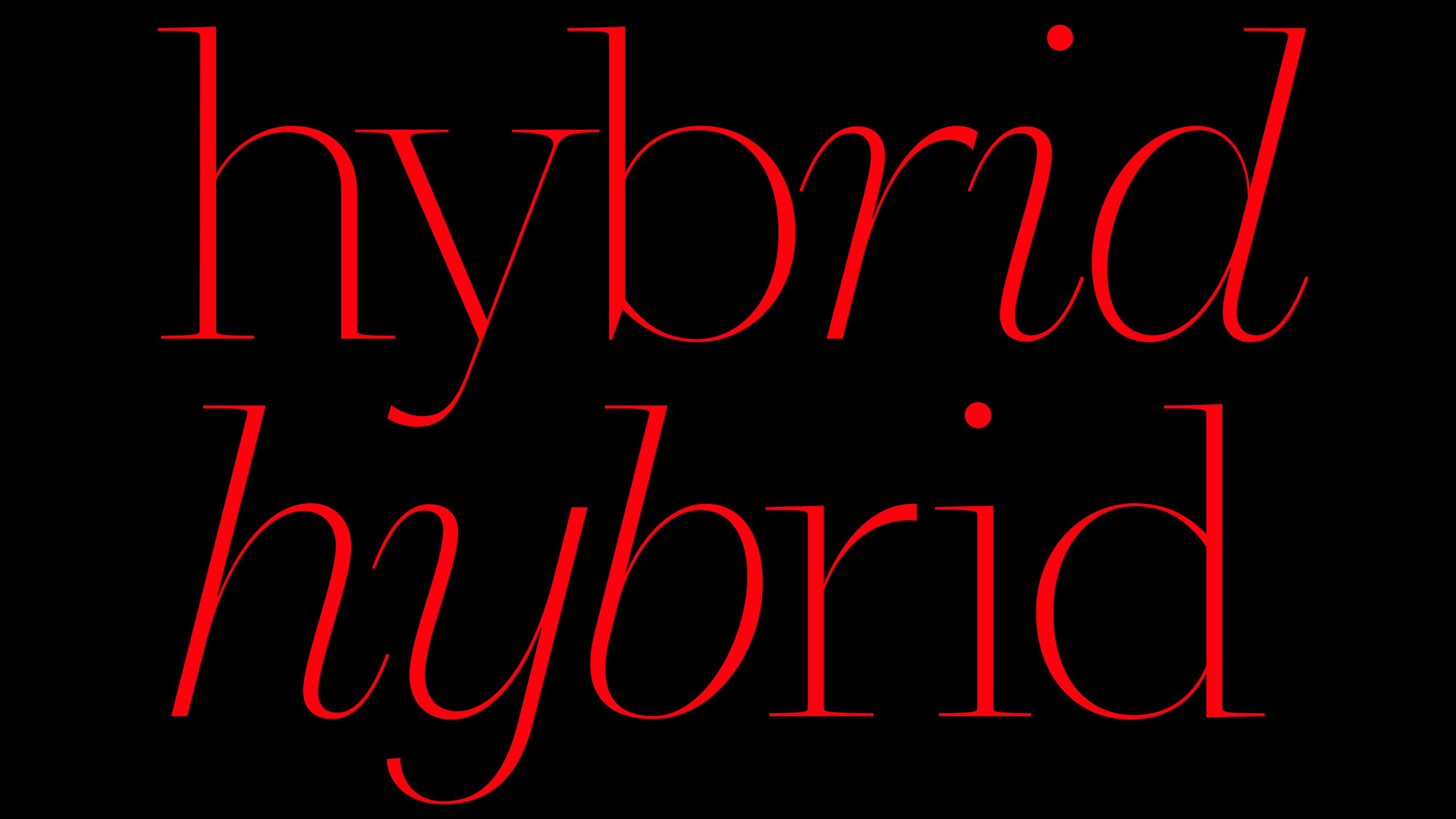
The Hybrid
writer Stephen Banham published Australian Graphic Design Research Journal (2007)
Oil and water don’t mix. That is of course the basis of printing. One occupies the space the other leaves empty. Readers of a design journal such as this know the beauty that comes from this most simple principle.
A comment question asked by fellow graphic designers is why did you do post-graduate study instead of just producing a project under one’s own steam?. The short answer is reflection – the opportunity to create a pause where one can take a bigger view and seek clarity and direction. In this respect, it shares some commonalities with strategic planning – something most practitioners, particularly those who run their own ‘shop’, would consider to be absolutely necessary for the smooth running of a practice. So why isn’t the reflection that post-graduate research creates considered to be of equal worth? The simple answer would be economics. Research doesn’t appear to hold the same direct and immediate opportunities for financial benefit that a well-planned studio strategy may have. But this distinction may be increasingly called into question – why can’t the experience of academic reflection on practice (particularly through the use of practice-led research) be seen as having favourable economic outcomes as well as research outcomes? In a saturated and highly competitive marketplace that graphic design has been (at least for the 20 years I can recall), the potential to explore and create perspectives that differentiate oneself is a very applicable and viable process. Enter the hybrid – the practitioners who is both at ease with the ever-changing demands of commercial practice as well as being engaged on a critical, academic and even philosophical level. The two realms, once the imaginary fences have been kicked down, make very happy neighbours indeed.
Having started a practice in 1991, under the premise of dividing the time between publishing, education and commercial projects, this hybridity seemed absolutely natural. But upon reflection even the terms used at the time – ‘dividing the time’ – spoke volumes of an underdeveloped awareness of how they could in fact overlap, loop and add great depth to each other. It was only after creating that pause and undertaking a Masters in Design were these complimentary value truly recognised. What seems like such a naïve practice modes created a space for reflection, allowing numerous publications and exhibitions to take place under the belief that authorship, and therefore ownership of one’s projects was paramount. The omnipresent beauty of graphic design practice is that it can be and reflect anything you wish it to – changing from project to project, year to year – in part responding to external forces (clients, economics etc) but also by creating catalysts for self-generated projects. The fact that the youthful field of graphic design remains ill-defined is to many a distinct advantage – your own experience of it can be steered into any direction. But this opening up of possibilities is best enabled by the creation of spaces for reflection – time to reflect upon the tensions between the industrial and academic spheres; pre-determined forms against the unpredictable research outcome; the acceptance of convention methodology or its constant critique; shorter term economic needs and decisions compared to longer-term speculative vision; external client-led decisions contrasting a self-generated autonomy – these are all either points of potential conflict or fruitful points of pivotal change. It all depends on perspective. The very thing research offers.
The hybridised designer/academic is certainly not a new phenomena. Ever since the beginnings of graphic design as a ‘trade’ educational institutions have been staffed by practitioners (sadly too often past their prime). But these associations have usually been in the spirit of bringing an ‘applied’ aspect to their more theoretical base rather than seeing teaching and learning as a progressive and explorative component of design practice itself.
The considerable commitment to undertaking a Masters of PhD in design research should be seen as an addition to a practitioner’s skill-set rather than just an academic qualification (or in many cases an semi-retirement escape kit). These skills of reflection and criticality, particularly when applied directly to design practice, have the potential to not only redefine and expand the notions of what graphic design can be but also go some way to create threads and linkages of understanding between both practice and academia.
We would all agree that there is little to be gained in maintaining the resentment between industry and academics – our field has suffered too much from this already.
Einstein’s turning tricks
writer Stephen Banham published Letterbox site
The decision to publish something is perhaps not quite as simple as it once was. Now one is confronted with liberating yet perplexing choices of medium — does one produce a website that is affordable, editable, accessible to all but lacking in tangibility — or make the financial commitment to ink on paper to ensure its archival durability, tactility and for some, integrity.
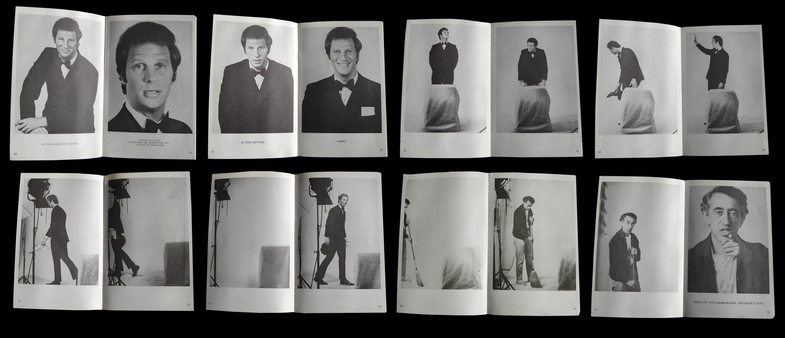
Bob Einstein’s 1970 book This is my first magic book so I’m a little nervous predates these choices by many decades and yet highlights the differences between the printed page and animation with immediate clarity. It’s basically a 96 page book of stills — each one gradually building up a narrative of Bob’s first magic show.
Bob Einstein, an Emmy award winning writer for Television comedy by the time this book was devised, goes through his goofy magic tricks page by page (or frame by frame) ever aware of not only the audience but the medium of the book itself. At one point, Einstein turns directly to the reader asking ‘Before we go on, is this print big enough for you? Can you read it all ok?’. The next spread then featured a larger font size with a satisfied Einstein saying ‘Good’ before going on with the next magic trick.

Given that the ‘real time’ spent on each act parallels the equivalent time in pages and stills, this book is about as close to a ‘time-based media’ as you can get in print.
Like the filmic out-takes that we have learnt to expect from comedy, the book comes to its finale with the finishing of the show, Einsteins’s exit and the cleaning of the set. The cleaner sweeping the floor then looks up to discover that he is still being watched (or read). He grumpily responds ‘That’s it, Hamburgers, the book’s over!’ and walks off the set leaving us with a lingering last frame of an empty set.
The comic self-awareness of this book and the blurring of the reader / audience member / voyeur relationship is instantly engaging — not just for its time but even now, some 37 years after its inception. Although its novelty appeal doesn’t necessarily encourage regular re-reading, Einstein’s book serves as a timely reminder that a book’s ability to transcend being just ‘ink on a page’.
Wellington Extra Bold
writer Stephen Banham published Design Quarterly (New Zealand)
In the 1990s I used to wonder why people would always immediately talk to me in German at typography conferences. At first I thought it was because of my blonde hair and blue eyes. It took me a while to realise that my name-tag featured an abbreviation of my country of origin. The AUS on my name-tag was naturally assumed to be Austria. The idea that an Australian would travel across the globe to be there seemed way too unlikely. We were considered just too far away from the ‘action’.
Thankfully things have changed. And dramatically so. Here in Australia there are regular typography and graphic design events (AG Ideas, Semi-Permanent and Character) as well as countless design festivals for every tone of black skivvy. While in the pages of the international design press Australians are featured alongside their Northern hemisphere colleagues. And now I’m convinced that New Zealand is doing the same. In mid February, a very ambitious event was held on Wellington’s waterfront. Entitled TypeShed11, the event brought together a heady mix of local New Zealand talent and international leaders in the field of typography. Initiated by the Wellington-based typographer Catherine Griffiths and assisted by Simone Wolf of Type Events (Italy), Typeshed11 was a lively celebration of things typographic.
The sheer variety of perspectives on 26 letters never ceases to amaze me. And for Typeshed11 it resonates as one of the event’s greatest outcomes. Griffiths managed to bring together an extraordinarily rich diversity of voices and broadcast them outwards both directly, through the audio-recordings of Dutch-based outfit Type-Radio, and indirectly, through the connections and memories of the event itself. A quick scroll down the menu of international speakers gave a clear indication that this was very much an international event – Experimental Jetset (Holland), Christian Schwartz (USA), Bruno Maag (UK), Paul Elliman (UK), Leonardo Sonnoli (Italy), Indra Kupferschmid (Germany), Stephen Banham (Australia), Donald Beekman (Holland), Walter Bohatsch (Austria) and Masayoshi Kodaira (Japan). Yet this event had a great sense of place. And that place was Wellington.
The international speakers offered a panoramic scope of type and how it has all had something to say about their own cultural experience. Experimental Jetset’s presentation Friendly Ghosts went into fascinating tangential directions; Bruno Maag’s lively passion for culturally appropriate typefaces and their quality held the audience captive; Indra Kupferschmid’s take on Helvetica was refreshing; Christian Schwartz’s reflections on living in a type designer’s ‘bubble’ drew a great deal of empathy whilst the sheer beauty of Masayoshi Kodaira’s recent design projects transcended language barriers.
Whilst the international speakers offered panoramic scope, the voice of New Zealand design was loud and proud. The wonderful hand-lettering of Sarah Maxey, the customised typographic identity work of Guy Pask and the extremely exciting typeface design by Kris Sowersby. This, combined with New Zealand-based design publications such as The National Grid, provides great confidence in the future of New Zealand typography and graphic design. The unique cultural context and significance of antipodean design was furnished with some insightful academic reflections including Sydney Shep’s compelling studies on emoticons through to Noel Waite’s informative look at the particular heritage of New Zealand design. As any typographer will attest, it’s the spaces around and within something that matter – and Typeshed11 certainly offered great opportunities for the mixing of the attendees, book launches, coinciding exhibitions and even a playful soccer match of type fans.
The timing for an event such as this was just right. The questioning of a globalised design future has given rise to an acknowledgement and celebration of regional graphic design forms. A particularly significant feature of Typeshed11 was the work of local type design veteran Joseph Churchward. Having drawn 605 typefaces over many decades his contribution to the field was enjoyed by newer generations of New Zealand designers wanting to express their own cultural experiences through the language of typography. As Griffiths states in the introduction to the event catalogue ‘TypeShed11 aims to raise the stakes of typography’s role in New Zealand – socially, politically and culturally’. One gets the sense that it will some time until we can truly gauge the longer-term effect and contribution of an event such as Typeshed11.
So were there any disappointments? Aside from factors outside of the organiser’s control, such as last minute speaker cancellations (Ed Benguiat, Wolfgang Weingart and Halim Choueiry) this very ambitious and complex event ran very smoothly indeed. Given the calibre of the speakers and the passion of the audience, the only time the presentations fell short of expectation was the rare occasion when presenters (unfortunately often local designers) spoke down to what was a very well-informed audience.
After seeing those talented designers at Typeshed11, I’m convinced that New Zealand designers won’t experience confusion with their NZ name-tags at future type conferences overseas. I just feel sorry for designers coming from North Zambia.
The Legible City:
Stories of place told through a typographic lens.
writer Stephen Banham presented Thesis Examination, Practice Research Symposium, rmit University (2019)
This doctoral research proposes a mode of telling stories of place and history through the eye of the typographer: How can the world be made legible through a typographic lens?
————————————————
abstract
This research proposes that the perspective of the typographer – namely the ability to see nuance and pattern – can offer clarity to phenomena beyond conventional letterforms.
Framing the research through Nigel Cross’ proposition of a ‘designerly way of knowing’, I explore how a typographic viewpoint becomes a ‘typographic way of knowing’. My research centres on the capacity of this ‘typographic lens’ to uncover underlying narratives and connections to larger social systems including economics, politics and social history. My investigations seek to contribute new knowledge in developing and articulating the uses of this unique prism.
My research begins with understanding how this ‘typographic way of knowing’ was initially formed during my pre- and early practice period, and the ways in which it was informed by discourse around concepts of the vernacular and designer authorship. Subsequent reflections map how the observationally-based first decade of my practice gradually transformed into a deeper and more nuanced investigation of how typography can create narratives that reflect, express and critique – especially narratives relating to place. The typographic way of knowing uses these specific sensitivities to recognise underlying familial relationships between sets, patterns and repetitions. When these are articulated through storytelling they offer a capacity for critical engagement in matters that are often considered outside conventional design discourse.
This process of reflective research has led to a greater understanding of my own practice, specifically its underlying knowledge base, its capacity for storytelling and its critical intentions. My investigations have also uncovered a steady evolution in the articulation of discourses larger than my own discipline through my own discipline. Whilst the reflection upon practice has continually informed and contextualised my thinking and analysis, it is through the making of projects during the candidature that this evolution has become most evident. An ultimately practical use of my research is that it offers a compelling model in how a typographic way of knowing can be used to develop and disseminate stories that contribute to an understanding of typography’s broader cultural significance.
————————————————
The document is available for download from the RMIT Research Repository.
Emerging from DTP:
Australian Typography 1995–2005
writer Stephen Banham published Australian Creative (2005)
On the tenth anniversary of Australian Creative, it seems an opportune moment to recall a statement about the state of Australian typography written a decade ago — ‘Whenever I read text set in Gill Sans, I can’t help but hear the voice of an English narrator reading along with me. Australian designers have a lot to say — we just don’t have a font to say it in’. I am the first to admit that these words (my own, from Ampersand 1) — now sounds like naivity tinged with a misplaced idealism. But the statement does however highlight the progress Australian typography has made in the past decade — the increased confidence and faith in that what we have to offer is not just ‘on-par with international practice’ but offers something unique.
There has of course been a great deal of typographic activity indeed over the past decade. We’ve shrugged off the dreaded menace of desktop publishing that once the struck fear of redundancy into the hearts of typographers. We’ve moved beyond the age of superficial deconstruction of form and language when the likes of David Carson and Carlos Segura (T26) were catapulted into dazzling stardom. The armies of hybridized ‘franken-fonts’ have faded away as people began to rediscover that typography is in fact more about reading than just looking.
Within current type design this maturity has brought with it a greater emphasis on text faces — so why is this the case? Like any product, type design responds to the changing environment of the marketplace. For type designers, that marketplace is generally graphic designers. As more and more design studios position themselves as branding agencies whose responsibilities are spreading to entire strategies over many medias and environments, their typographic choices are increasingly those able to cover a vast array of application. Hence the growth of hugely extended families that are able to respond to these needs — thus the extraordinary success of faces such as Erik Spiekermann’s Meta and Lucas De Groot’s Thesis. But of these these ‘typographic workhorses’ will always be balanced (and complemented) by ‘showpony’ display faces.
Typography’s ever-present companion, technology, has also had its fair share of influence along the way. Developments such as Opentype formats have introduced the opportunities for vastly expanded glyph sets and the all important cross-platform opportunities while improvements in font design software such as Fontlab have enabled leaps in both ease of use and complexity of output.
Perhaps one of the greatest virtues of typography is the seemingly infinite diversity of approaches on a single theme (the alphabet). The fact that typographic practice flourishes within these parameters is testimony to its energy and the Australian contribution to this is also showing very healthy signs indeed.
Apart from the ever-present font piracy that robs type designers of their livelihood, another (albeit longer-term) issue affecting the health of typographic skill may be found within design education. As the practice of typography, particularly type design, requires a significant investment of development and research, it finds itself somewhat at odds with the increasingly ‘express line’ mindset of much contemporary design education. This has tended to push type design into the post-graduate sphere — an undertaking unfortunately restricted to the few prepared to pay for this opportunity.
Despite this, there are always individuals who are prepared to take the ‘path of most resistance’ and explore new forms of typographic language. Any article on the current state of Australian typography can of course only be viewed as a snapshot of that time and place. This list of type samples is indicative rather than not exhaustive for two reasons; firstly, it was decided that the typefaces featured in this article should be available for purchase and secondly, due to the solitary and quiet nature of type designers, one can never be aware of every typeface being produced at any given time.
Of course there are many current typographic ‘works in progress’ — some being produced in academia and some in industry — but this may be best covered in another article altogether.
Throughout the following type samples, I have given the type designer the opportunity to describe their typeface/s in their own words — this both highlights the range of approaches and philosophies as well as simply paying due respect to those who have put in so many hours of work.
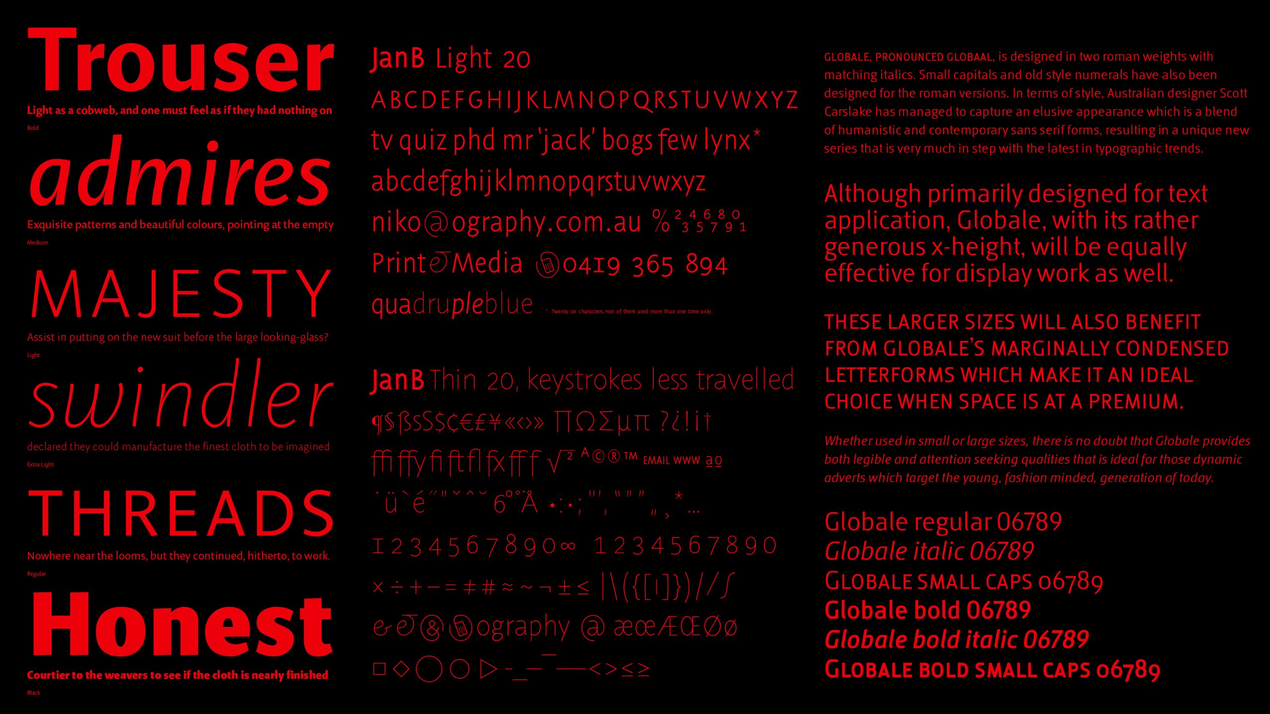
JanB (2005) Niko Spelbrink, Ography
Why another typeface? Just as trees adapt to life under changing circumstances so should type! And times are changing, especially where written language is concerned. The fountain pen has been discarded in favour of the keyboard. Writing now more and more means applying prefabricated type. The default typefaces we all use are testimony to us using shortcuts to shape language. Australian trees, and Mountain Ash forests in particular, provided me with inspiration for the lines and curves needed to make a font that can compete head-on with these few default fonts. Trees are significant features of our natural environment. Fonts similarly are features of our cultural landscape.
JanB, the font I developed, is suitable for both print and screen. Special attention is given to representation of text on a low resolution screen. JanB can be used to create beautiful and very readable small print, tables, text, headlines and on posters. It is an economical font, very legible and performing well in small point sizes. It is also a well-proportioned display font. JanB will be available in Thin, Light, Regular, Medium and Bold. A true Italic version, small capitals and a full set of expert glyphs accommodating a wide range of scientific usage are standard in this font.
Voca (2004) Monib Mahdavi, Mahdavi Design
A Modern sans serif with a slight grotesk touch to it, Voca was developed for corporate branding and as an alternative to things like Akzidenz, Helvetica, Univers etc.
Globale (2004) Scott Carslake, Voice
Globale was designed purely out of an interest and curiosity in letterforms. Its design began from looking at fonts that I liked, and specific letterforms that just felt right. In my own mind, I could see a beautiful lowercase a, but it did not exist in any font that I knew. I soon reached a point where I began creating my own letters; they were very crude, and out of proportion — I soon learnt that this was no easy skill. Therefore, it became a personal challenge to create a complete san-serif alphabet that functioned at small sizes, was aesthetically pleasing and read very well. I guess I also never saw myself designing a typeface in the future — who does? So it was a very rewarding exercise that had a deliberate purpose in the end. I was certainly inspired by many typefaces and typeface designers, but ultimately I was inspired by actual letterforms. When you deconstruct them and see how different letterforms have been constructed so they look right visually, well, it’s amazing! I once read a quote in a paper promotion that went something like this ‘Typography is like an aloof kind of lover, the closer you get, the more beautiful it becomes.’
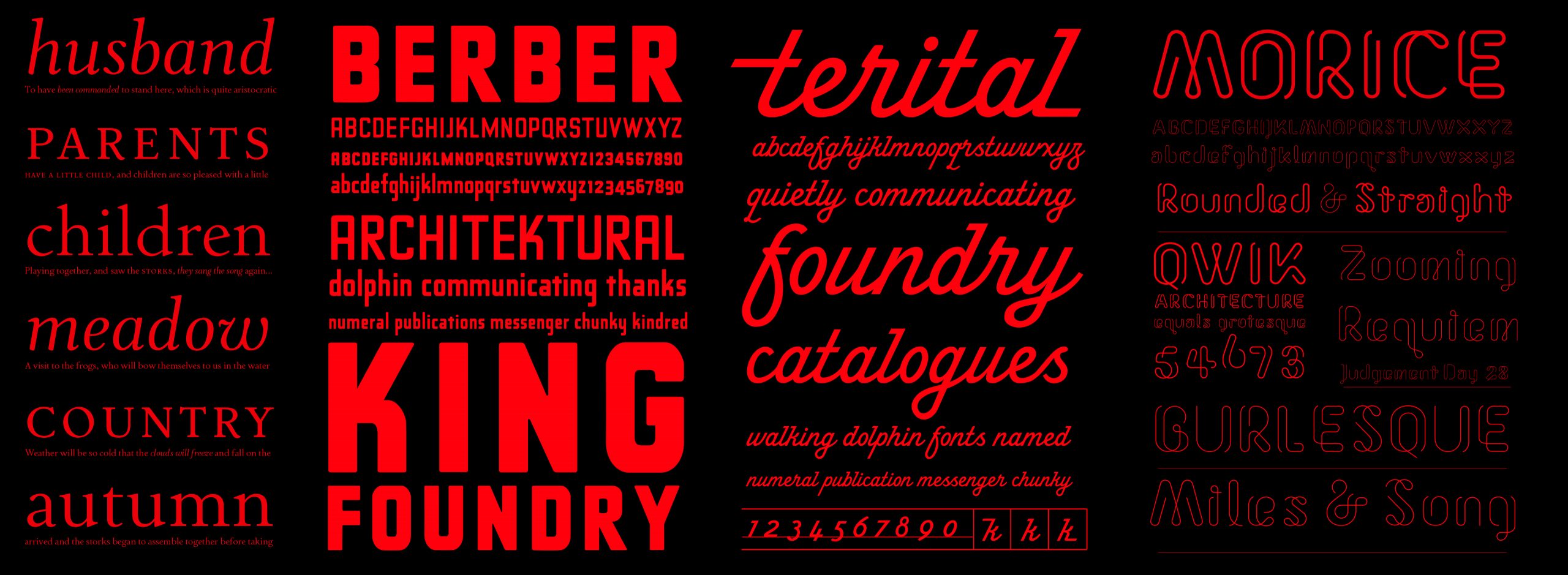
Terital (2003) Stephen Banham & Wendy Ellerton
Our long and frustrating search for a dynamic, monoline script typeface drew to our attention the lack of such a typeface. Hence, this prompted us to create our own Terital (so named after a 1960s Italian overcoat advertisement which was the starting point of the typeface). The formulation of incoming and outgoings (crediting the influence of Rian Hughe’s Cottingley) allowed for the intelligent solution of the linkage variants in the font — the most challenging aspect of designing scripts and possibly why there are so few. I have always considered one of the ugliest typographic acts is the setting of script in all caps in Terital we alleviate this problem by making the typeface lowercase only (with the exception of the upper case ‘i’ letterform).
Morice (2005) Morice Kastoun
Deceptively simple in its lineal structure, Morice expresses the essence of each letterform with a quiet elegance. There are several variations within the Morice family — rounded terminals or straight terminals and two weights of each of these — Regular and Thin. Originally designed by Morice Kastoun and digitised and developed by Letterbox, this typeface has been a collaborative project over the past year.
Ferrara (2003) Wendy Ellerton
A comprehensive typeface family which synthesizes past and present traditions in order to reveal the elegance of the Latin letterform. Ferrara is a reaction to my observations of the world, both aesthetically and conceptually. The type family visually responds and reacts to typography from the 15th Century to the present day.
Imogen (2005) Wendy Ellerton
The first and most important design concern for me is that the letterforms should be balanced, so that when set in text a natural flow and rhythm is accomplished. The second challenge is that the typeface should perform for me as a multi-purpose typeface family. Hence, the design needs to be concerned with a number of aspects, which are discussed further – “Generally, people use serif typefaces for the setting of lengthy texts, as the serifs encourage the reader’s eye to enter a state of energetic repose. Although Imogen is a sans serif typeface, it should be suitable for setting lengthy texts. Hence, the tone portrayed through the character shapes should not feel monotonous when read and the letter shapes should encourage the reader to do exactly that, read. As this is a requirement, I believe the design should emphasize the horizontal flow of words on a line, rather than accentuating the vertical nature of sans serif typefaces. The family should offer designers a wide range of styles and weights, so the largest and smallest projects can be handled. Through optimizing the typeface for display versions in the future, the typeface will also work in large point sizes, for example the setting headlines and signs. And lastly, on an aesthetic level, my typeface should look human and not as though it were constructed systematically by a machine. My main aim is to design something which looks completely natural”.
The Accidental Cartographer:
Morgans Street Directory (1917–1976)
writer Stephen Banham published Eye Journal 94 (2017) and the Automotive Historians Association of Australia Journal (2017)
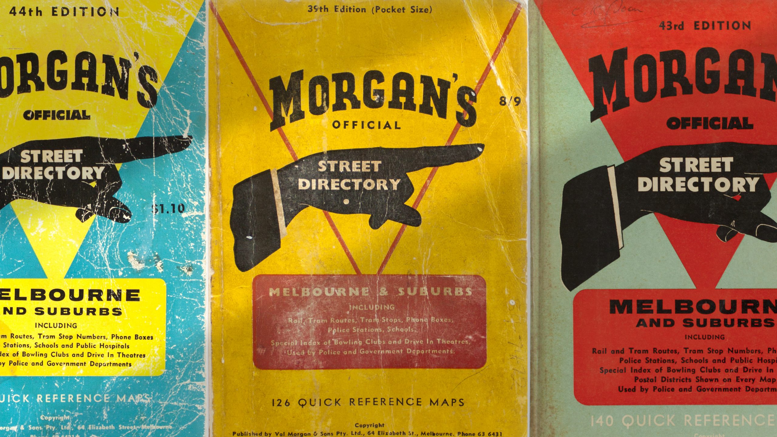
As one of Melbourne’s first noted publicists, Valentine Morgan (1876–1952) was well versed in the powerfully seductive possibilities of the printed image. His print advertising used all the typographic hallmarks of the early advertising age – embellished lettering, unapologetically loud display faces, snappy headlines and of course a typographic device commonly found in any compositors tray of the time – the ‘pointing finger’ known as the ‘index’ or ‘printers fist’.
Used to quite literally point readers eye to a key message, this ‘pointing finger’ motif offered the strategic Morgan an opportunity to perform a clever secondary role – for the covers of the new Morgans Street Directory the pointing finger device offered a perfect dual reading – communicating a way-finding system (the primary function of a map directory) as well as boldly identifying a directory with considerable advertising potential (the primary intent of the directory).
Morgan’s purchase of the Moulton Street Directory business, which had failed after its only edition in 1916, proved to be an astute and well-timed move. In the newly motorised streetscape of 1917 Melbourne, its emergence of the new Morgans Street Directory responded to a public need to know what lay beyond that which was within walking distance. As early as 1922 Val Morgan anticipating his future cinema advertising empire by producing glass slides advertising the modernity and utility of his directory. Press Ads in The Argus boldly stated ‘80 Picture Theatres nightly are telling the public about Morgans Street Directory –New Issue, Revised and Up to Date. On sale at all booksellers. It has a blue cover and fits easily in the pocket’.1
Early Morgans directory covers feature an illustrated hand with somewhat grotesque, gnarled and long-nailed pointing finger, more akin to ‘nosferatu’2 than the intended gentele aspiration. By the 1960s the pointing hand has been streamlined to a simpler black silhouette. Although the hand is presented as slender and elegant, its male gender is made evident by the profile of a neat suit sleeve.
And the title lettering steadily evolves over the sixty issues, it is the pointing hand that remains the emblematic and striking identity design for Morgans.
Whereas earlier cartographers fearing the unknown, and therefore empty, spaces on the outer fringes of their maps, would declare the now renown warning for potential explorers ‘Here be dragons’,3 for Morgan every blank space in the Morgans Street Directory maps represented an advertising opportunity – or ‘Here be profits’.
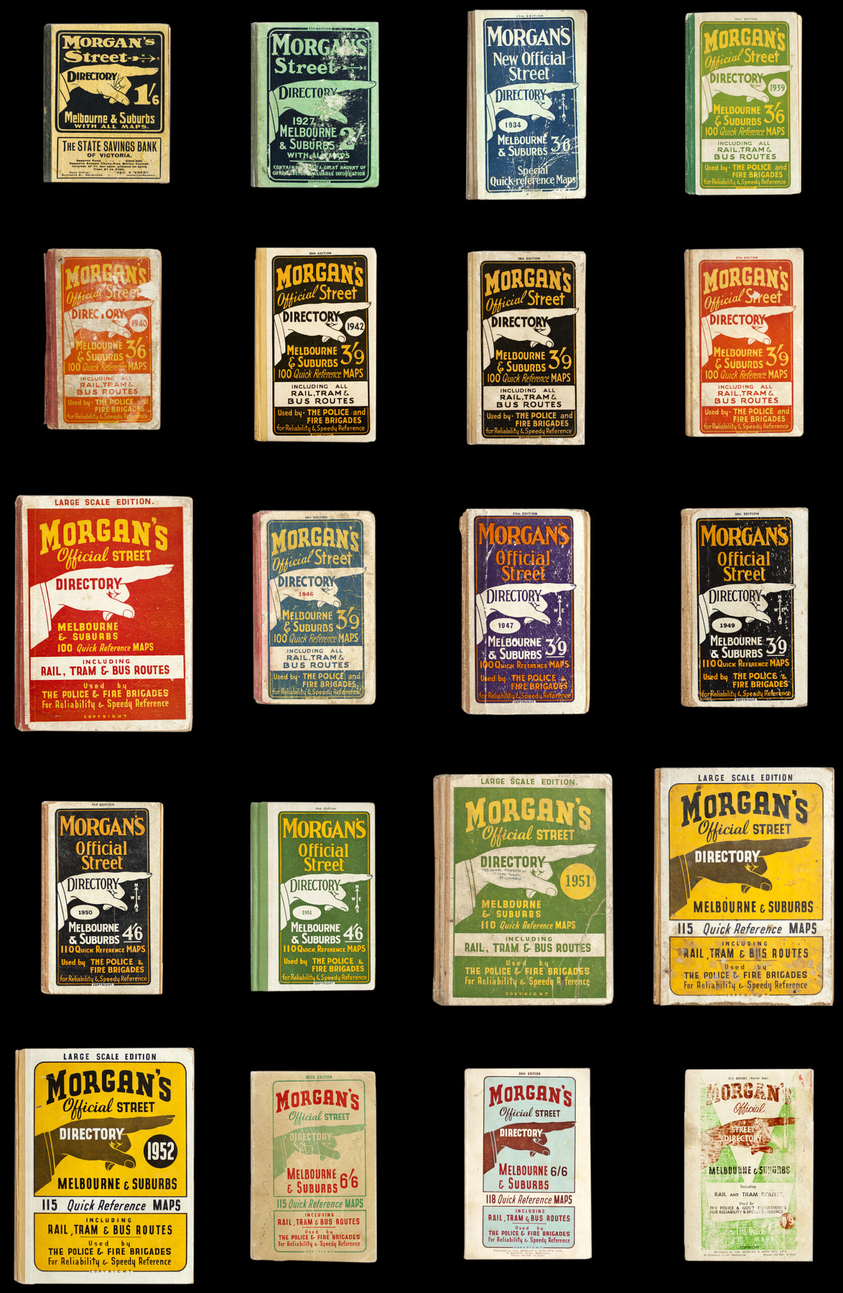
This strategy proved however to have an ironic fate. As an ever-expanding Melbourne was transforming open country into new residential or industrial estates, the maps within the directory had to change accordingly. Previously blank (rural) areas on the maps that had once been used for advertising were beginning to fill up with new estates and streets. So as Melbourne grew, advertising had to be steadily moved from inside the maps to the frames around its borders and even to the front cover itself. Map 21 of the 44th edition (c.1960) shows a substantial advertisement for a plaster board company over the outlying streets of Edithvale (then a new housing area) whilst a significant proportion of the aqua-coloured mass representing Port Philip Bay is occupied by an advertisement for a local real estate auctioneer. By issue 52 (c.1968) this same geographic area and map page has changed, the advertising (for a home loan company) having been moved overleaf, instead occupying an entire page.
Morgan’s use of a mapping system as a vehicle for commercial gain gently anticipates one of the most current and ubiquitous mapping endeavours – Google Maps. Despite one being local and the other global in its reach, both present themselves as ‘the’ important public reference of their times, blurring the difference between civic and mercantile intention.4 The presence of advertising on the map pages of Morgans – framed around the informational content – appears oddly familiar to website viewers today in a process marketers call ‘skinning’ or ‘page takeover’ whereby all areas around the information content are given over to the raising of advertising revenue. Interestingly, this process is also known in the advertising industry as a ‘roadblock’,5 a term imbued with a fittingly cartographic complexion.
Compared to many of his other entrepenurial ventures, such as his failed attempt to advertise messages on spinning car wheel hubs, the directory did in fact turn a profit. “We were not booksellers and therefore we didn’t really understand the trade. But the Morgan directory was very much a sideline and the job putting out a new edition was periodic. It wasn’t a major money-spinner but it was definitely profitable. As long as the sale price covered the printing, our profit was in the advertising’.6 The confidence of the post-war building boom meant that a new directory had to be published every year or 18 months. To ensure the directory kept pace with the city’s development, the directory’s draftsman, Alf Yorston, would visit councils and learn of new sub-divisions and new streets amending his meticulous maps and drawing new ones.7
The directory soon became a popular and reliable point of reference, and not just by the public. As proclaimed on its earlier covers, Morgans was ‘used by the police and fire brigades for reliability and rapid location’. It was often quoted in the popular newspaper columns of the day as an important reference for getting around the city and suburbs.4 In fact the currency of the directory was so high that some newspaper articles reported them even being stolen from police cars.8
When viewed alongside its counterparts in other Australian cities, the pages of the Morgans Directory were well covered in advertisements, mainly from local estate agents hungry for a market presence throughout the new, burgeoning Melbourne suburbs.
As Valentine Charles Morgan, grandson of the founder, recalls “Every time a new street directory was about to come out you would have to go back to the people who had previously advertised and convince them that they should be in the new book…. It (the directory) was sold cheaply but was a profitable venture because of the inclusion of a large number of advertisements…”.9 The business model was one developed on the run “We… didn’t allow the booksellers a very big margin so they didn’t market them as hard as they might have. Our policy on margins was based on the fast turnover the bookseller benefitted from, for by any standards our book was a ‘best seller’, particularly when compared with other publications of all descriptions on sale. We were not booksellers and therefore didn’t really understand the trade”.10 Despite this apparent naivety, at its height it is said to have held 90% of the market, with only minimal competition from Collins, Sands and McDougall and Universal Business Directories (UBD).11
“The first directory was a small (3 x 5 inch) hardcover book of 320 pages with what seem like rudimentary maps and indexes to government services, associations and societies, cemeteries, asylums and hospitals. This format was first overhauled in 1931 when a larger size book with the now familiar grid index system was used.”12 Describing itself as the ‘Official Street Directory of Melbourne and Suburbs’, the introductory page would proudly announce any revisions that has been made since the last edition ‘In accordance with our policy in providing an adequate coverage of the ever increasing spread of Melbourne suburbs, approximately 2000 new streets have been incorporated into this addition… as a result we have been able to include a greatly expanded area’ 13 as well as acknowledging its following of international convention ‘Following overseas practice, the street index appears at the rear of the directory following the map section’.14
By the mid 1930s the content within the Morgans directory had expanded to include the civic resources as well as the cartographic information. In a description of the new Morgans directory for 1936, The Argus points out that ‘it contains a list of all justices of the peace in the City of Melbourne, an index to all buildings in the city, commissioners of the Supreme Court for taking affidavits, a scale of costs for transfers and mortgages, the distance of the suburb from the city and how to reach them, an index of streets and maps showing their locality’.15
One of the devices to keep print costs lower was to use the same printing plates, changing only the colours from year to year. The unintended result of this is that each issue of Morgans would annually reinforce ‘the brand’, creating one of its most enduring appeals today – an extraordinarily consistent visual identity. Unlike the highly engineered and style-guided corporate identities of today, the consistency of the Morgans brand emerged from thrifty economy rather than any conscious overarching strategy. Throughout some periods of the directory, many issues would be the exactly the same cover as the previous year with only details such as the date and price overprinted in a single colour. Many issues have no dates marked at all. Considered by its makers as a mere side-line to the Val Morgan cinema advertising empire, the directory content of later issues was only lightly updated from year to year. That was of course until a new competitor arrived.
“In the mid 60s the first Melways Street Directory was published. The Melways was an excellent publication and from the first issue we realised that we had a major problem. I had collected and studied street directories from all over the world and was convinced that our book was the best. Unfortunately now it was second best.”16 Morgan’s response was to approach the co-proprietor of Melways, a meticulous cartographer by the name of Merv Godfrey, with an offer to purchase his business. This was declined and so in the late 1960s Morgans had every map of their directory redrawn and a new format was adopted. “Melways had a lot more information than our directory and it had a much larger coverage. I had always regarded our book as ‘Melbourne and Suburbs’ whereas Melways was far more expansive and covered the Mornington Peninsula, Geelong, Bendigo, Ballarat and so on”.17
For Morgans the impact of this superior competitor was relatively swift. “Prior to Melways our best circulation was 80,000 copies, but it started to decline and gradually the cost of printing became prohibitive because of the reduced print run. With great regret we made a commercial decision and ceased publication in 1976”.18
In the decades since its first edition in 1966, the enduring presence of the Melways cemented into Melbourne culture in a way that Morgans had not. The design of a Melways directory is so distinctive that artists and designers have reflected it in a ‘variety of teapots, mugs, cushion covers, T-shirts, clocks, coasters, placemats, jewellery and wrapping paper sporting the maps’.19 Its real point of distinction came from its masterfully drawn maps, redefining the cartographic conventions of the time such as ‘their use of single line representations of roads… It was thought at the time to be a mistake, however the design was popular with the users, the driving public, and this design became the ‘new’ convention’.20
Compared to its successor, Melways, cartographic prowess was never the strength or intention of the Morgans directory. Instead its innovations lay in the development of a distinctive and cohesive visual identity (the clever dual reading of the printers fist as an enduring brand) as well as the revenue system through which advertising could be integrated throughout the directory lay the way for future directories, such as Melways, to then develop further as a viable business model.
Perhaps the most telling record of the directory’s public appeal took the form of the Argus’ obituary of Val Morgan in 1952, when the Morgans directory stood unchallenged. Although by this time cinema advertising constituted the vast majority of Morgans’ business empire, the obituary ultimately referred to his earlier contribution, describing him as ‘the man behind the famous Morgan’s Street Directory that has solved the problems of Melbourne visitors for years’, 21 perhaps an appropriate and final acknowledgement of Morgan as the ‘accidental cartographer’.
1. The Argus, 21 September 1922, 13.
2. Nosferatu is the main character in the German Expressionist horror film Nosferatu, eine Symphonie des Grauens (1922) directed by F.W. Murnau.
3. The existence or otherwise of the words Hic sunt dracones (Latin) or “Here be dragons” on ancient European maps is still debated by cartographic historians. Some argue that it does not exist on any paper map but rather only on one of the very first atlas globes, the Hunt-Lenox Globe (c.1510).
4. According to the Google’s quarterly report from 30 September 2016, (http://www.investopedia.com/articles/investing/061115/ how-does-google-maps-makes-money.asp#ixzz4TuXPcCou) Google websites generates over 70% of Google Revenues and includes AdWords revenue from Google.com, as well as advertising revenue generated from YouTube, Gmail, Maps, Finance, Google Play, etc.
5. https://theonlineadvertisingguide.com/glossary/roadblock-ad/ (accessed 26 December 2018).
6. Healy, Chris. Interview with Valentine Charles Morgan (grandson of founder), Melbourne University. 22 April 1994.
7. Golding, Peter.‘What goes on’, The Argus, Wednesday 27 October 1957, 5.
8. ‘They stole from a police car!’, The Argus, 13 October 1956, 19.
9. Healy, Chris. Interview with Valentine Charles Morgan (grandson of founder), Melbourne University. 22 April 1994.
10. Ibid.
11. Ibid.
12. Ibid.
13. Morgans Street Directory, 39th Edition, pocket size. Introductory Page.
14. Ibid.
15. The Argus, Wednesday 29 January 1936, 15
16. Healy, Chris. Interview with Valentine Charles Morgan (grandson of founder), Melbourne University. 22 April 1994.
17. Ibid.
18. Ibid.
19. Stevens, Andrew. ‘The Melways is turning 50. But will Melbourne’s back-seat bible survive the GPS?’ The Age, 15 April 2015
20. Jelfs, Laura. Cartwright, William. Pupedis,Gita. ‘Considering innovations in cartography and changes in geographic representation methods’, Geospatial Science Research 3, RMIT University December 2014
21. Advertising Man Dies, The Argus, 12 July 1952, 11.
Little Symbols: The Typographic Landscape of Pieter Huveneers
writer Stephen Banham published RMIT Design Archives Journal Vol 11 Nº1 (2021)
Pieter Huveneers is only now being justly acknowledged as a pre-eminent figure in Australian design and his considerable archive of works at the RMIT Design Archives offers us many insights. It uncovers the life and processes of an émigré graphic design practitioner spanning the latter half of the twentieth century – not just the mechanical production of final artwork for printing but also the emerging modes of corporate communication, particularly the then-fledgling forms of market research and the application of ‘total design’.
————————————————
abstract
This paper argues that one of the many legacies left by graphic designer Pieter Huveneers is the indelible mark his corporate identity work made on the streets of our cities. Far from being ‘placeless’ (as communication design is often considered to be) Huveneers’ work forms a part of how we understand our urban experience. Using his design for Telecom, Australia Post, Westpac,
Myer and Target as a collective case study, this essay investigates the relationship between the city and graphic design, drawing on recent research on the typographic landscape.1
Total design involves the wider practice of ‘managing design’. Although Peter Behrens’ identity scheme for AEG in 1907 is regularly cited as the first large-scale application of design management,2 the latter rose in prominence with the growth of large and complex American corporations in the post-war period. Examples of these include Paul Rand’s identity system for IBM (1960), Otl Aicher’s work for Lufthansa (1962) and F.H.K. Henrion’s development of the KLM identity systems (1961).3
————————————————
Throughout his career Huveneers was at pains to express the depth of understanding demanded of the client to enable a ‘total design’ approach. One of the original proponents of ‘total design’ was the English product designer Stuart Pugh, who defined it as ‘the systematic activity necessary, from the identification of the market/user need, to the selling of the successful product to satisfy that need – an activity that encompasses product, process, people and organisation.’ 4 Huveneers was also careful to point out the difference within the realm of graphic design between ‘corporate image’ and ‘corporate identity’, the former being the sum of impressions a company has made upon the public, while the latter he defined as the visual appearance of a company to denote particular positive characteristics. Quoted in Geoffrey Caban’s seminal study A Fine Line (1983) Huveneers remarked: We do design systems, not just little symbols which we stick on things. We cover as much of the commercial side as the design side and we become completely involved with the operation of the company, not just the graphics. We are constantly in touch with the top management of a company. To get the feel of a company we might also talk to workmen, foreman or other personnel. We ask for complete access – unless we have this we can’t get under the skin of the company. We try to become totally involved with the objectives of a company – where they want to be in ten years time.5
As The Herald reported in an interview in 1981, Huveneers described his design process as an immersive and experiential journey almost akin to method-acting: One aim of the programs is to ensure the desired image of the company is conveyed to consumers, the press, staff, general public, shareholders and government. But Huveneers is forced to ‘live’ each company for which he designs a new identity package…. ‘You must have full access to everything. I would always insist on that’, Dutch born Mr. Huveneers said, stabbing his index finger at the table. ‘There must be nothing barred. You must be allowed to walk in anywhere and go and sit in certain meetings so that you can fully, in a short time, live that company.’6
Within the continuum of Australian graphic design history, one of the many legacies Huveneers has left us is this systematically structured mode of ‘totalised’ practice. Embracing the concepts underpinning ‘total design, his practice produced an array of corporate identity programs which served as case studies (such as Australia Post and Telecom following the division of the Postmaster General in 1975) for the popular uptake of such processes by subsequent Australian graphic designers such as Ken Cato and Garry Emery a decade later.
Huveneers arrived in Australia considerably influenced by English and continental design precedents, including the powerfully objective graphic language of the Swiss International School. This was to contribute to a gradual momentum of modernity within the local graphic design industry several decades later. As design historian Denise Whitehouse notes ‘… emerging designers like Brian Sadgrove, Max Robinson and Ken Cato faced with the demands of new corporate, commercial and institutional clients, found practical guidance in the Swiss School’s definition of design as a problem-solving practice grounded in a scientific approach to visual organisation and a deep understanding of the conceptual nature of visual language.’7 Although revolutionary at the time of its inception, the notion of ‘total design’ had, by the 1980s, become the conventional paradigm in ‘modern corporate communications’.
Although Huveneers emphasised the totalised understanding of a client’s business, its ultimate manifestation in the public eye is the single reductive design mark itself – the logo. It is precisely this distilled and tightly-focussed ‘pointy-end’ of a total design program that enables it to scratch itself into the collective psyche of the public through its constant use. Its omnipresence, indeed ubiquity, throughout our built environment ultimately lends itself an enduring quality.
Due to the nature of these publicly familiar marks, the work of Huveneers offers a peculiar opportunity to be viewed through the fragments left outside the archive, namely the physical traces of his design work in the street. His work on corporate identities including Telecom, Australia Post, Westpac, TAA, Myer, Target and ICI define his impact as an intrinsically public one. In Huveneers’ case, the question
at the centre of legacy – ‘what is left decades after?’ – may lie in the set of ‘publicly-owned’ logos,8 those marks he so playfully, almost dismissively, described as ‘little symbols’. It is with a hint of irony that these marks – consolidations of a larger ‘total’ consideration – endure long after the underlying company strategies, often buried deep in archival correspondence, have long since faded from memory.
So just how ‘present’ are the traces of Huveneers upon the streets of Melbourne? For the purposes of containing a workable area of investigation, my field of observation was restricted to two city blocks of central Melbourne. This covered an area between Collins Street and Bourke Street, framed by Elizabeth Street to the west and Swanston Street to the east.
What became apparent when walking these blocks was not only the ease of finding traces of Huveneer, but also how dense their distribution was within this framed streetscape. In many instances it was possible to document several of his corporate identities within the one photograph.
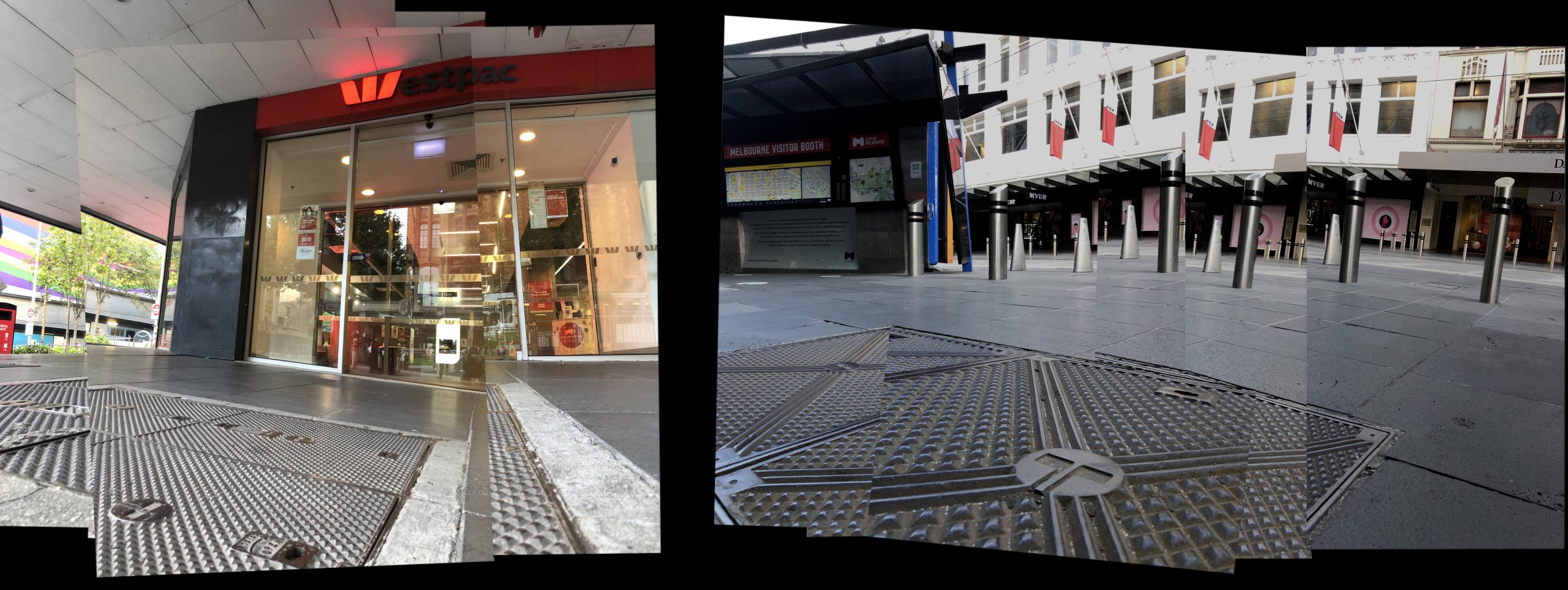
I begin with the most southern site, the south-western corner of Collins and Swanston Streets, with a building known as ‘Wales Corner’.9 The presence of Huveneers on this site is not accidental. The 16-storey ‘curtain of glass’ headquarters had been built in 1966 for the Bank of New South Wales, which then changed its name to Westpac Banking Corporation in October 1982 following its acquisition of the Commercial Bank of Australia.10 The work is a masterstroke of simplicity and informational compression. Although the name Westpac is a portmanteau of ‘Western’ and ‘Pacific’, the design of the now ubiquitous 1982 Westpac logo wisely retains the ‘W’ which had been the logo of the Bank of New South Wales, popularly known as ‘the Wales’. Nearly four decades later, the expansively-orientated bright red elements of the Westpac logo can be read as both typographic and iconographic, bridging a linguistic divide and opening the communication up to an international audience. As Huveneers reflected in an 1982 interview with the Brisbane Courier-Mail newspaper:
The styling of Westpac is good, and there’s been a great acceptance now. The retention of the W was of course an essential part. The W has a very high recall in the market area, the West Pacific area. A third of the world’s population live there adjacent to Australia.11
Photographing this logo-festooned (arguably over-branded) Westpac Bank on ‘Wales Corner’ today, you have to stand on another of Huveneers’ works – the Telecom logo (1975) solidly cast into an iron pit-cover. In contrast to the story of the Westpac logo, the Telecom identity emerged from division rather than amalgamation. With the splitting up of the Postmaster General’s Department on 1 July 1975 (known as vesting day) came the formation of two distinct bodies dealing with nationwide communication – the Australian Postal Commission (trading as Australia Post and aiming to be entirely self-funding) and the Australian Telecommunications Commission (trading as Telecom Australia, now Telstra).12
The Telecom logo celebrates Huveneers’ capacity for the power of visual abbreviation. Primarily typographic in nature, the central letter T for Telecom was designed to symbolise the semaphore system embracing the world, represented by a circle. The Telecom symbol is by far the most common and frequent of Huveneers’ work within the Melbourne (and presumably national) streetscape. This is primarily due to its nature as a symbol of long-term infrastructure, reinforced by the enduring materials with which it is cast – iron and concrete pit-covers and the like. This is particularly impressive given that Telecom was partially privatised in July 1997 and re-branded as Telstra by Melbourne design firm Flett Henderson and Arnold (FHA).
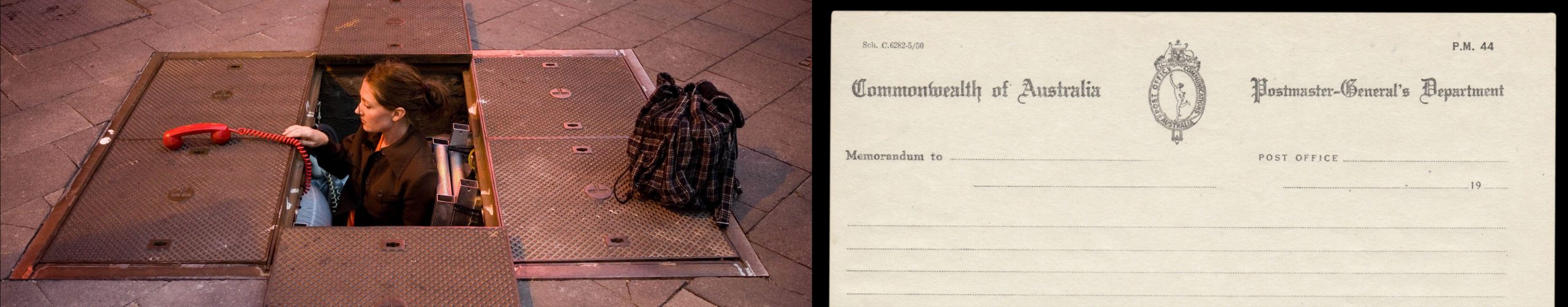
The way in which a corporate logo can become a site of urban culture was demonstrated in 2008 when a Telstra phone pit was used as a setting for a theatre performance. Entitled Underwhere, the production was a collaboration between a small independent arts company and Telstra. The main performer, Lucy Wilson (a stepdaughter of Huveneers), was initially inspired to produce the play when she kept noticing her stepfather’s Telecom logo on countless manhole lids. She performs the play standing in one of the Telecom/Telstra phone pits.13
Moving a block north to Bourke Street, you discover another Telecom phone pit lying in the shadow of the looming Myer department store façade. Huveneers designed the typographic identity for the iconic Melbourne Emporium in the late 1970s, famously advising the owners to drop the ‘s’ from Myers, making it simply ‘Myer’.14 This particular project highlights the importance Huveneers placed on naming as part of brand representation. As Oliver Harvey wrote in a 1982 interview with Huveneers, ‘One of the several things to be considered is the name of the company. A study is designed to confirm the value of the name for attracting goodwill in today’s market’. To which Huveneers added … it should be approached with a clear understanding on the part of the company of what corporate communication can contribute, and a designer must understand what the commercial processes can contribute to deliver the right identification to truly represent the nature and character of the industry now and for the next 10 to 15 years.15
Standing in front of the Myer façade adorned with Huveneers’ identity some 40 years later, you are struck by the enduring longevity of Huveneers’ identity work for the Myer Emporium, particularly given the massive shifts and disruptions in department store trading in the interim.
Within a few easterly paces, and partially screened by Melbourne’s plane trees, is another of Huveneers’ works writ upon a monumental façade – the Target department store logo. Arguably less complex in its design form than Telecom or Australia Post, this massive bright red mark is displayed at both eye height for passers-by and upon the top section of this considerable frontage. A trajectory from Huveneers’ previous work for Myer can be seen in this commission – Myer had purchased the right to use the name Target from its North American owners in 1971, opening up a diversified offer to the customer. Baillieu Myer, the group director of retail diversification at the time, described the decision: ‘Target in America, the concept, the quality, value in the broader sense – I felt that they were the one that we should model ourselves on’.16 From a design perspective, Huveneers’ role was to refine and apply the Target branding throughout the Australian stores. Huveneers companioned the mark with the typeface Franklin Gothic, an American sans serif popular and widely available to typesetting houses at the time. Although it lacks the design originality of Australia Post and Telecom, both home-grown commissions that allowed Huveneers to design from the ground up, the ‘adaptation’ of the American Target brand to an Australian context still shows the ability of Huveneers to thoughtfully orchestrate the nation-wide unrolling of a consumer brand.
Whilst observing and documenting the ‘embedding’ of Huveneers’ design legacy into the Melbourne streetscape, it becomes apparent that the second most frequent mark (running a close second to Telecom) is the logo for its counterpart, Australia Post.
Unlike the more ubiquitous but quieter Telecom logo (countless numbers of which are cast onto man-hole covers underfoot), the Australia Post mark is made for immediate and distant recognition, orientated to the viewer and floated within a bright, ‘fire-engine’ red background.
Designed to be clearly and reliably identifiable in the public gaze, the Australia Post logo on pillar boxes positioned on nearly every city block is a monument to graphic simplicity. This is in stark contrast to the original Postmaster General’s mark which features the Greek mythological figure of Hermes standing inside a tall oblong shape topped by an Australian Kangaroo and Emu crest. Other insignia used by the PMG Department, such as their uniform buttons, simply feature a royal crown. Within this context, the starkly graphic revisions by Huveneers in 1975 following the division of the PMG suggests a de-coupling of Australia from the crown through its modern reconfiguration as a pragmatic, consumer-facing set of organisations.
Within a bold background of bright red, Huveneers cleverly positions the internationally recognised postal-horn device, a potent symbol of communication history, to form a letter P for Post. The circular element surrounding this represents movement, direction and global connection of people and communities. That the logo is still being used several decades after its design is testimony to its clarity and effectiveness.17 Although there have been updates to the orbiting typographic system within the brand,18 the core identity has remained the same, close to half a century later.
Seen through the lens of Baudelaire’s ‘flaneur’, the streets of the city itself becomes a living archive of Huveneers, a testimony to his contribution to design. Scattered across each city block of Melbourne is an array of immediately-familiar corporate identities – or as a journalist noted of the designer during a 1981 interview ‘… the rest of Australia sees the work of Pieter Huveneers around them every day’.19 Built into the very fabric of the city, these marks proudly stand etched into stone, cast into metal or fabricated into illuminated acrylic signage. Many (like Telecom) sit silent, muted by redundancy, whilst others continue with their original purpose of identifying a contemporary entity (Australia Post, Myer etc).
Far beyond the formal design archive, the ‘public’ marks left by Pieter Huveneers leave us a trail, a way of mapping our city. Particularly in the case of his marks for organisations no longer operating, they have outgrown their initial role as corporate communications only to transform into markers of memory and place – a form of urban orientation. They can be viewed and understood as a set of stories and representations rather than complete abstractions – the identities for Telecom, Australia Post, Myer and Westpac are readily identifiable marks within our typographic landscape. The renowned designer Garry Emery once noted this important relationship between mark and place.
Identity, or point of difference, is also essential for successful place making. Urban legibility – or the way the city can be read or interpreted by people needing to orient themselves in order to find their way around – is important in all public spaces.20
Huveneers’ role within the mapping of a city is to be the dropper of breadcrumbs, leaving distinctive marks that help us navigate our city streets. Aligning our own experience and recollection of place enables these necessary connections, or as Hall points out, ‘like memory, geography is associative’.21
Huveneers’ corporate identity work becomes an ingredient in what has been described as a ‘typographic landscape’: … what we call typographic landscape is the landscape formed by a subset of graphic elements in the urban environment: characters that form words, dates and other messages composed of letters and numbers. Typography is here understood in a broad sense, including reference to alphabetic and para-alphabetic characters obtained from processes that would otherwise be better described as lettering (painting, engraving, casting etc.) and not only from automatic or mechanical processes that characterize typography in a more restricted sense.22
This idea of the typographic landscape has also been discussed by Nicolette Grey, Alan Bertram, Jock Kinneir, Phil Baines and Catherine Dixon, all of whom have articulated that the ‘visual, aesthetic and cultural identity of the city is made up of, amongst other things, its graphic elements’.23 Huveneers’ identity markers of institutions and corporations have also become identity markers of place in Australia. And, like many other forms of design, they offer a particular capacity to exist comfortably and silently beyond the formal archive or gallery, bleeding deeply into the public realm and collective psyche. Their historical presence persists into the contemporary experience of the city, and in doing so acknowledges a broader continuum, challenging the unhealthy fixation within graphic design culture with ‘the now’. The enduring lifespan of these marks long beyond their corporate life-span serves to reinforce the key strengths of Pieter Huveneers’ work – rigorous, well-considered and researched conceptual underpinnings executed with simplicity and precision. These firm foundations ensure that, even 40 years later, it is ultimately the ‘little symbols’ that remain, both in our streets and in our collective sense as Melburnians.
1 Stephen Banham, ‘The Legible City: Stories of Place Told Through a Typographic Lens’. Doctor of Philosophy (PhD), RMIT University; 2019
2 Frank Whitford, Bauhaus (London: Thames and Hudson), 21.
3 Adrian Shaughnessy, FHK Henrion: The Complete Designer. (Unit Editions, 2013), 92.
4 Stuart Pugh, Total Design: Integrated Methods for Successful Product Engineering. (London: Addison-Wesley, 1991), 5.
5 Geoffrey Caban, A Fine Line: A History of Australian Commercial Art. (Sydney: Hale & IreMonger, 1983), 38.
6 Michael Venus, ‘The symbol of success’, The Herald, 14 Feb 1981.
7 Denise Whitehouse, ‘A Matter of Influence: the Swiss School and the Growth of the Graphic Design Profession in Australia’, Design History Australia Research Network. http://dharn.org.au/a-matter-of-influence-the-swiss-school-and-the-growth-of-the-graphic-design-profession-in-australia/
8 ‘Publicly owned’ is used in a sense of a collective belonging and familiarity rather than a technical/legal ownership.
9 The multi-storey building at the corner of Collins and Swanston Streets, known as Wales Corner, was designed by architects Stephenson & Turner and constructed in 1964–66 for the Bank
of New South Wales.
10 https://www.westpac.com.au/about-westpac/westpac-group/company-overview/our-history accessed 28 Feb 2021
11 Oliver Harvey, ‘The man who markets images’. The Courier Mail Brisbane, 17 July 1982, 21.
12 Marcella Hunter, Australia Post. Delivering more than ever. (Sydney: Focus Publishing, 2000), 8.
13 Sue Moss, Real Time Issue #78 April–May 2007, 36. https://www.realtime.org.au/out-of-the-underworld/ accessed 1 June 2021
14 Stella Barber, Your Store Myer: The Story of Australia’s Leading Department Store. (Melbourne: Focus Publishing, 2008), 112.
15 Oliver Harvey. ‘The man who markets images’. The Courier Mail Brisbane, 17 July 1982, 21.
16 Stella Barber. Myer. The story of Australia’s leading department store. (Melbourne: Focus Publishing, 2008), 112.
17 Stephen Banham, Characters: Cultural Stories Revealed Through Typography. (Melbourne: Thames and Hudson Australia, 2011), 68.
18 The supportive typography of the Australia Post brand has changed from Helvetica (Meidinger) to Univers (Frutiger) to AP Letter (Sharmal) to AP Type (Chan).
19 Michael Venus, ‘The symbol of success’, The Herald, 14 Feb 1981.
20 Garry Emery and Suzie Attiwill, Outside Inside Out: Inside Outside In. (Melbourne: Images Publishing, 2002).
21 Stephen Hall, Introduction to You are Here. Personal Geographies and Other Maps of the Imagination, (New York, Princeton Architectural Press, 2004), 15.
22 A. Farias, P. Gatto, P. Gouveia, ‘Letters and Cities: Reading the Urban Environment with the Help of Perception Theories’, Visual Communication Vol 8 (3), (Sage Publications, 2009), 338.
23 A. Farias, P. Gatto, P. Gouveia, ‘Letters and Cities’, 336.