
How we got to Now:
A Brief Survey of Australian Typography (1983–2023)
Writer Stephen Banham | delivered Keynote Lecture at the 2024 ATypI Conference
Looking across 40 years of Australian typography highlights that, although typefaces are great at expressing the personalities of brands or small communities, it can no longer capture the essence of ever-changing national cultures. But that’s ok.
Australia has a very, very long human history, with arguably the longest surviving culture on earth. Respectfully acknowledging this context, this typographic survey will seem very brief indeed – just a tiny 40 years, from 1983 to 2023. When putting together any historical survey, there is always a temptation to draw a timeline and simply populate it with chronologically ordered content. But that approach would miss the necessary messiness of how these things work – much of the audience tonight would be aware that typographic history operates more like a pinball machine, ideas endlessly bouncing off each other backwards and forwards.
It may be helpful from the outset if I also clarify what this talk is not.
This survey will focus upon mechanically reproducible typefaces, and not lettering. To include the latter would simply not be possible in the limited time allocation. But it will touch upon some of the writings around typefaces as well as the design work itself. This survey will not include every single person who has ever designed a typeface in Australia. Such an exhaustive (or should that be exhausting…) listing can be found courtesy of the all-seeing, all cataloguing Luc Devroyes.
Instead I have chosen to explore the curious tension between typefaces designed by Australians and Australian typefaces. This may appear like I am splitting hairs, but acknowledging this distinction is central to this paper. Typefaces designed by Australians are indeed that – but for those resultant typefaces to somehow seek to reflect a national identity is a whole other thing.
Stephen Bnaham
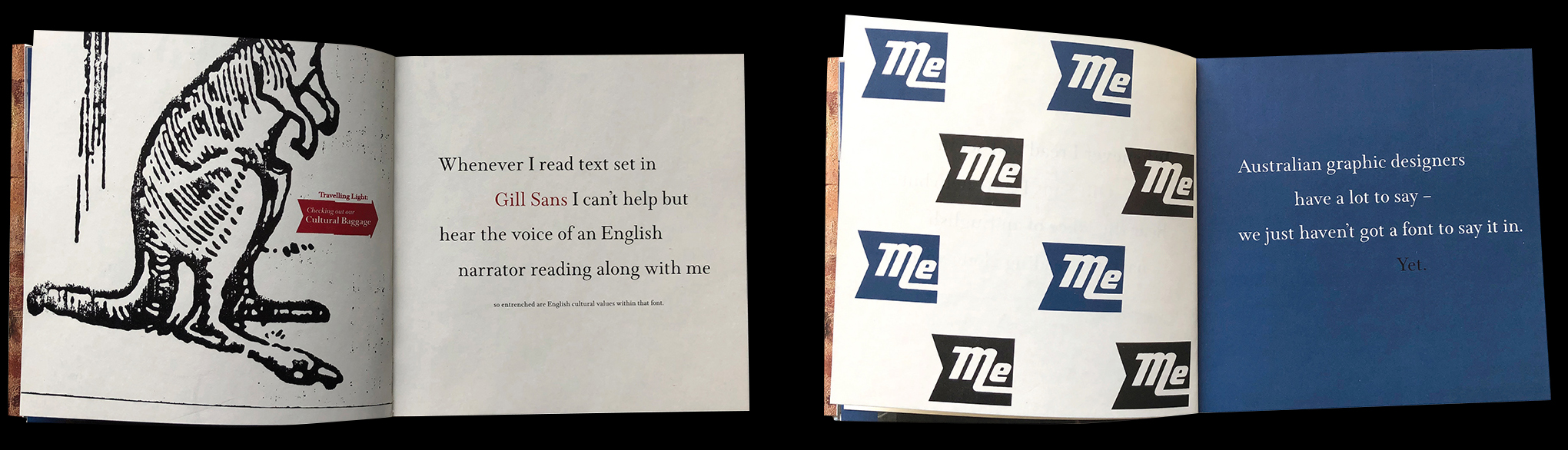
In 1996 I wrote what I thought at the time was just a throwaway line – ‘Whenever I read text set in Gill Sans I can’t help but hear the voice of an English narrator reading along with me. Australian graphic designers have a lot to say – we just haven’t got a font to say it in. Yet’. In the 28 years since, this much-quoted statement is something that I’ve often come back to. These are the thoughts of a young designer in search of an identity. A young Australian designer tired of having his international design conference lanyard forever misidentified as Austrian.
The second most common question I am asked would have to be Is there an Australian typeface?. It’s the best kind of question there is because it has no answer. It’s like a form of utopia – an ideal, a quest rather than an actual destination. Without becoming too ‘zen’ about it all, it is the process of questioning and searching for a sense of identity that is the important part. And you’ll see aspects of this journey in many of the typefaces I show in this presentation. For young Australian designers, the impossible quest for the Australian typeface is a ‘rite of passage’ – a necessary step in understanding not only the relationship between ourselves and typefaces, but also an important lesson in recognizing that most invisible of cultural ingredients – time.
Being a keen gardener, I can’t help but draw a metaphor here. When planting a new garden, the one thing you cannot buy is time. Plants are given the space they need to eventually grow and occupy. This evolution just takes the time that it takes. Nationally identifiable typefaces operate in a similar manner. Excoffon’s Antique Olive, Gill’s Gill Sans or Meidinger’s Helvetica have all acquired the unique ability to be read as cultural shorthand only through their repeated use in a specific place over a very long time.
Prior to the starting point of this brief survey – 1983 – there had been little written about Australian graphic design culture, let alone Australian typography. Although not specifically centred upon typography, Mimmo Cozzolino’s Symbols of Australia, first published in 1980, was a significant and meticulously researched showcase of colonial-era branding, highlighting the xenophobically racist voice of early Australia. And, as is often the case, it took the clear-eyed perspective of a migrant to cast light upon the culture of his adopted home.
It was in that very same year, 1983, that Geoffrey Caban wrote A Fine Line (1983), an excellent general history of Australian ‘commercial art’, a term that was itself entering its twilight. Importantly A Fine Line documented the adoption of international modernism in the 1960s upon what had been a very parochial design profession. It does make mention of some of the earlier Australian designers who had a particular interest in typography, such as Alistair Morrison, but only within a much broader graphic design context.
Unsurprisingly, Australian typeface design has been sculpted by technological developments and bigger, international undercurrents, patterns and trends. Influences within wider graphic design culture – deconstruction, an interest in the vernacular, designer as author, digital anti-mastery etc, can all be mapped upon the continuum of design work coming from Australia.
Like elsewhere across the globe in the mid to late 1980s, Australian typography responded to the paradigm-shifting technology of desktop publishing. Many typefaces created in Australia for earlier technologies such as photo-typesetting were redrawn and re-released into digital form.
The typefaces from Russell Bean’s Type Associates were an instance of this transition from analogue to digital. Perhaps most importantly within the context of this survey, many of his typefaces suggested aspects of Australian life – Billabong, Bouginville, Fremantle, Macquarie etc. Recent echoes of this can be seen in Troy Leinster’s naming of his recent typeface Brisbane – but more on that later.
The economic turbulence of the 1980s led to several short-lived typefaces – sometimes called ‘ghostfaces’. Nevertheless they are part of the overall narrative.
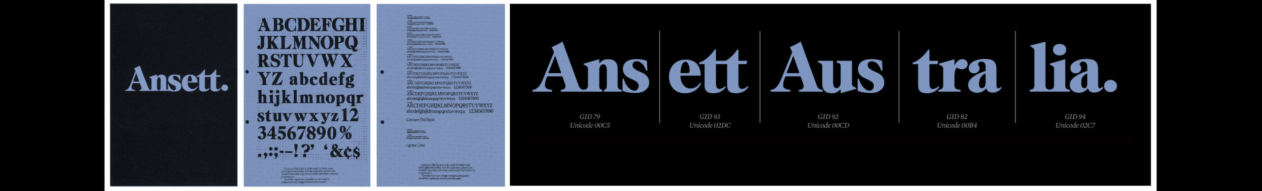
Ansett Caslon (1989–2001), designed by Brian Sadgrove, was part of a larger branding campaign by Campaign Palace when Reg Ansett sold his airline to Sir Peter Abels and Rupert Murdoch. The airline had been initially called just ‘Ansett.’ – the full point lending the single name some visual authority and decisiveness. The word ‘Australia’ was later added to address an international audience. As Sadgrove explained, “Caslon was chosen because it has a simple authority about it, the tt’s could be ligatured well and whole look wasn’t too designery. Pretty much everything ended up kerned and with a full point after it, which in hindsight seems a little 90’s excessive”. The truetype version of Ansett Caslon (designed to run on Mac OS6 no less) features one of the classic hallmarks of a customised typeface – a set of specific brand ligatures. Option Shift A would deliver a perfectly kerned Ans, Option Shift N the ett, Option Shift S the Aus, Option Shift E the tra and Option Shift T the lia. All conveniently located on the keyboard to spell out the word ‘Ansett’. Reflecting on the project, Sadgrove is philosophical about the ultimate demise of the airline only several years later “The original design was all changed before the airline died, so be it…”

Trak (c.1980s) was a display face designed by Alex Stitt and Bruce Weatherhead and drawn by Ian Hawksby. It was part of an identity design project to promote the then new arcade and cinema complex in Toorak, Melbourne. The abbreviation of Toorak to ‘Trak’ by the local ladies inspired the naming. Prints of the typeface were even handed out to the arcade retailers for their own usage. Influenced by the revival of typographic modernity, it channeled Bayer’s Universal, Lubalin’s Avant Garde and Taylor’s Blippo Black. As Stitt admits himself “Modernism was in’. The Trak arcade and cinema eventually fell upon hard times, closing in the early 2000s, and along with it, any trace of the typeface.
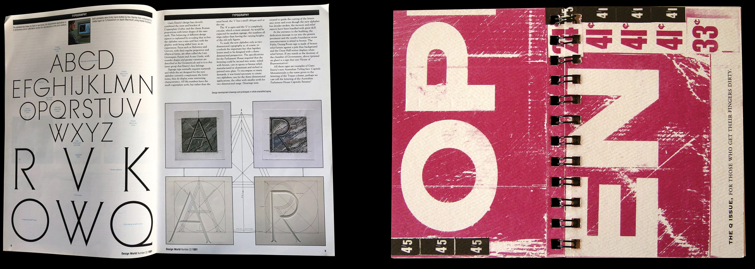
More successful and enduring projects do exist. In 1988 Garry Emery (of Emery Vincent Associates) was commissioned to design a bespoke titling typeface for Australia’s New Parliament House. Playfully known by the local design press as Capitalis Senatus 1, the typeface answered the pragmatic demands of the project, whilst subtly referencing the early signage of the colonial era. The result is an amalgam of Trajan, Avant Garde, Futura and Copperplate Gothic. Having been installed nearly four decades ago, the success of Emery’s typeface lies not only in its skilful execution and its avoidance of a laboured ‘Australian-ness’ but its enduring presence within this Australian institution. Emery observed ‘As part of our research, we compiled a dossier showing examples throughout the history of Australian type and analysed what we found, looking for any trends we could identify as somehow Australian. Really, although we would love to have discerned some evidence of a developing vernacular, there was nothing we could identify that was particularly distinctive’.2
right: Qwerty 1(1991)
By the beginning of the 1990s there were local attempts at addressing the ubiquity of desktop publishing. Qwerty contributed to a larger international interest in cultural vernaculars. In 1992, the second issue of the Qwerty series, The Vernacular Issue explored the existence of a truly Australian typographic expression. Despite its well-intended premise, an early-career reliance on aesthetics ultimately led to a rather contrived and reductive effort to find a ‘national’ typographic persona. This interest had been fuelled by texts such as Lift and Separate published by the Lubalin Centre, the photographic observations of Ed Fella and the typeface that encapsulated this era – Barry Deck’s Template Gothic whose echoes can be seen in Qwerty 4 Recession Issue, set in a typeface based on the glue outlines of storefront signage left after going out of business.
Australian printed type samplers have been relatively rare over the past 40 years, making the tracing of any ‘typographic evolution’ quite challenging. Those few that do exist include the Oblique series by Letterbox and the Recollection typeface produced by Domenic Hofstede and Vincent Chan.
The ‘Vernacular’ era was running in parallel with the undercurrents of deconstruction and the self-taught ‘intuition’ of figures such as David Carson. This wholly imported trend saw the development of smaller independent digital foundries. One of these was Prototype whose 1996 type catalogue Don’t Believe the Hype, presented an assortment of typefaces that clearly took advantage of then-recently-released type-editing software Fontographer, forming an Australian parallel to others such as Andrew Balius’ Garcia Fonts in Spain or Carlos Segura’s T-26 from the US.
As design writer Rick Poynor observed in the Australian issue of Eye “It’s odd, looking at contemporary Australian graphic design, how little it seems to be informed by a strong sense of place”.3 If it is rare in the wider practice of graphic design (with its more extensive toolbox of visual expression) then trying to achieve this link in a typeface is even trickier. But the search for national identity is a perilous journey. Any intent to visually represent national culture can lead to brutal abbreviations, compressing the complexity of lived experience of a place into a pattern of crudely related symbols.
The Canberra Centenary Typeface Competition in 2013 brutally highlighted the problem of developing a place-themed typeface. Admittedly this competition was open to all Australian residents so the vast majority of the results were… well intended…but not professionally produced. The winner, James Raftopoulos, dealt with the brief in a more nuanced manner, with a subtle nod to the era of Canberra’s formation a century before.
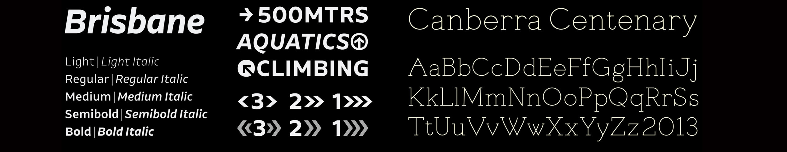
But it is not just our national capital that has the conceptual basis of a typeface. In 2012 the Australian type designer Troy Leinster developed the typeface Brisbane as a project for his Type Media course in the Netherlands. Reflecting upon its design, he noted ‘…the characteristics which I believe give Brisbane its distinct flavour are: optimism, ingenuity, cleanliness, its eponymous river, and outdoor lifestyle; as well as the people of Brisbane who are relaxed, unpretentious, and self-assured’. If you think that it’s ambitious to conceptually express all of that into a typeface, you can imagine how difficult it would be to extrapolate that out to an entire nation.
So far I’ve been framing this as a history of individuals, but what about Australian type communities? With such a small population spread across this massive continent, trying to sustain any group of like-minded people is always challenging, so formalised type-communities are a rarity: From the mid 1980s to 1991 the Australian Type Directors Club was established for the small community of typographers mainly working within advertising agencies; since 2009 the Australian chapter of the International Society of Typographic Designers (ISTD) has been running student assessments at design schools, whilst Typism has been joyfully bringing together the lettering community for over a decade; and most recently a small consortium of Australian and New Zealand type designers known as Counterforms have been formed to address issues of inequality and social justice. This is quite pertinent, as this survey highlights, that there is clearly a gender-bias within the world of Australian type design, with women being far more present within the field of lettering. This follows similar conventional contours in other parts of the world.
It is important that I point out to our international audience a particularly Australian phenomenon, first described in 1950, which is only now showing signs of fading – Cultural Cringe. I mention it because I would argue that this internalized inferiority complex borne of colonialism, has played a role in the evolution of Australian typography. Despite the few exceptions already shown, right up to the late 1990s, Australian institutions requiring custom typefaces would habitually commission these from the Northern Hemisphere. The commissioning of Harmony by Jeremy Tankard for our main telecommunications carrier, Telstra in 1999 being a case in point.
By the early 2000s many Australian designers were returning to their homeland having graduated from the multitude of type design courses ran overseas, most notably the Type Media course at KABK in Holland and the Masters Program at the University of Reading, or from periods of working at established international foundries. These returning emigres included Wendy Ellerton, Dan Milne, Troy Leinster, Vincent Chan, Wayne Thompson and David Foster amongst many others. I would also specifically mention Wei Huang, whose open-source Work Sans available through google fonts, is arguably the most widely-used Australian typeface I can think of.
The old adage ‘you can’t be what you can’t see’ also played a role here. By the 2000s Australian type designers could look across ‘the ditch’ to our kiwi neighbour Kris Sowersby, whose foundry KLIM offered a model of a rigorous practice could be viably run from the Antipodes. Basically, we no longer had to move to be taken seriously.
I would argue that this is perhaps one of the most significant shifts in the trajectory of Australian type design – leading to a steep professionalisation in Australian type design, bringing a new technical confidence to the field, all supported by seamless international connectivity.
The commissioning of a custom typeface for our national broadcaster, the Australian Broadcasting Commission (ABC) in 2015 is a particularly interesting recent project as it broached this complex issue of national identity. The designer of ABCSans, Wayne Thompson, reflects: ‘…it occurred to me that there is one factor which unifies all Australians: a sense of open space. Or what author Tim Winton refers to as our “impossibly open sky, dwarfing everything”. And although initial designs reflecting that ‘wide brown land’ were rejected, Thompson looked to other cues, ‘I tried to represent the national identity in ways which also improved legibility. As such, ABCSans includes deliberately open apertures — these avoid the letters ‘closing up’ at small sizes but also subtly communicate a welcoming, inclusive, easy-going nature’.4 The original font family of 11 weights, designed by ATF (Australian Type Foundry) was produced in 2016 with italics and condensed weights being added in 2020 to make the family more versatile.
Another current practitioner whose typographic output represents this period of cultural confidence is Vincent Chan (aka Matter of Sorts). The case studies shown here include custom typefaces – AP Pro for Australia Post and Preston for the Art Gallery of New South Wales. Despite Chan’s rigorous historical awareness (evidenced by his research), with a few exceptions, such as TN Monuments and the recent Powerhouse series, the need to express a specific cultural sense of place is not an explicit element in the final design. This is not a deficiency; in fact it can be seen as a confidence in the pragmatics of the typeface ‘doing the job at hand’. I mean, do we need to be reminded what country we are in when posting off a parcel? I think not…
I was reminded of this the other day when reading Jost Hochuli’s retrospective TypoBiography in which he reflected ‘I attach no importance to any sort of personal style. I believe that if my work as a typographer is honestly executed, focusing on the content, with the means at my disposal, and with regard to the future reader, it will inevitably result in a personal style’.5 If we replace the word personal with national, you get the idea.
The confident output of the current generation of Australian type designers signifies what I would describe as a post-national period in Australian type design. Sure, it is international in its scope – but not the imported steamroller ‘internationalism’ of mid-20th century modernism, flattering everything into neat grids of Helvetica. Its proficiency does speak outwards to an international audience but in a more nuanced form, avoiding the crude abbreviation of Australian culture down to a typographic shorthand. Whether any of these recently produced typefaces ever go on to become suggestive of Australian culture will be beyond our own control and possibly even beyond our own lifetimes.
Within the context of Australian typography 1983-2023 this tension between the rational and the national is a fascinating one. On one hand, it could be argued that, with the ever-increasing pace of creative output and redundancy, that the age of enduring typefaces that eventually go on to reflect a national culture (ie. Gill Sans, Mistral etc) are over. Expanding on just those two examples, both England and France are more culturally complex, more multicultural, than in the early 20th century. Metaphorically, it reminded me of the image claimed to be the very first photograph (or Degurretype) ever made. Given the very long exposure of the image, the moving crowds in the street simply vanish, with the only visible figure being the man who happens to be standing still while his shoes are being shined. Only the most still element becomes clearly legible. The idea that a national culture could stay still for long enough to be rendered typographically may have become an antiquity. A memory from a bygone era. Perhaps the ever-evolving nature of an national identity being expressed through a single typeface is now more of an impossibility than ever before.
On the other, the rising impact of Artificial Intelligence within the field of type design makes it more important than ever that type designers pour a little of themselves, of their humanity and culture, into their work. Not only will this be a determining point of difference, but it may even become a survival strategy. I am sure this is a very pertinent concern for all within this room and will be discussed in and between sessions of this conference.
All of this brings us up to the NOW.
In 2024 Australian typography is in a very happy place: Australia is now more aware and embracing of our geographic location within South East Asia with its rich spectrum of languages and cultures; there has never been more interest in the field leading to clients understanding the importance of having a distinctive typographic voice – and importantly we now have the practitioners to craft them. And yet some historical consistencies remain – the first recorded Australian typeface from the 1870s was a set of crude glyphs forged in iron for branding cattle, and 150 years later the key motivations behind contemporary Australian type design are also for branding, albeit in a less visceral form.
So what has this 40 year survey of Australian typography uncovered? If there was one consistent theme, it would be the ever-present concern around national identity. Being a colonial-settler nation, this quest offers both light and darkness. This exploration of a national typographic identity has come in a number of guises – in its observational form (such as Qwerty), in its metaphoric form (such as Brisbane or Canberra) and in its more subtle, pragmatic form where its absence is oddly conspicuous (AP Type Pro). Whether the work of the professional type designer can truly express the cultural life of Australians is yet to be seen. The hope, however, is still alive. Perhaps I’ll leave the last word to Garry Emery who said, when working on the Parliament typeface in 1988, ‘…If we look inwards, then we can create a sense of place and a sense of meaning that is Australian. The visual manifestation of that will be unique’.6
1. Harry Pears, ‘Capitalis Senatus’, Design World Issue 22 (Design Editorial Publishing, 1991), 8
2. Garry Emery interview with Jack Jan. jyanet.com/cap/index.html
3. Poynor, Rick. Eye, Journal of International Graphic Design. Issue 46. P22.
4. Atf.com.au/abc-custom-font-development/ accessed 20 February 2024
5. Hochuli, Jost. Jost Hochuli: The work of 60 years. Editions B42. 2023. P22.
6. Rick Poynor, ‘Look Inward’, Eye, The International Journal of Graphic Design. Issue 46, Volume 12. (Quantum Business Media, 2002), 23.